
Template details
Responsive Travel Website
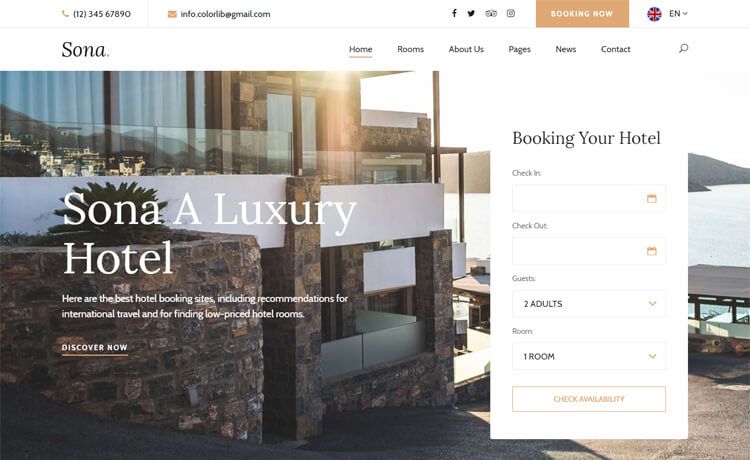
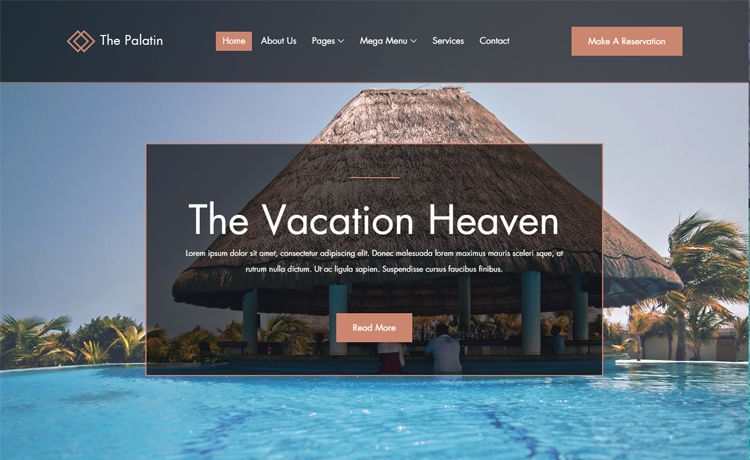
Responsive travel website template built with HTML, CSS, and JavaScript, featuring automatic slides, scroll animations, and dark/light themes.
About this template
Responsive Travel Website is a single-page travel landing template built with vanilla HTML, CSS, and JavaScript by Bedimcode, designed as a mobile-first, dependency-free starting point for travel sites.
What is Responsive Travel Website?
Responsive Travel Website is a front-end website template created by Bedimcode, a YouTube channel that publishes web development tutorials. It is built entirely with HTML, CSS, and JavaScript, with no frameworks, build tools, or server-side dependencies. The template takes text content and images for travel destinations and renders them as a fully responsive landing page featuring an automatic slideshow, smooth-scrolling sections, scroll-triggered entrance animations, and a dark/light theme toggle. The output is a static set of files that run directly in any modern browser.
Key Features
- Automatic slides — A slideshow cycles through images on its own, requiring no clicks to advance, which works well for hero banners.
- Scroll animations — Elements animate into view as the user scrolls, adding motion without external animation libraries.
- Smooth scrolling — In-page navigation links glide to their target section, improving the feel of one-page layouts.
- Dark & light theme — A built-in toggle switches the site between dark and light color schemes, with the current state applied across all sections.
- Mobile-first design — The stylesheet was written for small screens first and then enhanced for larger viewports, following the Mobile First methodology.
- Cross-device compatibility — The layout is designed to work on all mobile devices and scales up to desktop, as stated in the accompanying video description.
- No dependencies — The entire template uses only standard web technologies, so it can be hosted anywhere and customized by editing HTML, CSS, and JavaScript directly.
Who is it for?
- Front-end developers — Use the template as a hand-coded reference for responsive navigation, slideshows, scroll animations, and theme toggling without relying on jQuery or React.
- Travel agencies and tour operators — Quickly assemble a destination showcase site with a built-in slideshow and mobile-first layout that loads fast on phones.
- Students learning HTML/CSS/JS — Study the source to see how mobile-first media queries, scroll-triggered effects, and CSS custom properties for theming are implemented in practice.
- Freelancers — Deliver a lightweight, customizable travel website to hospitality clients without licensing a commercial theme.
What can you do with Responsive Travel Website?
- Travel agencies: Present featured destinations in the automatic slideshow and link each slide to a detailed section using smooth scrolling.
- Travel bloggers: Maintain a personal travel site with a dark/light theme that stays readable in low light, on devices of any size.
- Web developers: Fork the template to add new sections, change the color palette via CSS variables, and integrate with any static hosting service.