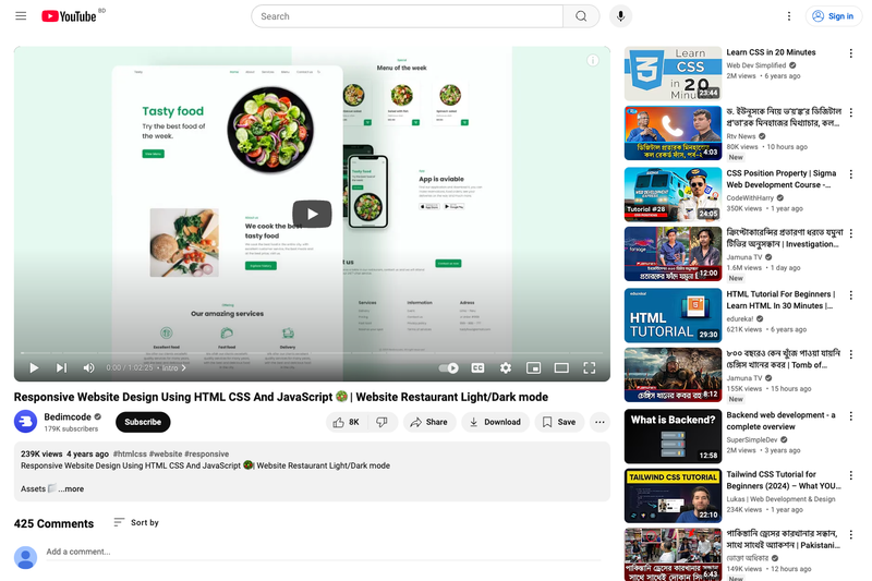
Responsive Restaurant Website is a free, mobile-first HTML, CSS, and JavaScript template for building a restaurant's online presence, created by the YouTube channel Bedimcode. It focuses on delivering a responsive layout with scroll animations, smooth navigation, and an optional dark/light theme, all without requiring a framework or build step.
What is Responsive Restaurant Website?
Responsive Restaurant Website is a front-end template for a restaurant website, built with vanilla HTML, CSS, and JavaScript. It is designed using the Mobile First methodology, meaning the layout is optimized for small screens first and then expanded for desktop viewports. The template takes static content (text, images, and menu items) and produces a polished, single-page restaurant website with a modern look. It is distributed as part of a YouTube tutorial by Bedimcode, who also provides a video walkthrough.
Key Features
- Mobile-First Development — The entire layout is built with mobile devices as the primary target, ensuring small screens receive a clean, usable experience before desktop enhancements.
- Dark & Light Theme — A built-in theme switcher lets visitors toggle between dark and light color schemes, matching user preference.
- Scroll Animations — Elements animate into view as the user scrolls down the page, adding motion without external animation libraries.
- Smooth Scrolling — Navigation links scroll smoothly to their corresponding sections instead of jumping abruptly.
- Pure HTML/CSS/JavaScript — No frameworks, libraries, or build tools are required; the template runs directly in any modern browser.
- Cross-Device Compatibility — Compatible with all mobile devices and standard desktop browsers, providing a consistent user interface.
Who is it for?
- Restaurant owners — Launch an attractive website to showcase the restaurant, share the menu, and give customers essential information without relying on a web developer.
- Aspiring front-end developers — Study a well-structured, mobile-first codebase to learn responsive design, theme toggling, and scroll-triggered animations in native JavaScript.
- Freelancers — Use the template as a quick starting point for client projects, replacing placeholder content with real restaurant details and photos.
Use cases
- Local restaurants — Get an elegant online presence that works on phones, so customers can browse the menu and find hours on the go.
- Food startups — Present a modern brand image with a dark/light theme that adapts to different audiences.
- Learning projects — Follow along with the Bedimcode YouTube tutorial to understand how each section is built and styled.
FAQ
What technologies does this template use?
It uses only HTML, CSS, and JavaScript — no frameworks like React or Vue. This makes it easy to run and modify with minimal dependencies.
Is the template free to use?
Yes, the template is distributed as part of a free YouTube tutorial by Bedimcode. You can download the code and adapt it for personal or client projects.
Does it include a dark mode?
Yes, the template includes a dark and light theme toggle so users can switch between the two appearances.
Is it mobile-friendly?
Absolutely. It is built with the Mobile First methodology, which means the design starts from mobile screens and scales up, ensuring compatibility with all mobile devices.
Who made the template?
The template was created and published by Bedimcode, a YouTube channel focused on HTML, CSS, and JavaScript tutorials.