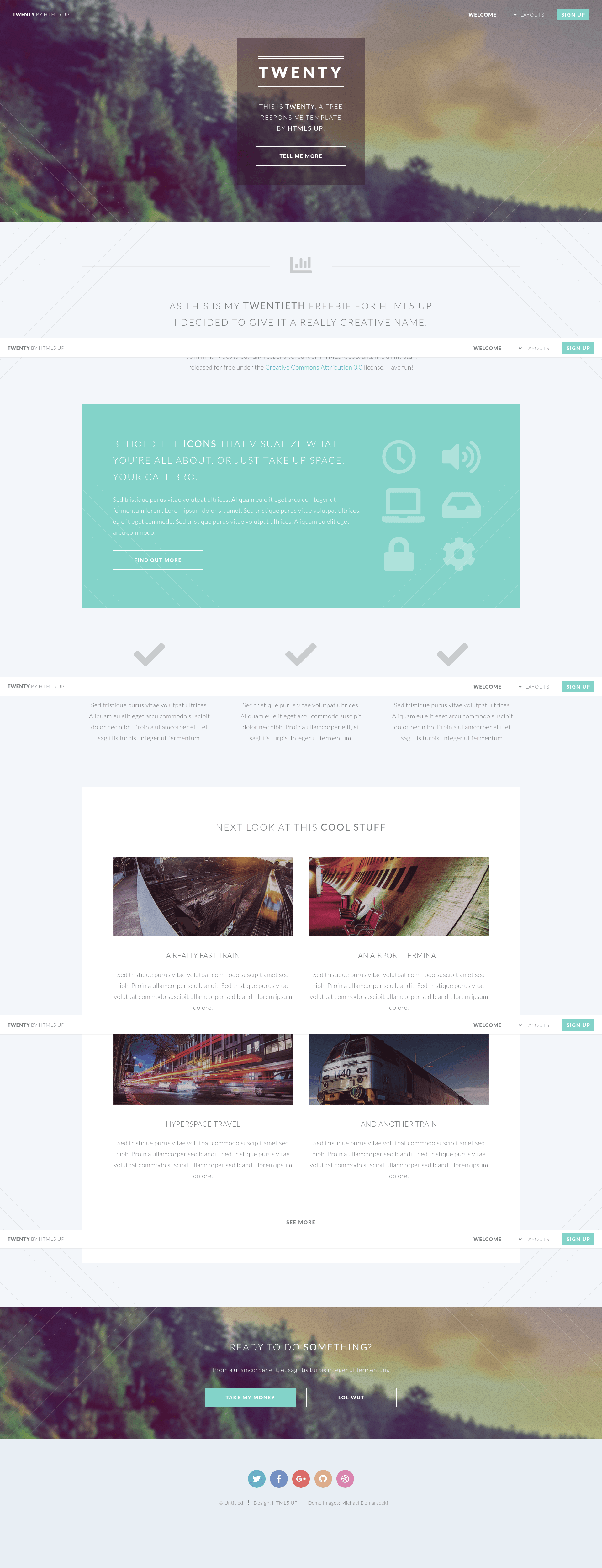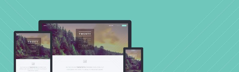
Twenty is a free, responsive HTML5 website template from HTML5 UP, built for multi-page sites with sidebar navigation and a prominent intro section.
What is Twenty?
Twenty is a free responsive HTML5/CSS3 template created by HTML5 UP. As input it takes the static HTML and CSS files you download from the site; as output you get a multi-page website that runs on any static web host, no server-side processing required. The template ships with five page structures: the home/index page, a left sidebar layout, a right sidebar layout, a no-sidebar layout, and a contact page.
The homepage is built around an intro text block, a six-item feature list, and a row of four image-and-caption blocks (labeled pic01 through pic04 in the file names). The body copy is placeholder lorem ipsum text, so you replace it with your own content before publishing. The navigation includes a submenu with five example links (Dolore Sed, Consequat, Lorem Magna, Sed Magna, Ipsum Nisl), demonstrating a dropdown menu pattern you can adapt.
Key Features
- Multi-page structure — Includes separate HTML files for home, left sidebar, right sidebar, no sidebar, and contact, so internal navigation is already wired together.
- Sidebar layouts — Three content pages show left, right, or no sidebar, letting you pick the content column arrangement that fits each page.
- Six-item feature grid — The homepage lists six feature placeholders (numbered 1–6), ideal for presenting services, product benefits, or capabilities in a grid.
- Four-image gallery row — A section with four image placeholders and caption text gives you a ready-made project or client showcase.
- Dropdown submenu navigation — The header menu includes a submenu with five placeholder links, showing how to build nested navigation with pure CSS.
- Contact page — A dedicated contact page is included, with form markup ready to be connected to a form handler or mail service.
- Responsive layout — The template is described as responsive, meaning it reflows for mobile and tablet viewports out of the box.
Who is it for?
- Freelance designers and small agencies — Use Twenty to put together a client-ready site quickly: the intro section, feature grid, and contact page cover the standard sections a service business needs.
- Small business owners — Deploy a static marketing site without paying for a CMS; you can edit the HTML directly and host it on any static file server.
- Web development students — Study the file structure and responsive CSS in a real-world template, then customize it for coursework or practice projects.
What can you do with Twenty?
- Launch a business site — Replace the placeholder text on the home page with your services and contact details, and upload the files to any static host to go live.
- Create an image portfolio — Swap the four pic placeholders with your own photography, projects, or client work to build a simple gallery section.
- Demonstrate a multi-level menu — Use the included submenu pattern to test how dropdown navigation behaves on desktop and mobile before rolling it into a larger project.
FAQ
Is Twenty free to use?
Yes. The template page states that Twenty is a free responsive template by HTML5 UP, so you can download and use it without paying a license fee. No purchase option or paid tier is mentioned on the page.
What pages are included in Twenty?
The download includes a home page, a left sidebar page, a right sidebar page, a no-sidebar page, and a contact page, plus shared CSS and image assets. These are the five page files linked in the template's navigation.
Does Twenty require a framework or build tool?
No. Twenty is plain HTML and CSS with no JavaScript framework, CMS, or build step. You can open the files directly in a browser or push them to any static host, and the page will render as-is.
Can I use Twenty as a learning resource?
Yes. Because the template is static HTML and CSS and includes multiple layout examples, you can study how HTML5 UP structures responsive pages, menus, and sidebar columns in a real-world project.