Accessible Astro Components is an open-source library of WCAG-aligned, ARIA-enhanced UI components for Astro, created by incluud, that installs via npm and delivers zero-dependency, TypeScript-supported components with automated keyboard and screen-reader support.
What is Accessible Astro Components?
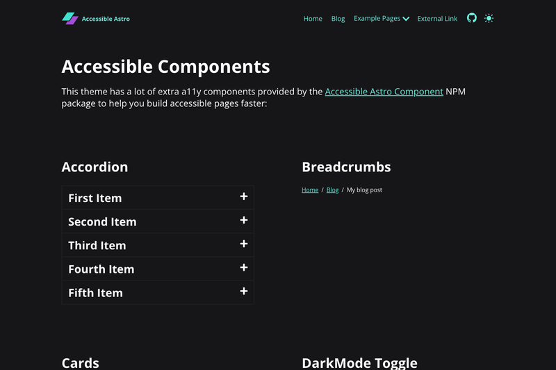
Accessible Astro Components is a collection of more than 20 pre-built UI components for the Astro framework, including Accordion, Modal, Tabs, Forms, Avatar, Breadcrumbs, and Video. It takes standard Astro markup and props as input and returns semantic, keyboard-navigable HTML with ARIA attributes. The library is maintained by incluud, the team behind Accessible Astro Starter, Dashboard, Launcher, Docs, and a color contrast checker. The package name on npm is accessible-astro-components.
What makes Accessible Astro Components stand out?
- Accessible by default — Every component follows WCAG guidelines and ARIA best practices, with semantic HTML, proper focus management, and screen-reader labels.
- Zero dependencies — Components are pure Astro files with no runtime npm dependencies, which keeps bundles small.
- TypeScript support — Each component ships with full type definitions and documented props, enabling editor autocompletion and type checking.
- Dark mode — The library uses the modern CSS
light-dark()function to support light and dark themes without JavaScript. - i18n ready — Components are designed with internationalization in mind, so labels and text can be adapted for multiple locales.
- Form validation — The Form, Input, Textarea, Checkbox, and Radio components include built-in validation and error handling, with proper fieldset and legend grouping.
- Preference-aware utilities — DarkMode, HighContrast, and ReducedMotion components respect system preferences and offer global toggles.
- Modern CSS — Styling uses logical properties and modern selectors, and the components are mobile-first and touch-friendly.
Who should use Accessible Astro Components?
- Astro developers — Add accessible components to a new or existing Astro project without writing ARIA logic from scratch.
- Accessibility-conscious product teams — Meet WCAG requirements for public and enterprise sites by deploying components that already handle keyboard navigation, focus management, and screen-reader semantics.
- Agencies and freelancers — Speed up UI development by importing ready-made components that are customizable via CSS and TypeScript props, then adapting them to a client's design.
- Design system maintainers — Use the components as a building block for internal accessible pattern libraries, since they are dependency-free and themeable with
light-dark().
What can you do with Accessible Astro Components?
- Build accessible forms — Use the Form, Input, Textarea, Checkbox, Radio, and Fieldset components to create validated, error-handling forms that work with keyboards and screen readers.
- Add navigation patterns — Implement Breadcrumbs, Tabs, Pagination, SkipLinks, and Link components to create clear, accessible site architectures.
- Enhance pages with overlays and media — Deploy the Modal, Notification, Video (YouTube embed), and Media components for dialogs, alerts, and responsive images.
- Respect user preferences — Integrate the DarkMode, HighContrast, and ReducedMotion toggles to let visitors adjust contrast and motion according to their needs.
How does Accessible Astro Components work?
Install with npm install accessible-astro-components, pnpm add accessible-astro-components, or yarn add accessible-astro-components, then import components in any .astro file. The Quick Start example shows an Accordion containing AccordionItem components, where each item's title prop defines the accessible heading. Once mounted, components manage their own ARIA state, focus, and keyboard events, so developers only provide content and styling.
FAQ
What components are included?
The library includes 25 named components: Accordion, Avatar, AvatarGroup, Badge, Breadcrumbs, Button, Card, DarkMode, HighContrast, ReducedMotion, Form, Input, Textarea, Checkbox, Radio, Fieldset, Heading, Link, Media, Modal, Notification, Pagination, SkipLinks, Tabs, and Video. These cover common UI patterns like navigation, forms, overlays, and media embeds.
Does Accessible Astro Components support dark mode?
Yes. The DarkMode component provides a theme toggle with system preference support, and the library's CSS uses the light-dark() function so colors adapt automatically when a theme is set. Components also ship with HighContrast and ReducedMotion toggles for additional accessibility preferences.
Is Accessible Astro Components a standalone project?
No. It is part of the Accessible Astro ecosystem created by incluud, which also includes Accessible Astro Starter (a Tailwind-based project starter), Accessible Astro Dashboard, Accessible Astro Launcher (a command palette), Accessible Astro Docs, and a WCAG-compliant Color Contrast Checker. The ecosystem shares accessibility-focused design patterns.