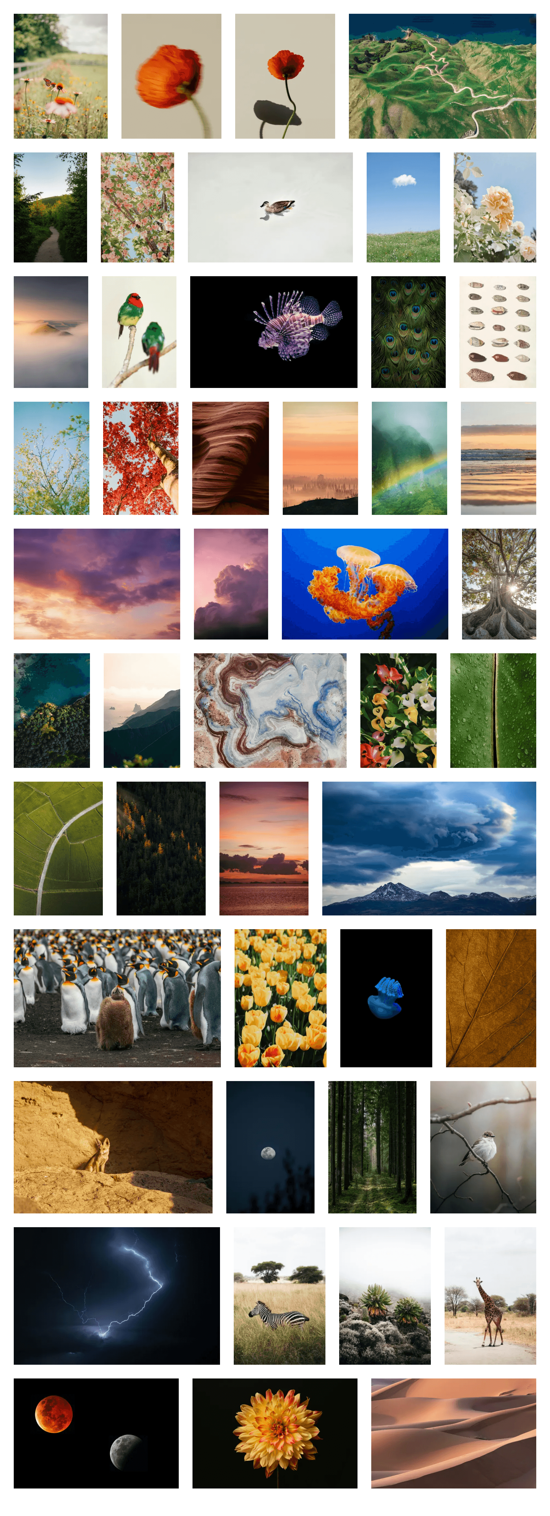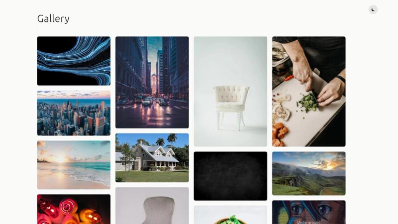
Astro Photo Grid is a minimal, single-page photo gallery starter template for Astro that builds a responsive, justified image grid with a lightbox and zero JavaScript for layout.
What is Astro Photo Grid?
Astro Photo Grid is a starter template for Astro that turns a folder of images into a single-page photo gallery. You provide your own photos in src/images and configure your site URL and site name, and the template outputs a static gallery page with a justified grid and a full-screen lightbox. It is distributed through GitHub's "Use this template" button, so you can clone it and deploy it to any static host such as Netlify (the linked demo runs on Netlify).
Key Features
- CSS-only justified grid — The gallery layout and reflow logic are handled entirely with pure CSS, so positioning requires no JavaScript. The technique is credited to Helmut Wandl and SmolCSS.
- Fancybox lightbox — Images open in a full-screen preview using Fancybox, with swipe, drag, pinch-to-zoom, and a customizable toolbar.
- Astro Image optimization — Grid images are optimized and resized with Astro's built-in Image component.
- Lazy loading — Images that are not in the first screen are loaded lazily, reducing initial page weight.
- Single-page layout — The template is intentionally minimal: one page, one grid, no blog, no routing, no extra sections.
- Easy setup via template button — Clicking "Use this template" creates a new GitHub repository with the whole project; then you update two config values and replace images.
Who is it for?
- Photographers — Quickly publish a clean, self-hosted portfolio gallery without building a full CMS or maintaining a separate gallery app.
- Developers — Use it as a base for client projects that need a fast, no-frills image showcase; all layout logic is CSS, so it is easy to restyle.
- Hobbyists and travelers — Share a set of photos on a custom domain with a simple static page that stays free to host.
What can you do with it?
- Publish a personal photo page: Drop your own images into
src/images, deploy to Netlify or another static host, and you have a live gallery. - Create a minimal portfolio: Use the single-page grid as a lightweight replacement for heavier gallery themes, adding your own name and links directly in
BaseLayout.astro. - Learn from the source: Study how the CSS-only justified grid works or how Astro's Image component and lazy loading are wired together, then adapt the code.
How does it work?
- Click "Use this template" on the GitHub repository to create a new repository.
- In
astro.config.mjs, updatesitefromhttps://mysite.comto your actual site URL. - In
src/layouts/BaseLayout.astro, updatesiteNameto your site name. - Replace the items in
src/imageswith your own photos. - Deploy the built static site anywhere Astro outputs to, such as Netlify.
FAQ
How do I use this template?
Click the "Use this template" button on the GitHub repository to create your own copy, then update the site value in astro.config.mjs and the siteName in BaseLayout.astro before adding your photos.
Does the grid require JavaScript?
No. The justified grid layout is pure CSS, and the only JavaScript that ships is for the Fancybox lightbox interactions. Image reflow on resize is handled natively by CSS.
How do I add my own pictures?
Replace the image files in the src/images directory. The grid uses Astro's Image component, so the filenames you reference need to match what the component imports.
What lightbox does it use?
Fancybox. It provides the full-screen preview with swipe, drag, and pinch-to-zoom gestures, plus a toolbar you can customize.
Where do the demo photos come from?
All demo images are from Unsplash, so you can swap them out freely for your own photography.