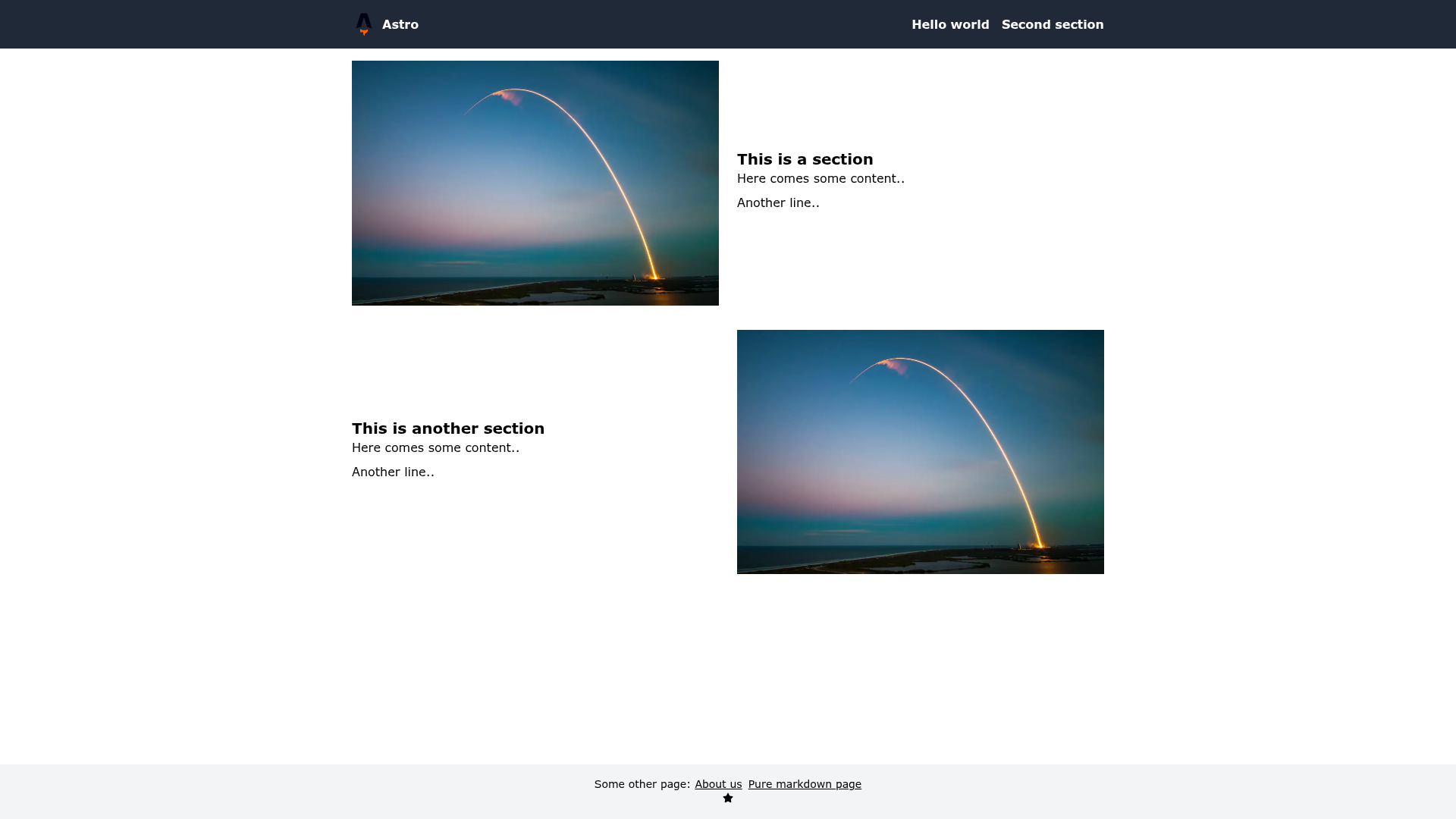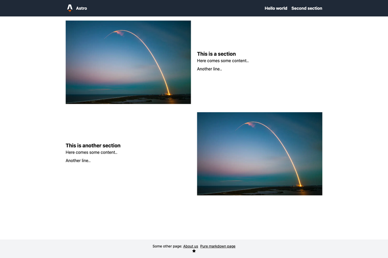
Astro Tailwind Starter is a boilerplate Astro site built on the official with-tailwindcss template, demonstrating Tailwind CSS styling, responsive image generation, and Vercel deployment.
What is Astro Tailwind Starter?
Astro Tailwind Starter is a minimal Astro starter repository that pairs Astro with Tailwind CSS for utility-first styling. The project was scaffolded using npm init astro -- --template with-tailwindcss and then extended with a custom Image component, a Font Awesome icon, and a Node script that generates responsive image sizes before the dev or build command. It also demonstrates fetching content through Astro.fetchContent (the API that later became Astro.glob in Astro). The demo is publicly deployed to Vercel at https://astro-demo-five.vercel.app/ and the repository is tagged with topics like astro, tailwindcss, vercel, and starter.
Key Features
- Tailwind CSS styling — The official Astro Tailwind integration is configured, so utility classes like
flex,grid, andp-4work directly in.astrocomponents and pages. - Responsive image generation — A custom Image component works with a Node script that runs before
devorbuildto produce multiple responsive sizes, so images are optimized at build time instead of at runtime. - Content fetching with Astro.fetchContent — Demonstrates importing local content (e.g., markdown or data files) at build time using the legacy Astro API; code can be adapted to the modern
Astro.globsyntax. - Font Awesome icon — The layout includes a Font Awesome icon, showing how to install and render icon libraries inside an Astro page.
- Vercel deployment — The public demo at astro-demo-five.vercel.app proves the template works on Vercel; the repository has the necessary configuration for Vercel builds.
- Pending scrollnav integration — An open task in the README plans to add the
scrollnavnpm package for single-page navigation, so the starter is still being extended.
Who is it for?
- Astro learners — Developers new to Astro can use this repository as a working reference for combining Astro with Tailwind CSS, fetching content, and handling images.
- Prototypers — Anyone who wants to bootstrap a styled static site quickly can start from this template and replace the placeholder content.
- Vercel users — Teams already deploying on Vercel can confirm an Astro site with Tailwind works there, and can use this repo as a base for their own deployments.
How does it work?
The starter is initialized from the official Astro Tailwind template. Tailwind CSS is wired up via Astro's integration system. A Node script runs as a pre-step in the dev and build scripts, scanning image assets and generating responsive sizes for the Image component. At build time, Astro.fetchContent pulls local content into pages. The finished static output is uploaded to Vercel through a Git-based deployment.
Use cases
- Learning Astro — Use this starter as a walkthrough of Tailwind CSS integration, content fetching, and image optimization in Astro.
- Building a landing page — The Tailwind-styled layout with an icon and responsive images can be extended into a simple landing page or personal site.
- Testing Vercel builds — Since the demo is already deployed, you can fork it to test how Astro output behaves on Vercel.
FAQ
Is Astro Tailwind Starter free to use?
Yes, the repository is publicly available on GitHub and can be freely cloned and used as a starting point. There is no payment required, and the code is meant to be experimented with.
Does this starter include a blog or portfolio layout?
No, the demo is a single experimental page. It is a bare-bones starter rather than a full-featured layout, so you need to add your own pages and components for a complete site.
Can I deploy this to platforms other than Vercel?
Yes, since Astro generates static output, the starter can be deployed to any static hosting service. The repository already includes a working Vercel deployment, and the configuration is not tied to Vercel exclusively.
Does the generated site include a Font Awesome icon?
Yes, one Font Awesome icon is rendered on the page, and the dependencies are set up so you can add more icons by importing them from the package.