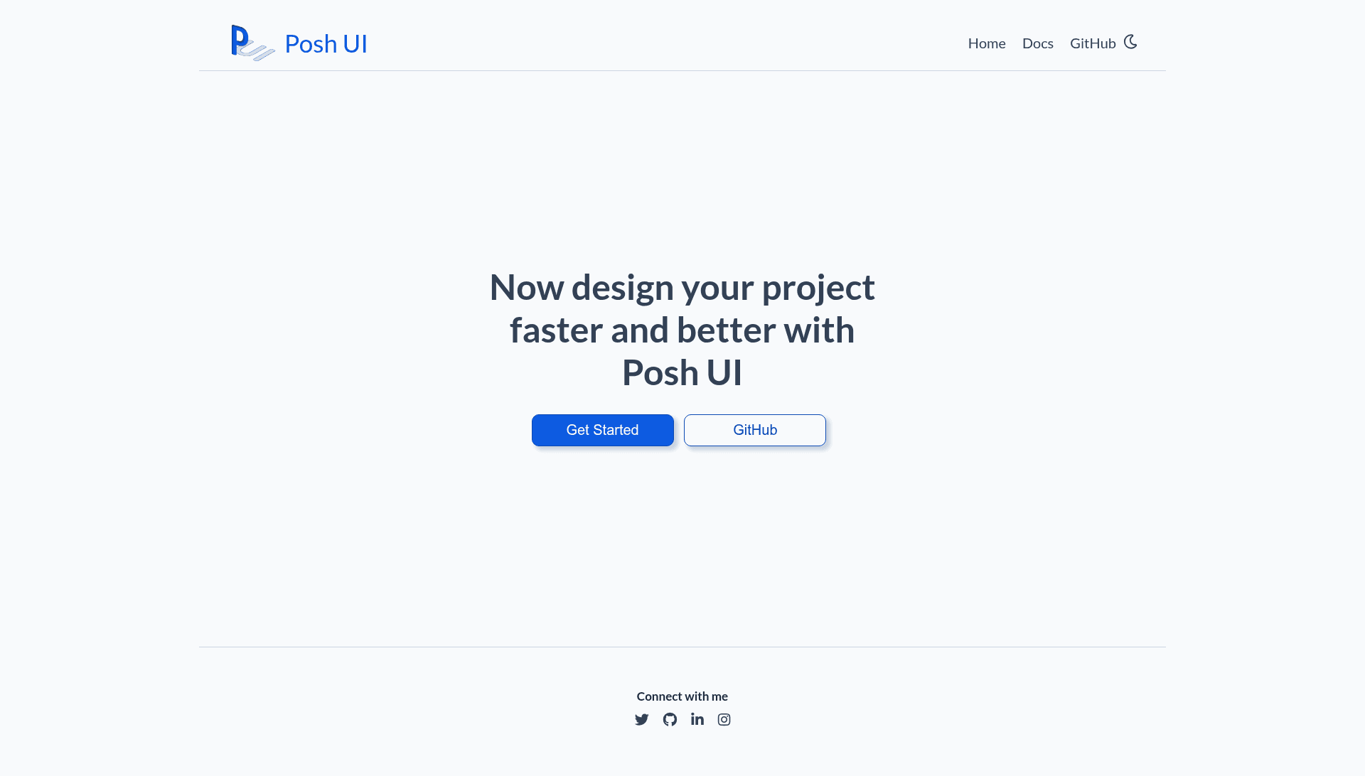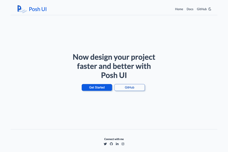
Posh UI is an open-source, continuously developing component library built with HTML5 and CSS3 only, providing copy-paste CSS and JavaScript for 16 ready-to-use UI components from a Netlify-hosted CDN.
What is Posh UI?
Posh UI is a component library that gives developers pre-styled HTML, CSS, and JavaScript for common interface elements. Input is a stylesheet <link> in the document head and a <script> before the closing body tag; the output is a set of styled components such as alerts, avatars, badges, buttons, cards, grids, images, inputs, lists, modals, navigation, ratings, sliders, toasts, tooltips, and typography. It is created by GitHub user hsnice16 and distributed through the PoshUI-Documentation repository.
Key Features
- Sixteen components — Includes alert, avatar, badge, button, card, CSS grid, image, input, list, modal, navigation, rating, slider, toast, tooltip, and typography, each with multiple style variants.
- CDN quick start — Copy the stylesheet link from
https://poshui-components.netlify.app/css/main.cssinto the head and the script fromhttps://poshui-components.netlify.app/js/main.jsbefore the closing body tag to load the library. - Interactive components — Modal, toast, and other components depend on the included vanilla JavaScript file for behavior like opening dialogs and showing notifications.
- Multiple variants per component — For example, alerts come in danger, info, primary, secondary, success, and warning styles; cards include horizontal text, vertical item, text overlay, and dismiss card with shadow.
- Pure HTML5 and CSS3 — The library is built with HTML5 and CSS3 only, with no framework dependencies, making it lightweight and easy to inspect.
- Live documentation — Each component has its own page on the Posh UI website, showing code examples and the rendered result.
Who is it for?
Posh UI targets front-end developers who want to assemble interfaces quickly without writing CSS from scratch. Beginners learning HTML and CSS can study the component source to understand how styling works. Students working on portfolio projects can copy components like cards, buttons, and navigation to build a polished site in minutes.
What can you do with Posh UI?
- Front-end developers: Drop in the CDN link and script, then use the provided class names to add styled buttons, cards, and inputs to any static HTML page.
- Hobby project builders: Assemble an e-commerce product card with the vertical item card, add a rating display, and include a toast notification for add-to-cart feedback.
- Portfolio creators: Use the avatar, badge, and tooltip components to add professional profile UI details without writing custom CSS.
How does Posh UI work?
To use Posh UI, copy the stylesheet link into the head of your page, then copy the script tag just before the closing body tag. After that, reference the component class names documented on the Posh UI website to render each element. The JavaScript file powers interactive features like modal dialogs and toast notifications.