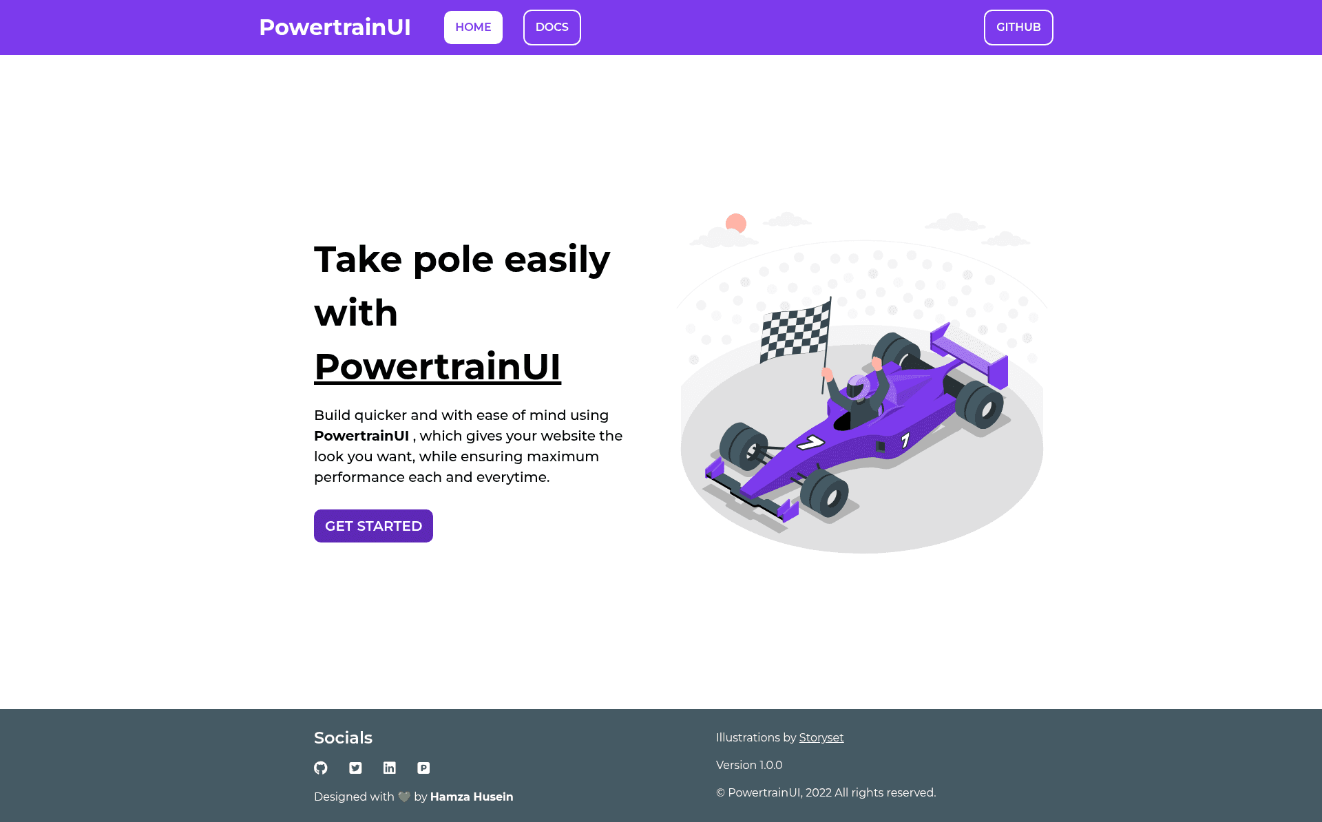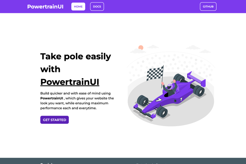
PowertrainUI is an open-source CSS component library that delivers 14 HTML and CSS components — alerts, avatars, badges, buttons, cards, grids, images, inputs, lists, navigation, ratings, sliders, snackbars, and typography — through a single hosted stylesheet. Maintained under the GitHub account Hamdrive, the library is built purely with HTML and CSS, with no JavaScript or framework dependencies, and is free to use in any project.
What is PowertrainUI?
PowertrainUI is a component library that takes no build step: you add one <link> tag to https://powertrain-ui.netlify.app/styles.css inside your page's <head> section, then use the ready-made CSS classes for each component. It runs in any browser and is hosted on Netlify for the stylesheet delivery. The library is maintained by the developer Hamdrive as an open-source project on GitHub.
Key Features
- 14 components included — Alert, Avatar, Badge, Button, Card, Grid, Image, Input, List, Navigation, Rating, Slider, Snackbar, and Typography, each with its own documentation page.
- Component variants — Buttons come in four sizes (small, medium, large, extra large) and four varieties (solid, outline, ghost, link), plus icon and floating-action versions; avatars support square, rounded-corner, round, and text-only shapes.
- Pure HTML and CSS — No JavaScript, no build tools, and no framework lock-in; the entire library uses only HTML and CSS.
- Single stylesheet link — One
<link>in the head is the only setup required; it's served from a Netlify-hosted URL. - Documentation site included — The repository hosts a full documentation website with live example pages for every component at
powertrain-ui.netlify.app/documentation/html/.... - Input component coverage — Text, password, email, textarea, checkbox group, radio group, and dropdown list inputs are all part of the library.
- Utility-oriented lists — Basic lists support bullet, square, number, roman, alphabet, and emoji markers, plus a stacked list variant.
Who is it for?
- Front-end developers who need a quick, dependency-free UI kit for a project and want to avoid pulling in a full framework like React or Vue.
- Design engineers who want to inspect and customize a small, readable CSS codebase rather than fight with compiled utility classes.
- Learners who are studying CSS and want to see how components like badges, cards, and grids are built with bare HTML and CSS.
- Rapid prototypers who want a consistent, presentable UI for a landing page or web app without writing custom styles from scratch.
What can you do with it?
- Speed up UI building: Drop in the stylesheet link and immediately use styled buttons, cards, and forms on a new page.
- Build a landing page: Combine navigation, hero typography, image, grid layout, and list components into a complete landing page layout.
- Create a dashboard shell: Use cards, grids, badges, sliders, and ratings to assemble a functional dashboard mockup.
- Learn from documentation: Read the per-component documentation pages to understand how each component's CSS classes are structured.
How does PowertrainUI work?
To start, add the provided stylesheet link to your page's head, keeping it as the first CSS import if you plan to use your own custom classes. Then add the component markup — such as a card or button — using the classes shown in the documentation pages. Because the library is pure CSS, dynamic interactions (for example, snackbar dismiss behavior) are not built in; you would add your own JavaScript for those.