Newsletter
Join the Community
Subscribe to our newsletter for the latest news and updates

Open-source React and Flutter component library monorepo built on Ark UI, Tailwind CSS, and shadcn/ui, with 36 ready-to-use components.
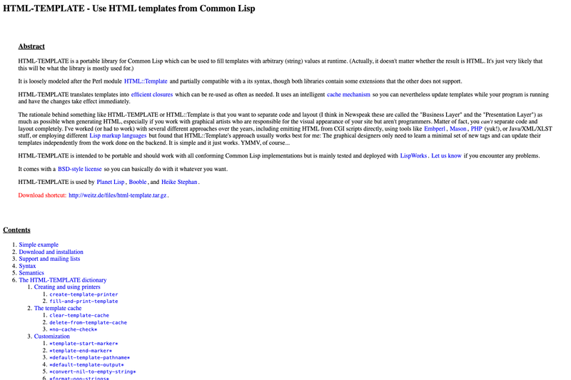
Portable Common Lisp library for filling templates with string values at runtime, featuring closure-based rendering and intelligent caching.
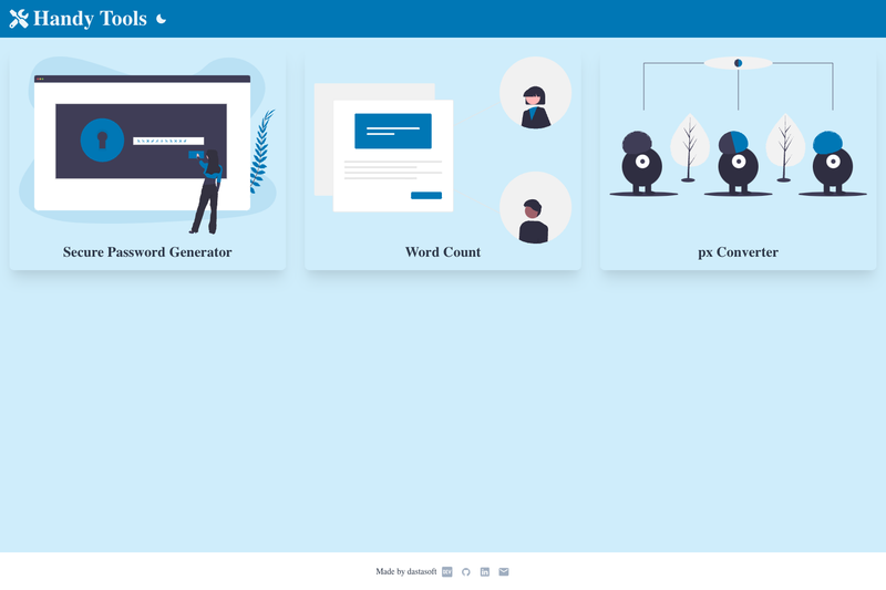
A collection of web tools to make your life easier. Made with Next.js and Chakra UI.
Automatically optimizes images used in Nuxt.js projects (JPEG, PNG, SVG, WebP and GIF).
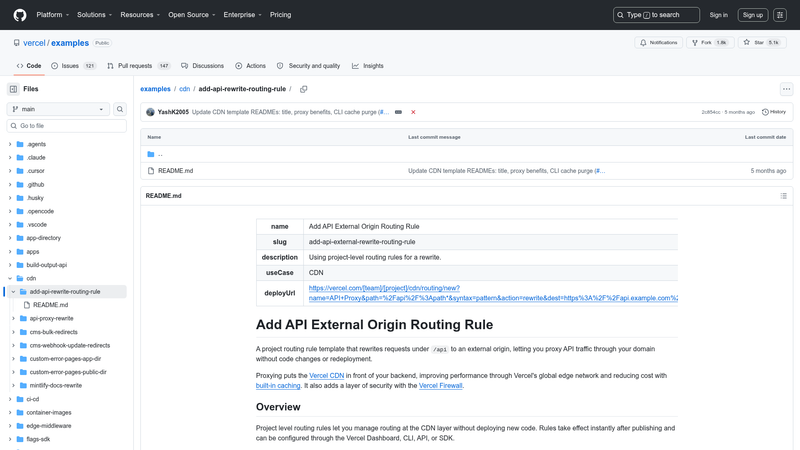
Configure a Vercel project routing rule to rewrite /api requests to an external origin.
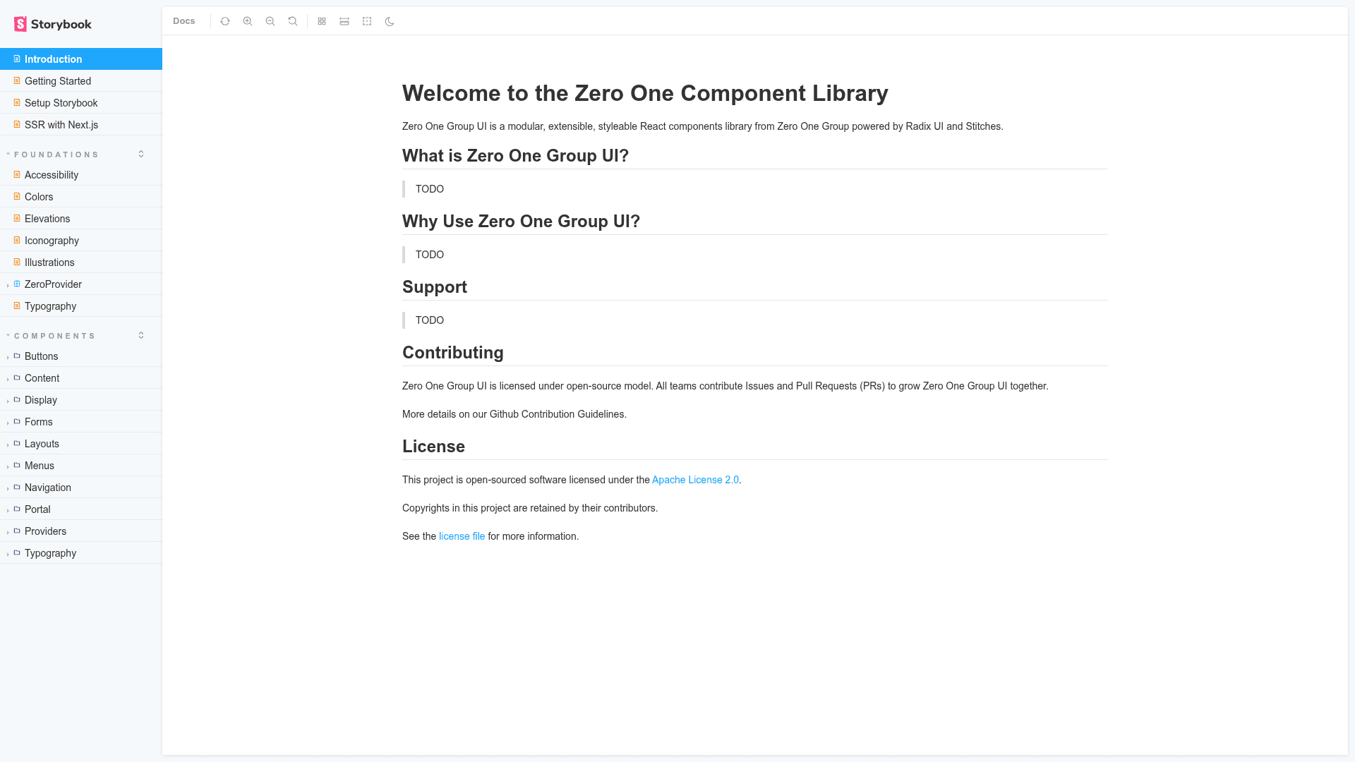
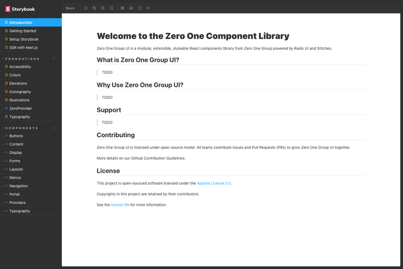
Zero One Group UI (Zero UI) is a modular, extensible, styleable React components library from Zero One Group, built on Ark UI and Tailwind CSS and distributed as a monorepo that also targets Flutter. The project is open-sourced under Apache License 2.0 and is currently in WIP alpha status, with over 30 ready-to-use components listed on the repository page.
Zero One Group UI is a React component library that combines the headless primitives of Ark UI with the styling convenience of Tailwind CSS. It takes the shadcn/ui approach — components are designed to be copied into your own project and customized — and enhances it with Tailwind Variants for more flexible class composition. The library is maintained by Zero One Group, which provides a website, blog, Twitter, LinkedIn, and an npm organization at @01group-ui. The monorepo also includes a Flutter UI library, though the Flutter side is marked as work in progress.
tailwind-variants, making it easy to extend or override styles with standard Tailwind classes.The library follows a copy-paste distribution model similar to shadcn/ui: you take the source of a component into your own project rather than importing a runtime dependency. The source is published under the @01group-ui npm organization, so you can install individual packages as well. Each component uses Ark UI for behavior and Tailwind Variants for styling, meaning the classes are right in the source and can be edited directly.
Yes, the project is open-sourced under the Apache License 2.0, so you can use, modify, and distribute it freely, including in commercial products. The license file is included in the repository.
It is primarily a React component library built on Ark UI and Tailwind CSS, so it works in any React project, including Next.js. The same monorepo also contains a Flutter UI library, but that part is marked as work in progress and not yet stable.
The repository lists a contributor guideline and asks potential contributors to start by emailing [email protected]. You can also review the open component checklist to see which parts of the library still need work.
No, the repository shows 36 components as implemented and 13 as not yet available. The checked components, such as Button, Card, Dialog, and Tabs, are ready for use, while Calendar, Carousel, Chart, and others remain on the roadmap.