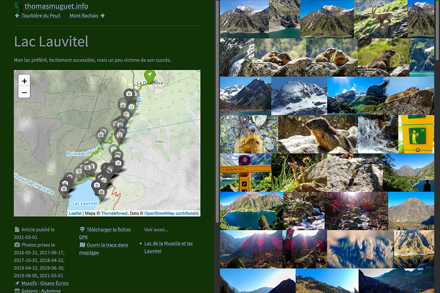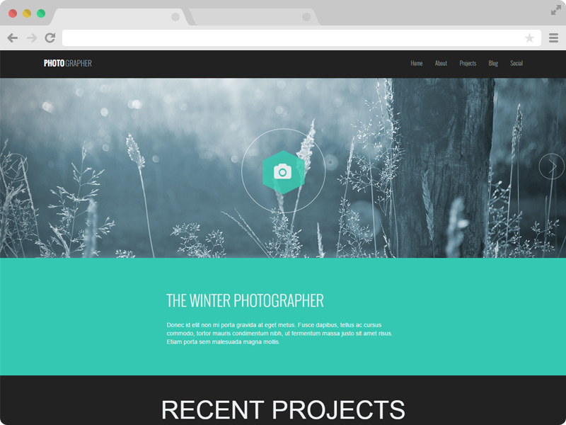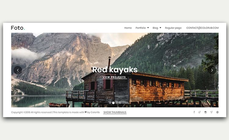
Template details
Astro Photo Grid
A minimal, single-page photo gallery for Astro with a responsive CSS grid and Fancybox lightbox.
About this template
Astro Photo Grid is a minimal, single-page photo gallery template for Astro that compiles an images folder into a responsive justified grid with a Fancybox lightbox.
What is Astro Photo Grid?
Astro Photo Grid is a minimal, single-page photo gallery template built on the Astro static site generator. It takes the photos you place in the src/images directory and generates a responsive, justified gallery page with automatic lightbox support. The template is distributed as a GitHub template repository with 164 stars and includes a live demo at https://astro-photo-grid.netlify.app/.
Key Features
- Pure CSS justified grid — The grid layout and reflow logic use only modern CSS, so no JavaScript is required for positioning.
- Fancybox lightbox integration — Images open in a full-screen preview with swipe, drag, pinch-to-zoom, and a customizable toolbar, powered by Fancybox.
- Astro Image optimization — Each grid image is processed through Astro's built-in Image component for optimized sizing and format.
- Lazy loading — Images beyond the first screen are lazily loaded, reducing initial page weight and speeding up load times.
- Minimal structure — The project consists of a base layout (
BaseLayout.astro) and an images folder, with only five configuration steps needed to go live. - Credited layout technique — The CSS-only justified gallery approach is credited to Helmut Wandl and SmolCSS, and all demo photos come from Unsplash.
Who is it for?
- Photographers — Quickly publish a clean, single-page portfolio or gallery from a local folder of images without touching complex configurations.
- Front-end developers — Use it as a starting point for Astro projects that need an image gallery, or as a reference for implementing CSS-only justified grids and Astro image optimization.
- Designers — Stand up a demo or client mockup with a minimal gallery using Unsplash placeholder images included in the template.
What can you do with it?
- Publish a photo essay or gallery — Drop your images into
src/imagesand the template generates a ready-to-deploy static gallery. - Create a lightweight portfolio — Combine the gallery with a custom site name to make a one-page showcase for your work.
- Learn Astro image patterns — Inspect the source to see how the Image component and lazy loading are integrated into a real project.
How does Astro Photo Grid work?
The template provides an Astro project with a base layout and a page that imports images from src/images. When you run the Astro build, it outputs a static site containing the justified grid and the Fancybox lightbox. The getting-started workflow is: click "Use this template" on GitHub, edit the site URL and site name, replace the images, and deploy.
FAQ
Is Astro Photo Grid free?
Yes, the template is open source and distributed via GitHub as a template repository. There is no mention of a license or paid tier in the repository description.
Do I need JavaScript for the grid layout?
No. The justified gallery layout is implemented entirely with modern CSS, so the grid itself renders without JavaScript. JavaScript is only used by the Fancybox lightbox for full-screen previews and interactions.
How do I change the photos in the gallery?
Replace the image files in the src/images directory with your own photos. The template automatically picks up the images in that folder and generates the grid. You may also update the site name in src/layouts/BaseLayout.astro to customize the page's heading.
What lightbox does the template use?
Astro Photo Grid uses Fancybox, a library that provides full-screen previews with swipe, drag, pinch-to-zoom, and a customizable toolbar. Fancybox is credited in the template's feature list.