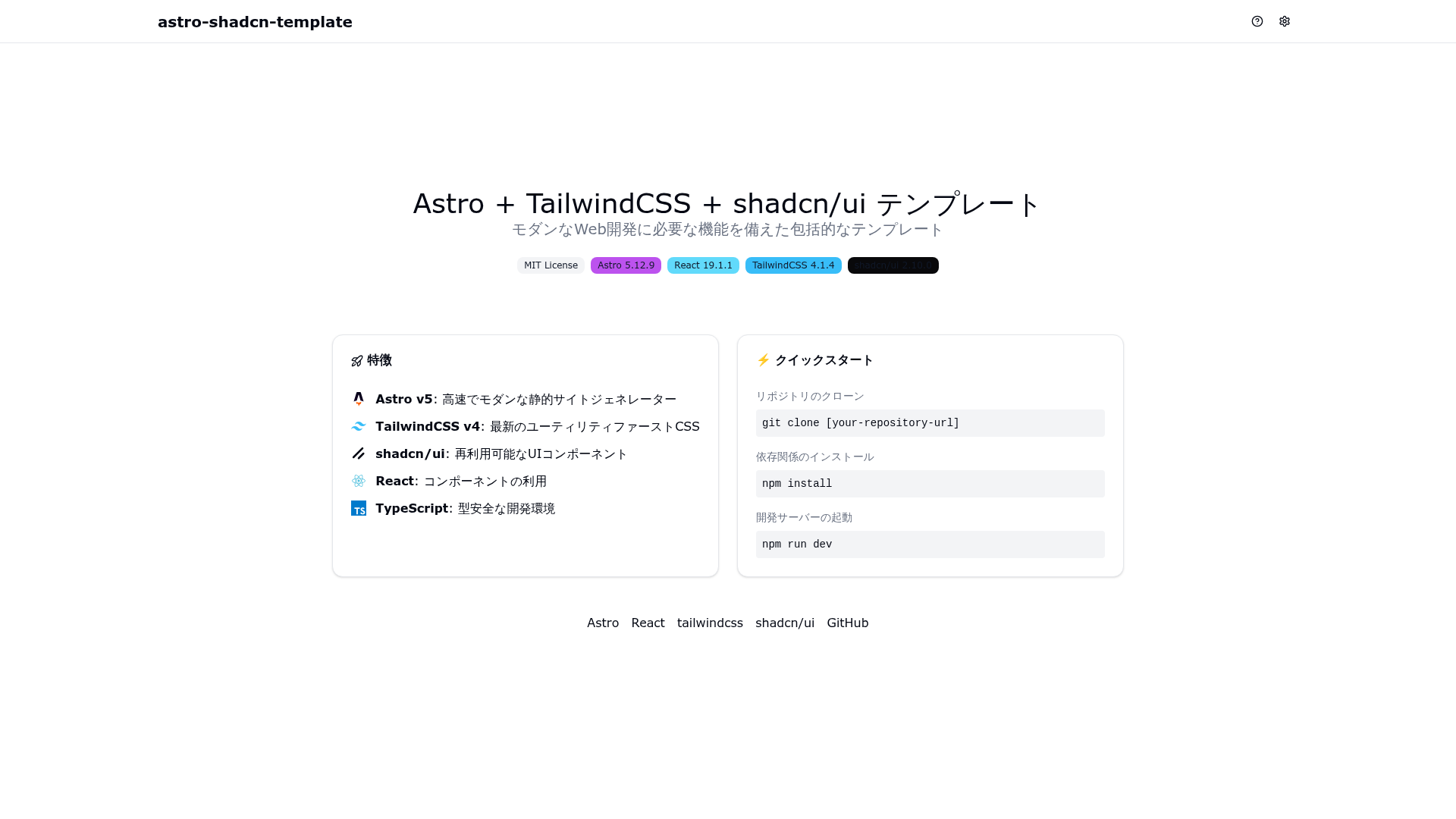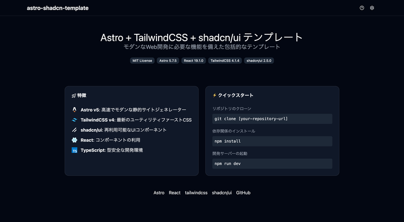
The Astro + TailwindCSS + shadcn/ui Template is a boilerplate for building static sites with Astro v5, a React 19 component layer styled by TailwindCSS v4 and shadcn/ui, and production-ready tooling for error tracking, testing, and CI/CD.
What is the Astro + TailwindCSS + shadcn/ui Template?
It is an open-source, MIT-licensed starting point for static websites and web apps. The template takes source files written in Astro, React, and TypeScript and builds them into a static site with environment-specific URL and asset configurations. It runs on Astro 5.12.9 with React 19.1.1, TailwindCSS 4.1.4, and shadcn/ui 2.10.0 per the version badges in the README, and it is published on GitHub with a live demo hosted on GitHub Pages.
Key Features
- Astro v5 and React 19 — static-first framework with island architecture; interactive React components are mounted using client directives such as
client:load, and path aliases via@/are configured intsconfig.json. - TailwindCSS v4 styling — global styles in
src/styles/global.cssdefine an OKLCH color palette, a.darkclass for dark mode, and custom variants; theme tokens are exposed as CSS variables for shadcn/ui. - shadcn/ui components — preconfigured through
components.jsonwith the New York style, gray base color, CSS variables enabled, and Lucide icon library; included components are badge, button, card, dialog, label, radio-group, and switch. - Multi-environment build config —
src/lib/constants.tssets separateSITE_URL,BASE_URL, andASSETS_URLfor development, staging, and production;npm run stgandnpm run prodswitch builds between environments. - Sentry error tracking —
src/lib/sentry.tsinitializes Sentry in production, captures exceptions, warnings, and HTTP errors, and falls back to console output in development. - Testing with Vitest — configured with jsdom, React Testing Library, and setup file;
npm run test:run,npm run test:ui, andnpm run test:coverageare available. - GitHub Actions CI/CD — workflows run ESLint, Prettier, TypeScript checks, tests,
npm audit, multi-version Node.js builds (20.x and 22.x), and deploy the built site to GitHub Pages. - Code quality tooling — ESLint uses flat config with TypeScript, React, jsx-a11y, and Astro plugins; Prettier formats
.astrofiles; VSCode settings enable format-on-save.
Who is it for?
- Static site developers who want an Astro + React + Tailwind stack pre-integrated rather than assembling it manually from scratch.
- Teams deploying to GitHub Pages — the included workflow builds with production settings and publishes on push to main.
- Projects that need staging and production environments — URL and asset settings default per environment, including subdirectory deployment via
BASE_URL.STATUS. - Solo developers who want observability — Sentry hooks are ready to use by setting your own DSN in
.env.
What can you do with the template?
- Build a landing page — compose the included shadcn/ui components (button, card, dialog, badge) inside Astro pages, using the provided
Layout.astroandHead.astrofor SEO meta tags. - Switch the site into a subdirectory — set
BASE_URL.STATUSto true insrc/lib/constants.tsand the build output moves to a path such asdist/hoge/. - Track errors from API calls — call
captureHttpErrorwith the URL and HTTP status to get detailed Sentry reports for failed requests. - Add more shadcn/ui components — run
npx shadcn add formor similar commands to copy components intosrc/components/ui/for customization.
How does the template work?
Clone the repository, install dependencies with npm install, and start development with npm run dev. The build commands npm run build, npm run stg, and npm run prod produce environment-specific static output in dist/, and the GitHub Actions workflow automates tests plus GitHub Pages deployment.
FAQ
What are the system requirements?
Node.js v20.9.0 or higher and npm v10.1.0 or higher. The repository includes .node-version, .nvmrc, and a Volta config that pins Node 20.18.0 and npm 10.8.2.
Is the template free to use?
Yes, it is released under the MIT License, so you can use and modify it freely, including in commercial projects.
Does it have dark mode?
Yes. The SettingsDialog component lets users choose light, dark, or system theme; dark mode is implemented with a .dark class on the document root, and the choice persists in localStorage.
How do I add a new shadcn/ui component?
Use npx shadcn add button or npx shadcn add dialog card alert to copy the component source into src/components/ui/. Because components are copied directly, updates require manually re-running the command.
How do I enable asset delivery from a separate domain?
Set ASSETS_URL.STATUS to true in src/lib/constants.ts and provide the CDN base URL; the build then places assets under that prefix and sets assetsPrefix in the Vite config.