Newsletter
Join the Community
Subscribe to our newsletter for the latest news and updates

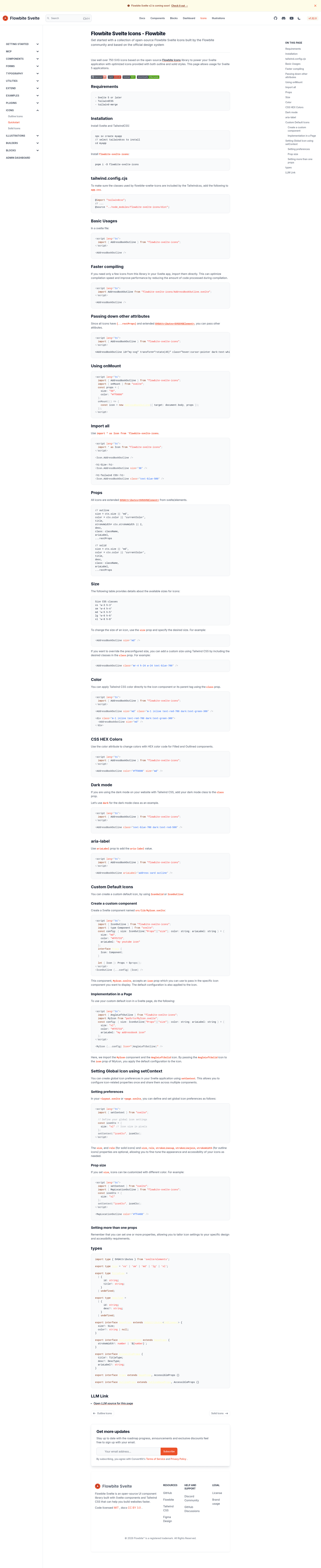
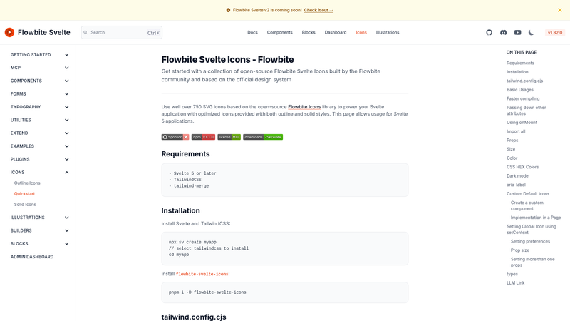
Official library of 750+ Flowbite SVG icons as Svelte 4/5 components with Tailwind CSS support.
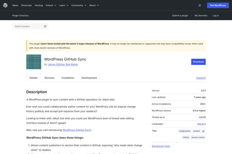
A WordPress plugin to sync content with a GitHub repository (or Jekyll site)
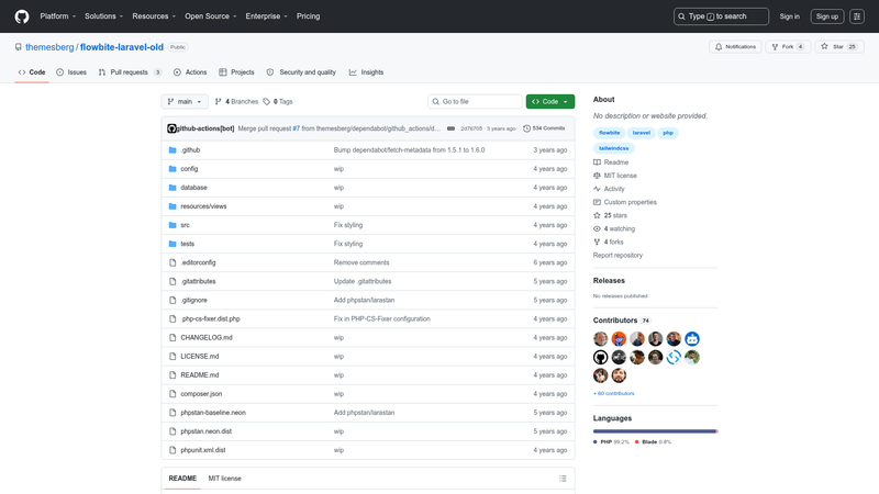
Official Laravel package integrating Flowbite UI components and Blade components with Tailwind CSS.
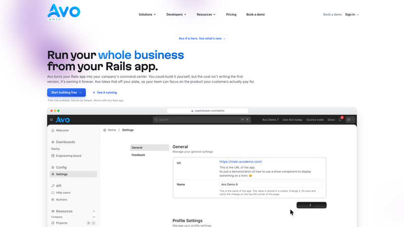
The Essential Toolkit for building Internal Tools and admin panels with Ruby on Rails
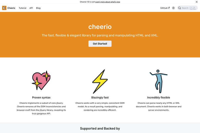
The fast, flexible, and elegant library for parsing and manipulating HTML and XML.
Flowbite Svelte Icons is an open-source component library that packages 750+ SVG icons from the Flowbite icon set as reusable Svelte 4/5/Runes components for Tailwind CSS projects.
Flowbite Svelte Icons converts the free Flowbite SVG icon collection (originally from the themesberg/flowbite-icons repository) into individual Svelte components. Each icon can be imported and rendered inside a Svelte application, with sizing and coloring controlled through Tailwind utility classes. The package is published on npm as flowbite-svelte-icons and maintained by Shin Okada under the MIT license.
The library differentiates between Outline and Solid icon styles, each documented separately on the official docs site. Version 2 of the package targets Svelte 5 or later, while version 1 (installed via the v1-latest npm tag) supports both Svelte 4 and 5. Both versions require TailwindCSS.
tailwind.config.cjs snippet that references the package's file path, so icon size and color respond to Tailwind classes.Svelte developers who build Flowbite-based UIs and need to embed consistent icons without writing raw SVG markup. Tailwind CSS users who want to control icon size and color using the same utility classes as the rest of the design. Also, open-source contributors looking for a permissive, MIT-licensed icon library that accepts GitHub sponsorship.
Install the package with pnpm i -D flowbite-svelte-icons (or flowbite-svelte-icons@v1-latest for Svelte 4/5), then add the package path to the content array in tailwind.config.cjs. After configuration, import an icon component from the package and use it like any Svelte component.
Flowbite Svelte Icons is free to use under the MIT license. The maintainer accepts optional GitHub sponsorship to fund ongoing maintenance and improvement, as noted on the project's README.
Yes, the package is released under the MIT license, so it is free for personal and commercial use. The author accepts optional donations via GitHub Sponsors, but there is no paid tier or license fee.
Yes. Install the v1-latest tag, which supports both Svelte 4 and 5. Version 2 requires Svelte 5 or later, so Svelte 4 projects should pin the v1 line.
Add './node_modules/flowbite-svelte-icons/**/*.{html,js,svelte,ts}' to the content array in tailwind.config.cjs. This tells Tailwind to scan the icon components for utility classes.
Outline icons use stroked lines with open or thin shapes, while Solid icons are filled with a solid color. Both sets are available as separate Svelte component collections, so you can mix them within the same project.
The official documentation is hosted at flowbite-svelte-icons.codewithshin.com and covers usage, installation, and the full icon lists for both Outline and Solid styles.