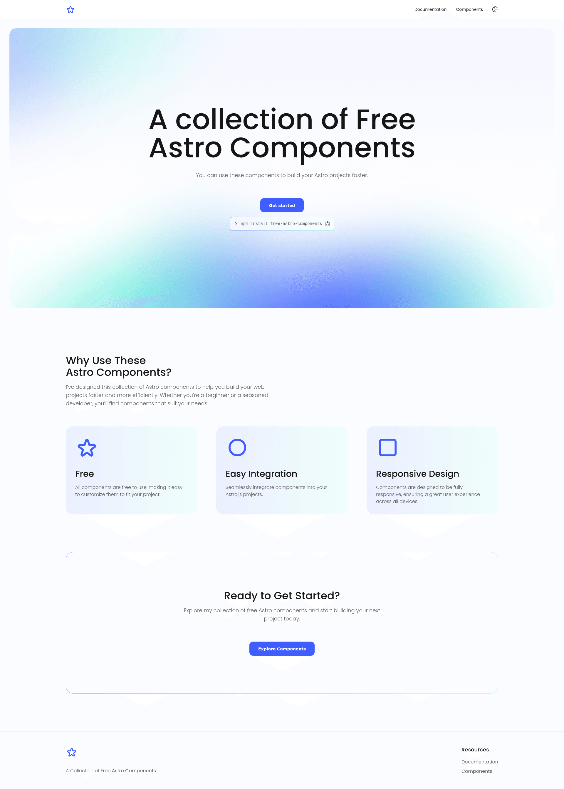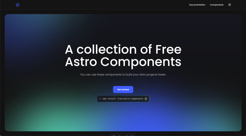
Free Astro Components is an open-source component library for Astro.js that ships a collection of free, customizable UI elements with CSS variable-based theming. The package is available on npm as free-astro-components and maintained by developer denv17 on GitHub, with a documentation site hosted at free-astro-components.vercel.app.
What is Free Astro Components?
Free Astro Components is a library of Astro.js-specific UI components. It takes an Astro project as its environment and produces importable component code that renders interactive elements like buttons, form controls, modals, and accordions. The library is authored and maintained by denv17, and all source code is publicly accessible under the MIT License in the GitHub repository denv17/free-astro-components.
Key Features
- Astro.js native — Every component is written for the Astro framework and can be imported directly in .astro files.
- CSS variable customization — Components use CSS variables for theming, and the docs include a dedicated "Customize Colors" guide.
- Compound components — Modal ships with ModalHeader, ModalBody, and ModalFooter subcomponents; Accordion includes AccordionItem; Tab includes TabItem.
- Form controls — Checkbox, Radio, Switch, Input, Textarea, and Select cover common user input needs.
- Dialog and content components — Modal, Accordion, and Tabs add overlays and collapsible/tabbed sections.
- Documentation site — Usage examples and API references are hosted at free-astro-components.vercel.app.
- MIT license — Free to use in personal and commercial projects.
Who is it for?
- Astro.js developers — Add ready-made interactive components to sites without writing custom UI code.
- Frontend designers — Adapt component colors and spacing via CSS variables to match a project's design system.
- Open-source contributors — Report issues or submit pull requests through the GitHub repository.
What can you do with Free Astro Components?
- Create a form — Combine Input, Textarea, Select, Checkbox, Radio, and Switch to collect structured user input.
- Build a modal dialog — Use Modal along with ModalHeader, ModalBody, and ModalFooter to present content and action buttons in an overlay.
- Organize content — Use Tab and TabItem for tabbed panels, or Accordion and AccordionItem for collapsible sections.
- Add simple actions — Import the Button component and render it with a label prop.
How does Free Astro Components work?
Install the package with npm install free-astro-components. Then import individual components, such as import { Button } from 'free-astro-components', and render them inside your Astro pages. Customization is handled by overriding each component's CSS variables.
Pricing
Free Astro Components is free and open-source under the MIT License. The npm package can be installed without cost or registration.
FAQ
Is Free Astro Components free?
Yes, it is completely free to use and open source. The project is licensed under the MIT License, allowing both personal and commercial use.
How do I install Free Astro Components?
Run npm install free-astro-components in your Astro.js project. Then import components like Button from the package in your .astro files.
How do I customize colors in Free Astro Components?
The components use CSS variables for styling. The documentation site includes a "Customize Colors" page that explains how to override these variables to fit your design.
Does Free Astro Components require Astro.js?
Yes, the components are built specifically for Astro.js and are distributed as .astro files. They need to be used inside an Astro project.
What components are included in Free Astro Components?
The library includes Icons, Buttons, Checkbox, Radio, Switch, Input, Textarea, Select, Tab with TabItem, Modal with ModalHeader, ModalBody, and ModalFooter, and Accordion with AccordionItem.