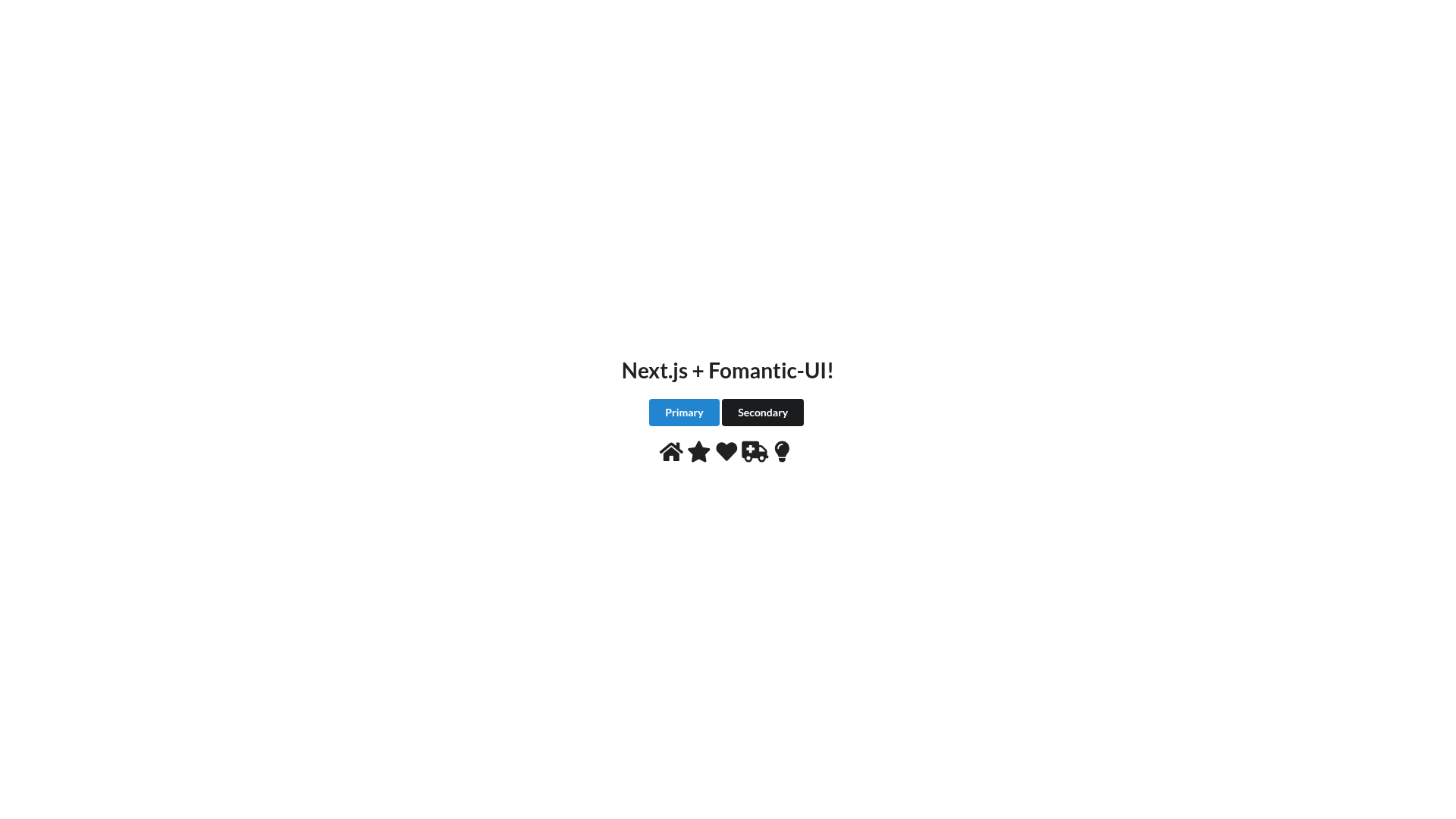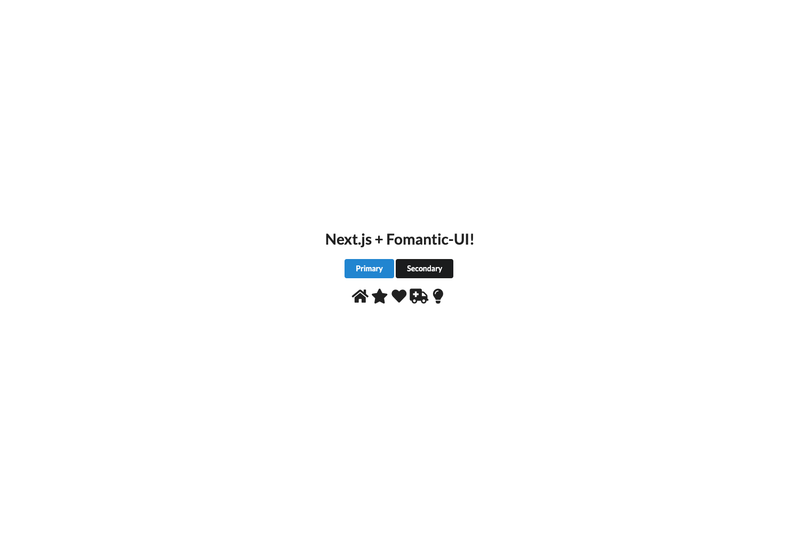
nextjs-semantic is a boilerplate starter for Next.js that bundles Fomantic-UI and Styled Components into a single preconfigured project, giving React developers a working foundation for building styled web applications. The template is maintained by skydiver on GitHub, and this repository is specifically built around Next.js 12, React 17, Fomantic-UI 2.8, and Styled Components 5.3.
What is nextjs-semantic?
nextjs-semantic is a GitHub starter template that combines Next.js 12, React 17, Fomantic-UI 2.8, and Styled Components 5.3 in one project. It is designed to be cloned, installed, and run immediately, producing a Next.js application with Fomantic-UI components and Styled Components already wired together. The template's core function is to eliminate the manual integration work required to use Fomantic-UI inside a Next.js project.
Key Features
- Fomantic-UI 2.8 by default — The template installs Fomantic-UI (the community fork of Semantic UI) and uses it by default, replacing Semantic UI since version 2.0.0 of this package.
- Semantic UI React components — React component wrappers for Fomantic-UI are installed and recommended; their official docs are linked from the repository.
- Styled Components 5.3 — Preconfigured CSS-in-JS styling with Styled Components, so component-level styles work out of the box.
- Customizable CSS output — semantic.json lets you remove Fomantic-UI components to reduce the generated CSS size.
- Source-level theme editing — The .semantic folder contains Fomantic-UI source files where the default theme can be customized directly.
- Google font swapping — The default font (Lato) can be changed in .semantic/src/themes/default/globals/site.variables.
- Live theme watching — Running
npm run semantic:watchwatches for theme file changes while you customize. - One-click Vercel deployment — The repository links to Vercel's deployment flow, allowing a public instance to be created without manual configuration.
Who is it for?
- React developers starting a new project — they can clone the repository, run npm install, build the Semantic CSS, and start with a working Next.js app rather than wiring Fomantic-UI and Styled Components from scratch.
- Teams that want a consistent UI foundation — the bundled Fomantic-UI components and CSS-in-JS setup give a shared starting point for building dashboards or marketing pages.
- Developers evaluating Fomantic-UI — the template demonstrates how Fomantic-UI works alongside Next.js and how to customize its theme at the source level.
What can you do with nextjs-semantic?
- Frontend developers: build a styled Next.js application using Fomantic-UI's ready-made components (buttons, forms, grids) with Styled Components for custom styling.
- Theme designers: modify the Fomantic-UI theme files in .semantic and run semantic:watch to see live updates, then rebuild the CSS with semantic:build.
- Hobbyists and open-source contributors: use the one-click Vercel deployment to put a demo app online quickly, then customize it.
How does nextjs-semantic work?
The setup is a four-step process: clone the repository, run npm install, run npm run semantic:build to generate the Fomantic-UI CSS, and run npm run dev to start the Next.js development server. The template also supports npm run semantic:watch for theme development.
FAQ
Why did the template switch from Semantic UI to Fomantic-UI?
Since version 2.0.0, the package replaced Semantic UI with Fomantic-UI because Semantic UI requires Node 10, Fomantic-UI is actively developed, adds more components, and fixes several security vulnerabilities. Users who still want Semantic UI can use release 1.1.0.
Is nextjs-semantic free?
The template is an open-source GitHub project with no mention of paid tiers or licensing costs; it is free to clone and use.
What versions are included?
The current versions listed are Next.js 12, React 17, Fomantic-UI 2.8, and Styled Components 5.3.
Can I remove unused components to reduce CSS size?
Yes, the semantic.json file lets you remove Fomantic-UI components so the generated CSS is smaller. The .semantic folder contains the source files for deeper theme customization.