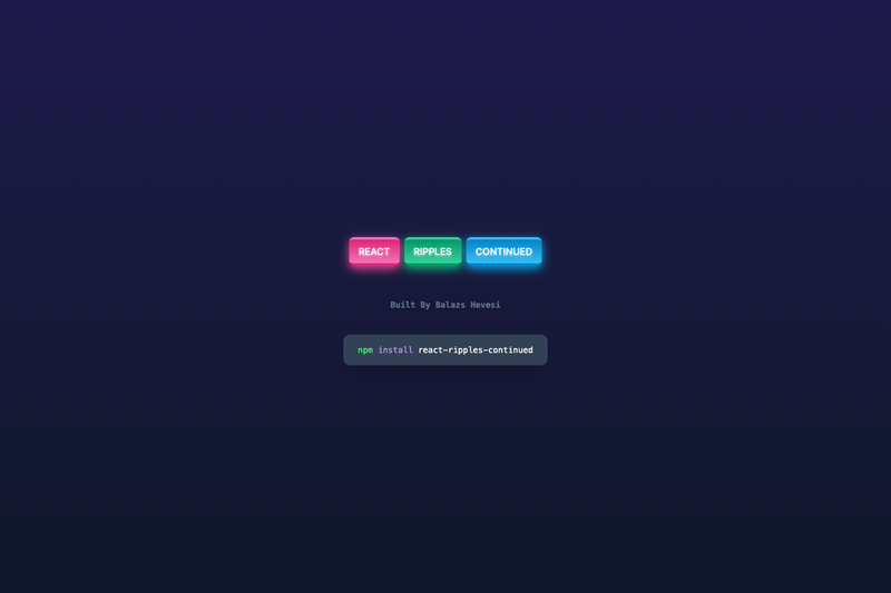
React Ripples Continued is an open-source React component library that adds Material Design-style ripple effects to buttons and surfaces with a two-component API: Ripples and RippleSurface.
What is React Ripples Continued?
React Ripples Continued is a React component library for creating ripple effects, published on npm and maintained by Balazs-topg on GitHub. It takes a React application and produces interactive ripple animations on any element by rendering an animated circular overlay where the user clicks or hovers. The package includes the npm library, documentation in the README, and a showcase website hosted on GitHub Pages.
What makes React Ripples Continued stand out?
- Two components —
Ripplesfor raw effect placement andRippleSurfacefor a wrapper that handles required styling automatically. - Configurable trigger events — The
onprop accepts"click","mouseDown","clickAndMouseDown", or"hover"to control when ripples appear. - Full styling control —
color,opacity(0 to 1),blur(in rem units),duration(in milliseconds), andzIndexare all individually settable. - Fill and hold mode —
fillAndHoldmakes the ripple expand to fill the container and stay until mouse up. - Performance optimization —
optimizeremoves ripple elements from the DOM after animation completes, useful for frequent triggers; it defaults to false because it can cause odd behavior. - Custom content inside ripples —
rippleElementaccepts JSX and displays it inside the ripple, with the suggestion to lower opacity or clear the color when used. - Server-side rendering ready — Both components carry the
"use client"directive, making them compatible with Next.js and other SSR React frameworks. - MIT licensed — Free to use, modify, and redistribute.
Who is React Ripples Continued for?
React developers who want Material Design-style feedback on buttons, cards, and menus without pulling in a full UI framework. Design system maintainers can use it as a lightweight, dependency-free interaction primitive. Next.js developers benefit from the client-component setup that avoids SSR hydration issues.
What can you do with React Ripples Continued?
- Build interactive buttons — Wrap a button with
RippleSurfaceto get the ripple effect without manually setting positioning or overflow styles. - Add ripples to custom containers — Place the
Ripplescomponent inside any element that hasposition: relativeandoverflow: hidden. - Create visual feedback for touch and mouse — Choose from click, mousedown, or hover triggers to match the desired interaction pattern.
- Customize the ripple shape — Use
rippleElementto render emojis, icons, or other JSX inside the expanding ripple.
How does React Ripples Continued work?
Install it with npm i react-ripples-continued and import either component. The Ripples component listens for the configured event and calls an internal addRipple function that renders an animated circle into the nearest positioned ancestor. The function is written to be framework-agnostic, using ReactDOM.createRoot only for JSX parsing, so it could be adapted to Vue, Svelte, Angular, or Solid.
FAQ
Is React Ripples Continued free?
Yes, the library is open-source under the MIT license, and the source code is available on GitHub.
Does React Ripples Continued work with server-side rendering?
Yes. Both Ripples and RippleSurface are marked with the "use client" directive, so they work in Next.js and other React SSR setups.
What event triggers the ripple by default?
The default trigger is "click", but the on prop can be changed to "mouseDown", "clickAndMouseDown", or "hover".
What are the required styles for the Ripples component?
The parent container must have overflow: hidden and position: relative. RippleSurface applies these styles automatically unless disableDefaultStyling is set to true.
Can I speed up or slow down the animation?
Yes, pass a duration value in milliseconds to the Ripples component, or through rippleProps when using RippleSurface. The default is 500 ms.