Newsletter
Join the Community
Subscribe to our newsletter for the latest news and updates
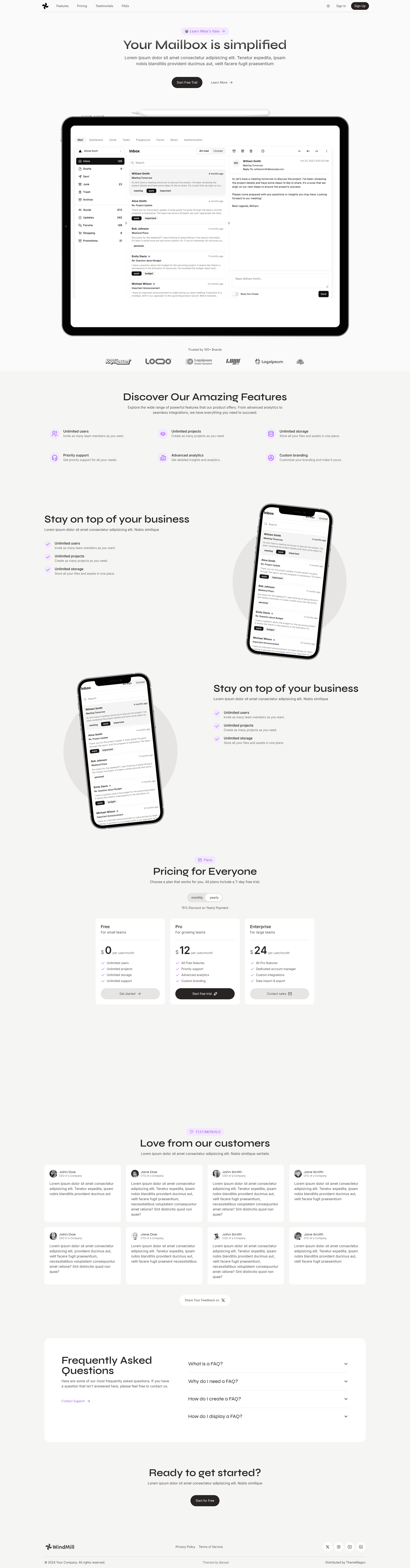
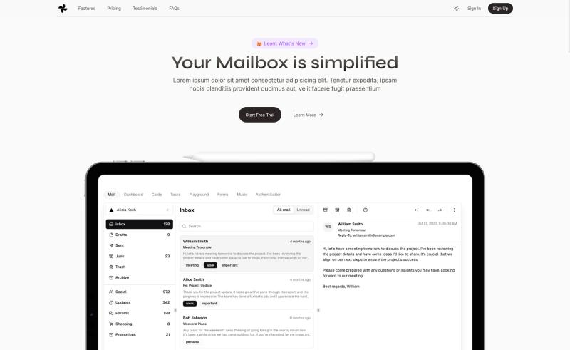
Free one-page Tailwind CSS landing page template for SaaS businesses, portfolios, and blogs, with light/dark mode and React support.
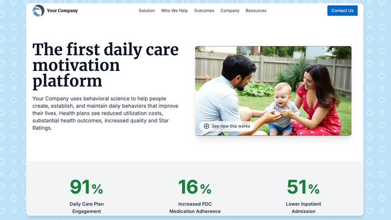
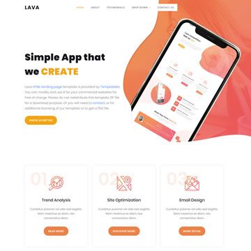
A visually stunning theme perfect for businesses seeking a modern and responsive online presence.
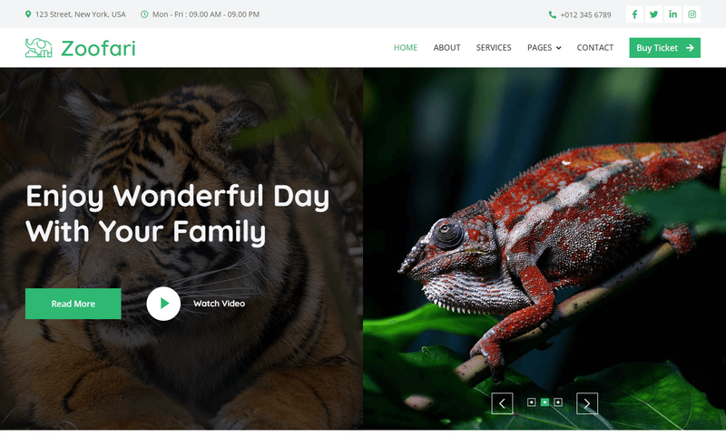
Free open-source Bootstrap 5 wildlife website template with 9 HTML pages, split header, carousels, and contact/visiting forms.
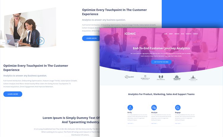
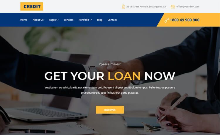
Free multi-page HTML5 corporate website template built on Bootstrap 3, with pricing, blog, contact, and team pages.
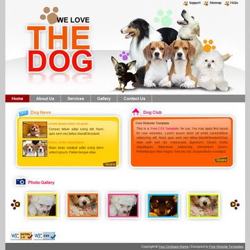
Free website layout for dog websites, W3C XHTML CSS compliant layout
WindMill is a free one-page Tailwind CSS landing page template distributed by ThemeWagon, built with React and designed for SaaS businesses, portfolios, and blogging websites.
WindMill is a free, open-source one-page website template from ThemeWagon, created by the author Freebibuges. It takes a single-page layout built on Tailwind CSS and React and outputs a responsive, SEO-optimized landing page with light and dark mode, a sticky navigation bar, a pricing table, FAQ section, and call-to-action buttons. The template ships as version 1.0.0, released about a year ago and updated three months ago, and includes one pre-built page, HTML and CSS files, all demo images, JavaScript source files, and the included libraries and plugins. It is licensed for use in commercial projects with lifetime free updates.
WindMill is free to download and use, including for commercial projects. ThemeWagon lists it as an open-source template with lifetime free updates, so no paid tier is required. The download itself requires an email address, and a link is sent to that inbox.
Yes, WindMill is a free template from ThemeWagon. You can download it after providing an email address, and the license allows use in commercial projects with lifetime free updates.
WindMill uses Tailwind CSS for styling and React for the front-end structure. It ships with HTML and CSS files, JavaScript source files, library and plugin files, and all demo images needed to run the one-page layout.
Yes, the template ships with light and dark mode enabled, allowing visitors to switch between color schemes. This is listed as one of the key features alongside the sticky navigation and pricing table.
WindMill includes one pre-built page — a single-page landing layout. That page contains a hero header, sticky top navigation, pricing table, FAQ section, tabbed content, social media icons, and call-to-action buttons, all designed to fit on one scrollable screen.
Yes, it is fully responsive and works across Chrome, Edge, Firefox, Opera, Safari, iPad, iPhone, Android, and other mobile devices. The page is also optimized for search engines and page speed, which helps reduce bounce rates.