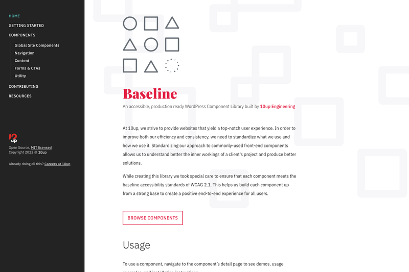
10up Component Library is an archived, open-source collection of barebones front-end components created by the WordPress agency 10up, with every component tested to meet WCAG 2.1 accessibility standards.
What is 10up Component Library?
10up Component Library is a GitHub repository containing six ready-to-use front-end components — Accordion, Animate, Countdown Timer, Navigation, Tabs, and Tooltip — built for WordPress projects. The components are distributed as an NPM package and include demo and test pages, intended to be copied and adapted into any project. The library is authored by 10up, a digital agency known for WordPress work, and its documentation site is generated with Jekyll.
Key Features
- WCAG 2.1 compliance — All components are tested to meet WCAG 2.1 accessibility standards.
- WordPress-tailored markup — Components are built to fit the opinionated nature of WordPress core output.
- Barebones simplicity — Each component is minimal and unopinionated, designed to be easily adapted to different projects and use cases.
- Six components included — Accordion, Animate, Countdown Timer, Navigation, Tabs, and Tooltip, each with a README and demo page.
- NPM package distribution — Components are published as an NPM package and pulled into the docs site from the latest release.
- Jekyll-based documentation — The public-facing docs site is built with Jekyll and includes demos and usage examples for every component.
- Testing suites — The repository includes an end-to-end testing suite under the e2e directory for local testing of all package components.
- MIT licensed — The project is open source under the MIT License.
Who is it for?
- WordPress developers — Use the components to implement common UI patterns quickly while keeping markup accessible and consistent with WordPress core.
- Accessibility-focused teams — Rely on the pre-tested components to meet WCAG 2.1 requirements without writing custom accessible behavior.
- Agencies and freelancers — Standardize front-end components across multiple client projects to improve efficiency and consistency, as 10up itself does.
What can you do with it?
- Build accessible accordions — Drop in the Accordion component to create expandable content sections that work with keyboard navigation.
- Add progress indicators — Use Countdown Timer to display a countdown for promotions or events.
- Improve site navigation — The Navigation component provides accessible menu structures for WordPress themes.
- Create tabbed interfaces — The Tabs component lets you organize content into accessible tabs.
- Show contextual help — Tooltip adds accessible tooltips for links or buttons.
- Animate elements — The Animate component helps with scroll-triggered animations.
How does it work?
To use a component, navigate to its detail page on the documentation site to see demos, usage examples, and installation instructions. Each component lives in its own package directory with a README, and the e2e directory bundles all packages for local testing. The docs site pulls component files from the latest NPM release.
FAQ
Is 10up Component Library free?
Yes, the project is open source under the MIT License.
Is 10up Component Library still maintained?
No, the project was archived as of 17 September 2025 and is no longer actively maintained. 10up is no longer responding to Issues or Pull Requests unless they relate to security concerns, and encourages interested developers to fork the project and make it their own.
What components are included?
The library includes Accordion, Animate, Countdown Timer, Navigation, Tabs, and Tooltip.
Does it work with WordPress?
Yes, the components are specifically tailored to fit the opinionated nature of WordPress core output.
What are the accessibility standards?
All components are tested to be WCAG 2.1 compliant.