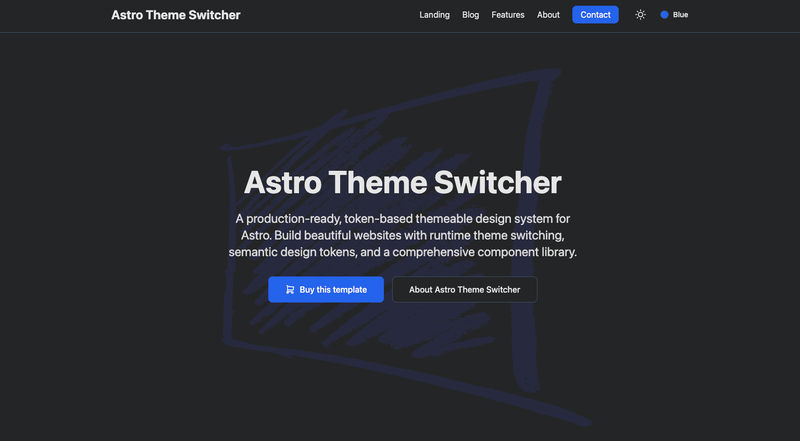
Astro Theme Switcher is an open-source Astro starter template that implements a token-based design system with runtime theme switching, semantic design tokens, and a theme-aware component library.
What is Astro Theme Switcher?
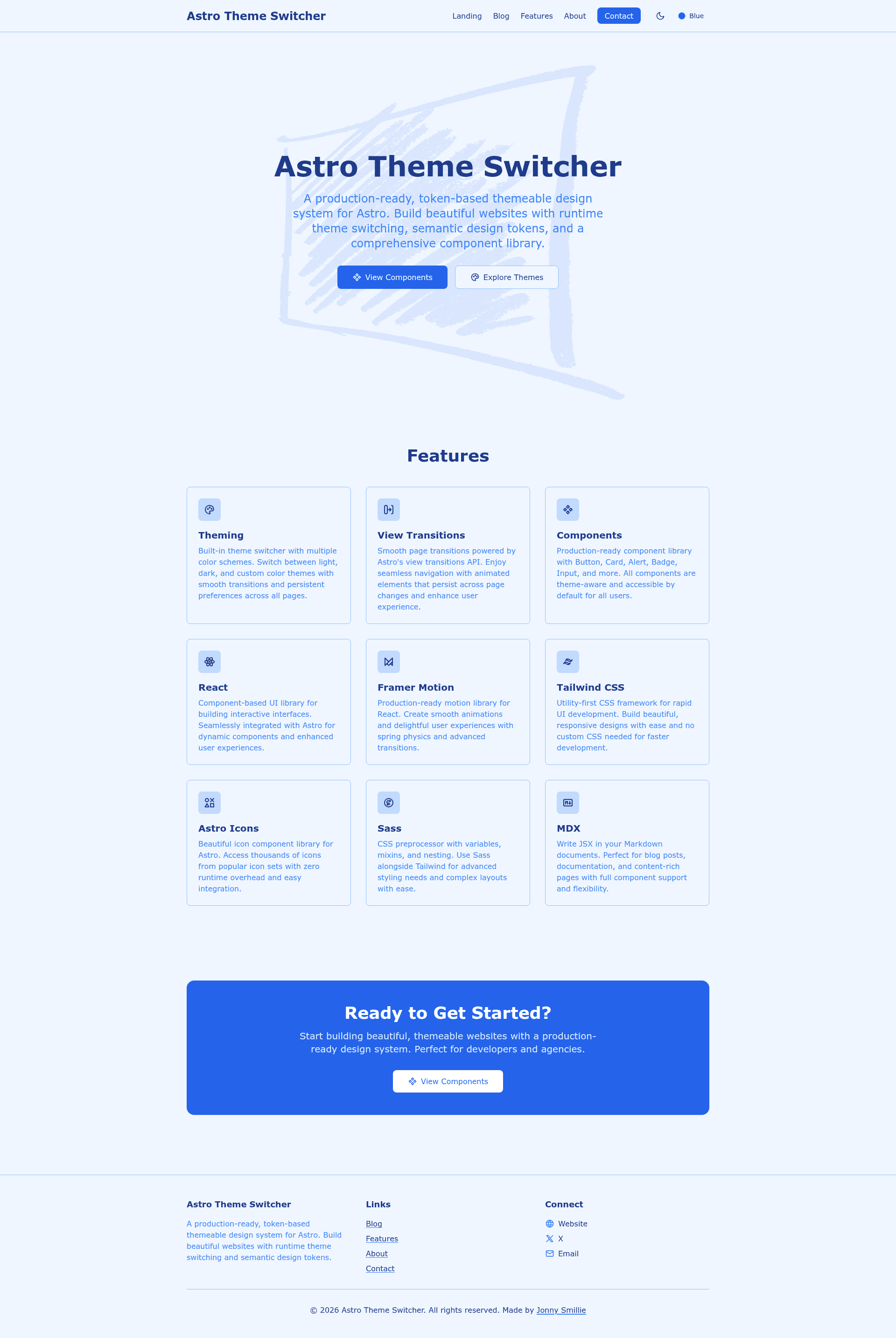
Astro Theme Switcher is a production-ready design system and starting point for content-driven websites built with Astro. It takes a standard Astro project and layers in a semantic design-token system, multiple color themes, and light/dark mode toggling, all powered by React components that hydrate on the client. Created by Jonny Smillie and published on GitHub, the template runs on Astro ^6.0.5 and requires Node.js 22.12.0 or higher. It outputs a static site with file-based routing, MDX pages, and a component library that responds to the active theme.
Key Features
- Token-based theme system — All colors, typography, and spacing are defined as semantic design tokens that can be swapped at runtime; new themes can be added without touching components.
- Runtime theme switching — Visitors change color theme and light/dark mode without a page reload, using the React
ThemeSwitcherandModeTogglecomponents. - Multiple color themes — Ships with Blue, Green, Purple, and Orange themes, plus the premium Aurora and Obsidian themes, each with custom typography.
- Theme-aware component library — Production-ready components for Header, Hero, Features, CTA, Footer, and a
ScrollRevealReact animation wrapper. - Tech stack — Built on Astro 6, React 19, Tailwind CSS v4 (via
@tailwindcss/vite), MDX, astro-icon with the Tabler icon set, Framer Motion, and Sass. - Ready-to-use pages — Includes homepage, features, about, contact, and an MDX example page under
src/pages.
Who is it for?
- Astro developers who want a theming foundation for content or marketing sites without building a token system from scratch.
- Agencies that build multiple Astro sites and need a consistent, themeable starting point with reusable components.
- Developers new to design tokens who want a working reference for semantic tokens, runtime switching, and light/dark mode in a real Astro project.
What can you do with Astro Theme Switcher?
- Launch a marketing site — Use the included Hero, Features, CTA, and Footer sections to stand up a landing page with built-in theming.
- Publish MDX content — Write inline JSX in Markdown documents and style them with Tailwind Typography for styled prose.
- Demo multiple themes — Let stakeholders switch between Aurora and Obsidian themes to preview different visual identities.
How does it work?
Clone the repository from GitHub, install dependencies with npm, and start the dev server with npm run dev — the site runs at localhost:4321. Build the production site with npm run build, which outputs static files to ./dist/. The theme system is defined in src/themes and documented in THEME_SYSTEM.md.
Pricing
Astro Theme Switcher is free and open source under the MIT License, so you can use, modify, and redistribute it for personal or commercial projects.
FAQ
Does Astro Theme Switcher support light and dark mode?
Yes. Each color theme has its own light/dark mode toggle, so visitors can combine any theme with light or dark mode.
What themes are included?
The template includes Blue, Green, Purple, and Orange themes, plus the premium Aurora and Obsidian themes. All are defined with semantic tokens in src/themes.
What versions does it require?
It requires Node.js 22.12.0 or higher, and uses Astro ^6.0.5, React ^19.2.3, Tailwind CSS ^4.1.18, and Framer Motion ^12.24.7.
Can I add my own theme?
Yes. The theme system is designed to be extensible — you can add new themes by defining new semantic tokens without modifying existing components.
Is Astro Theme Switcher free?
Yes. The project is released under the MIT License, so it is free to use, modify, and redistribute.