Newsletter
Join the Community
Subscribe to our newsletter for the latest news and updates

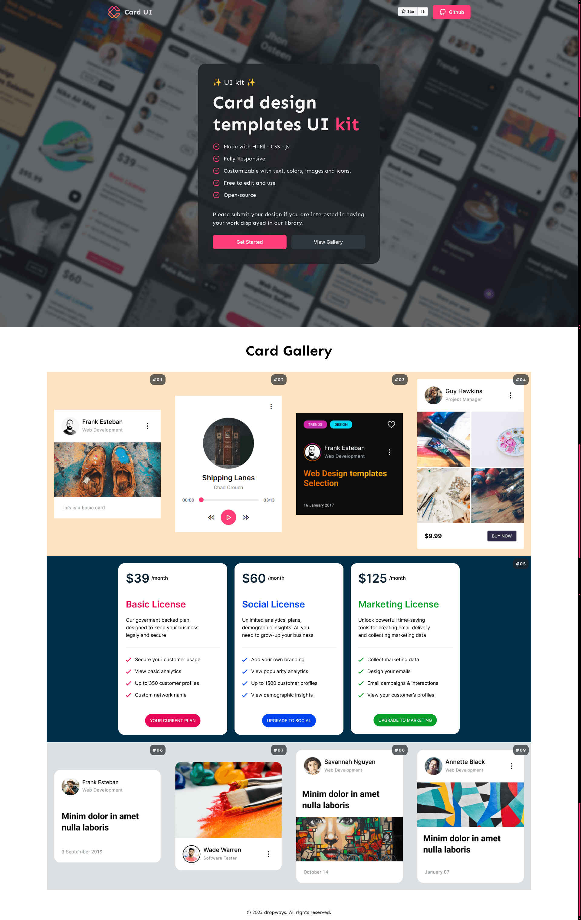
A free collection of HTML/CSS UI cards with live demos, Alpine.js interactivity, and broad browser support.
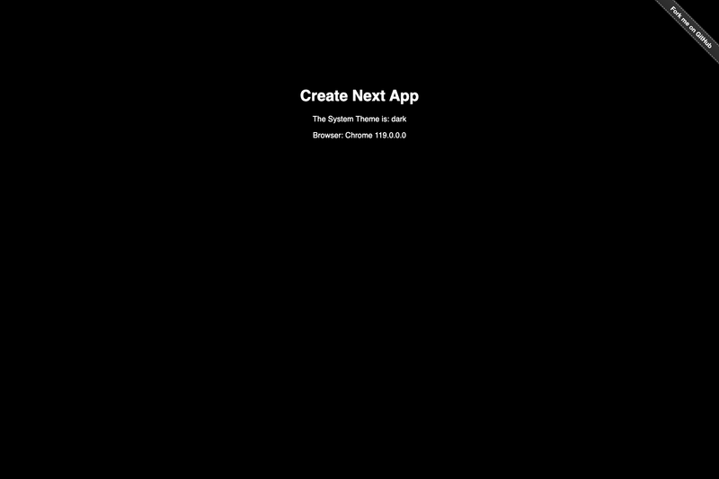
React Hook that detects the user's system color scheme (light/dark) and updates live whenever it changes, with SSR support.
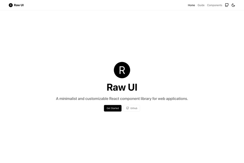
A minimalist and customizable React component library for web applications.
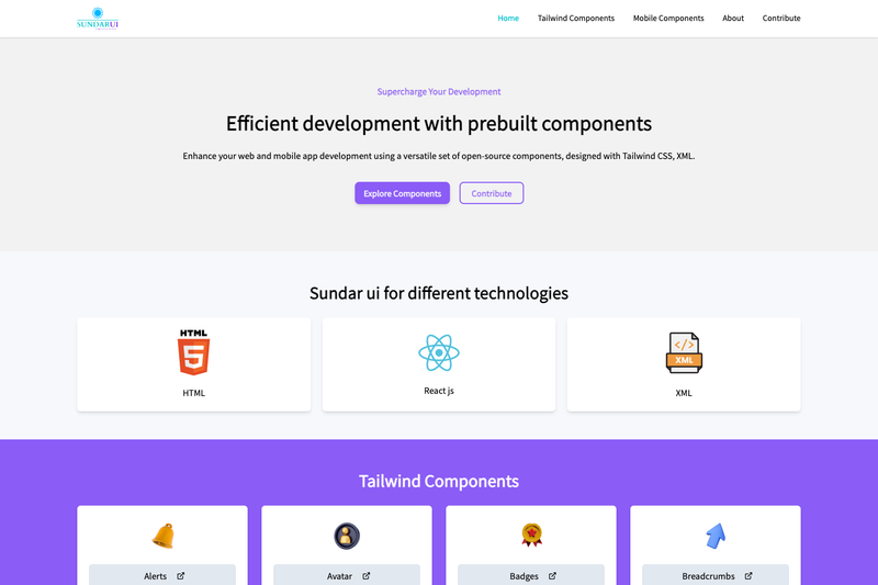
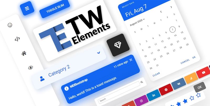
Open-source library of prebuilt Tailwind CSS UI components built with React and Vite.
Card UI library is a free collection of ready-to-use HTML and CSS card designs that helps developers drop UI cards into web projects, with live demo pages for each card and Alpine.js-powered interactivity.
Card UI library is a free collection of five demo card designs (Card-01 through Card-05) built with HTML5, CSS3, and Alpine.js, hosted on GitHub Pages at dropways.github.io/card-ui. Each card has its own demo page that shows the card's layout, typography, color palette, and interactive elements, and the source can be integrated or built upon for free in personal or commercial projects. The library is maintained under the Dropways GitHub organization and is not tied to any particular framework, making it a drop-in resource for any static or server-rendered website.
Free — the cards can be integrated or built upon for free, with no mention of a paid tier or premium features.
Yes, you can use the cards for free in personal or commercial projects. The only condition is that you cannot republish, redistribute, or sell the collection as-is.
It uses HTML5, CSS3, and Alpine.js for interactivity. The demo images come from Unsplash, Pixabay, and Pexels, and the icons come from Tabler.
The library officially supports the last two versions of Chrome, Firefox, Edge, Safari, and Opera.
Yes, dropdowns and other JavaScript actions are powered by Alpine.js, a lightweight JavaScript framework.