Newsletter
Join the Community
Subscribe to our newsletter for the latest news and updates

Free collection of 500+ interactive Tailwind CSS components and 117+ design blocks with dark mode support.
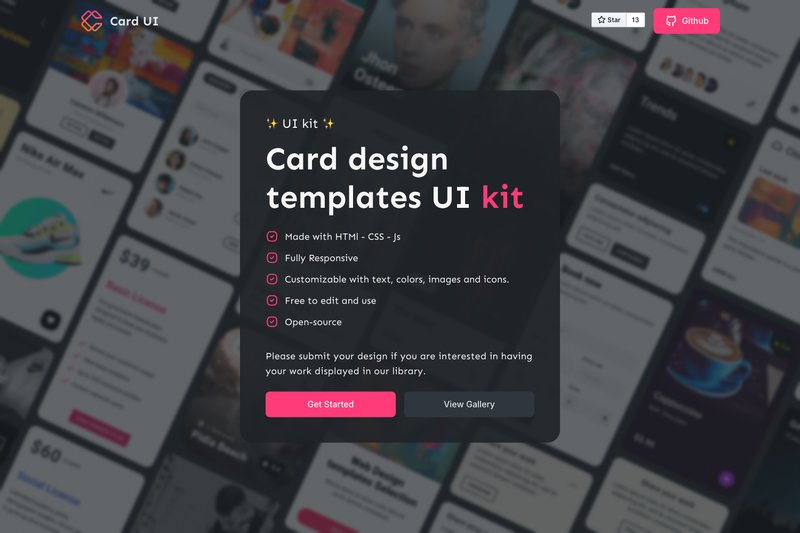
A free collection of HTML/CSS UI cards with live demos, Alpine.js interactivity, and broad browser support.
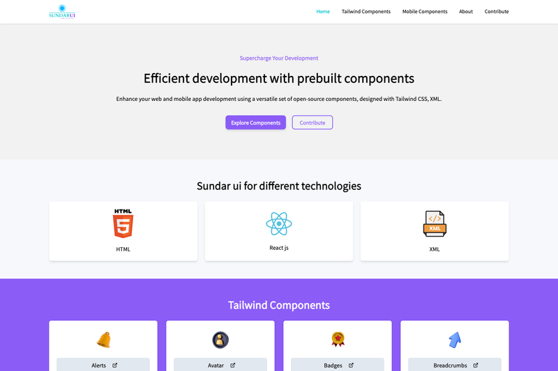
Open-source library of prebuilt Tailwind CSS UI components built with React and Vite.
AI-powered resume analyzer with ATS scoring, keyword gap analysis, resume builder, and job search — built with Streamlit.
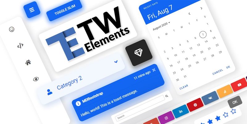
TW Elements is a free, MIT-licensed UI component library that adds 500+ interactive components and 117+ design blocks to Tailwind CSS projects. It runs as a Tailwind CSS plugin, extending standard Tailwind utilities with JavaScript-powered widgets like datepickers, modals, carousels, and charts, as well as ready-made landing page sections. The project is developed and maintained by MDBootstrap, the team behind the MDB UI Kit for Bootstrap.
TW Elements is a collection of open-source components and design blocks built specifically for Tailwind CSS. It takes a Tailwind project as input and produces interactive UI elements plus responsive page sections, delivered through a plugin and a JavaScript bundle. The library is free for personal and commercial use and is available on NPM, CDN, and through the MDB GO/CLI tool.
darkMode: "class" configuration, letting you toggle dark styling by adding a class to the document root.TW Elements is a Tailwind CSS plugin. After installing via NPM, you register it in tailwind.config.js under plugins and extend the content array with the library's JavaScript files. Interactive components then load when you include the tw-elements.umd.min.js script (or import 'tw-elements' in a bundler). The CDN option skips the build step: add two stylesheets and one script tag, and components work from a static HTML page.
The core TW Elements library is free and MIT-licensed. The README lists no paid tier for the components themselves; MDB GO / CLI is a separate hosting and deployment platform with its own account-based workflow.
Yes, the library is MIT licensed and free for personal and commercial use. The README states this explicitly and the GitHub repository does not mention any paid tier for the core components.
Yes. Dark mode is supported and activated by configuring Tailwind's darkMode to "class" and adding the appropriate class to the document root. The components are built to respond to that class.
Official integration guides cover Django, Angular, Express, Laravel, Next.js, Nuxt, React, Remix, Solid, Svelte, SvelteKit, and Vue. The library itself is framework-agnostic and works with any Tailwind CSS setup.
You can install it via NPM (npm install tw-elements), use MDB GO/CLI (mdb init tailwind-elements-free), or load the CDN scripts directly into an HTML page. The NPM path requires adding the plugin to tailwind.config.js.
No. The interactive components like modals, dropdowns, and datepickers rely on the bundled JavaScript file. Static components such as buttons and badges are just Tailwind utility classes and work without JS.