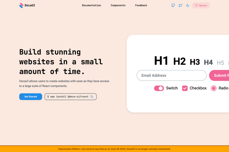
DecaUI is a React component library that provides accessible, customizable UI components with a centralized theming system, built with TypeScript and Stitches.
What is DecaUI?
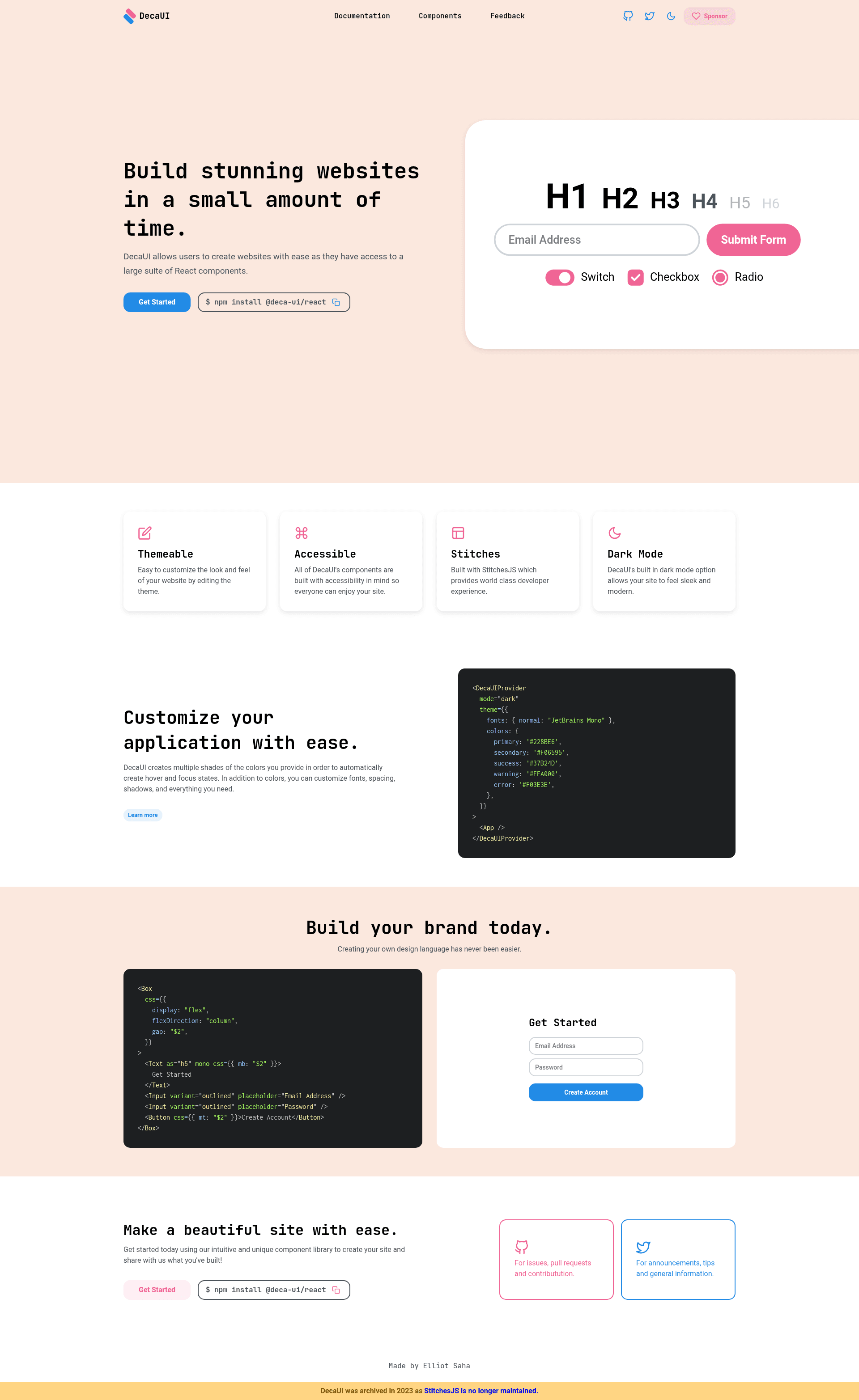
DecaUI is an open-source React component library designed to help developers quickly prototype and build websites. It takes pre-built components such as Button, Input, and Box along with a root theme object as inputs, and outputs styled, accessible UI elements. The library is installed via npm as @deca-ui/react and runs in any React environment, including server-side rendering setups. It was created by the deca-org team and published under an open-source license.
Key Features
- Accessible components — The repository topics list a11y, indicating the components are built with accessibility in mind.
- Centralized theming — A root theme object following the System UI theme specification lets developers define design tokens once and reuse them throughout the application.
- Shorthand CSS props — DecaUI replaces verbose sx objects with concise properties such as
m: "md"for margin, and even amaxWidthprop directly on Button. - TypeScript support — The library is written in TypeScript, providing type safety for component props and themes.
- Stitches integration — Built on the Stitches CSS-in-JS library, which supports server-side rendering and zero-runtime styles.
- Component variants — Components like Button accept variants, e.g.
variant="solid", to switch between visual styles.
Who is it for?
- React developers — who want a small set of ready-made components to speed up UI development without pulling in a large framework.
- Design system maintainers — who need a themeable library that follows the System UI specification for consistent design tokens.
- Teams building accessible products — because the components are designed with accessibility as a core focus, as listed in the project topics.
What can you do with DecaUI?
- Prototype interfaces fast: Assemble forms and layouts using Button, Input, and Box components — the README shows a sign-up form built in just a few lines.
- Enforce consistent styling: Define spacing and other values in the root theme, then apply them with shorthand props across all components, avoiding repetition.
- Use it in SSR frameworks: Because Stitches supports server-side rendering, DecaUI components can be used in Next.js and similar frameworks without extra configuration.
How does DecaUI work?
Install the package with npm install @deca-ui/react, then import components like Button. Customize styling either through CSS props passed to components or by defining a centralized theme object that follows the System UI specification.
Pros and cons
- Pros: Accessible components, centralized theming, TypeScript support, Stitches integration for SSR.
- Cons: No longer actively maintained since June 2023, so no updates or bug fixes are planned.
FAQ
Is DecaUI still maintained?
No. As of June 28, 2023, DecaUI is no longer actively maintained, as stated in a warning at the top of the README. This means no new features or updates are expected, though the package remains available on npm.
How do I install DecaUI?
Run npm install @deca-ui/react in your React project. Then you can import components such as Button and Box from @deca-ui/react.
What styling system does DecaUI use?
DecaUI uses Stitches, a CSS-in-JS library that supports server-side rendering. The theming system follows the System UI theme specification, allowing shorthand CSS properties like m: "md" for margin.
Does DecaUI work with Next.js?
Yes. Since DecaUI is React-based and Stitches supports server-side rendering, it works with Next.js and other SSR React frameworks. The project topics include server-side-rendering.