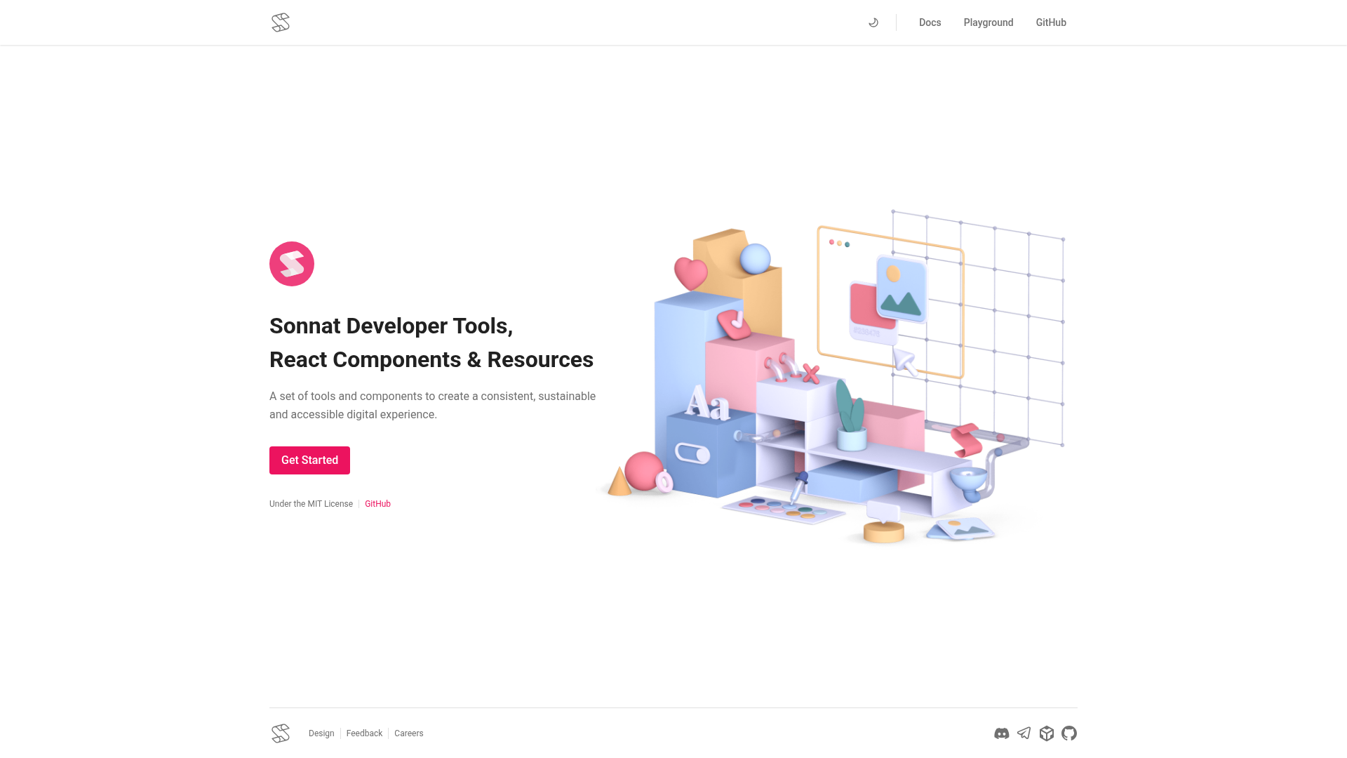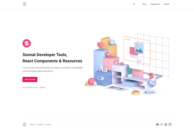
Sonnat-UI is an open-source React component library built on the Sonnat Design System, providing accessible and reusable UI components for building web applications.
What is Sonnat-UI?
Sonnat-UI is a React component library that implements the Sonnat Design System, allowing developers to create consistent and accessible web interfaces. The project is distributed as the @sonnat/ui npm package, hosted on GitHub, and documented on the Sonnat-UI website. It accepts React props and returns ready-to-use UI elements such as buttons, forms, and navigation components, following the design language defined at sonnat.design.
Key Features
- React component library — a collection of reusable components written in React, available to install through the
@sonnat/uinpm package. - Built on Sonnat Design System — components implement the design tokens and UX patterns of the Sonnat Design System for a unified look.
- Accessibility emphasis — the stated goal is to build accessible web applications, so components are designed with accessibility in mind.
- Open source project — the full source code is available on GitHub, and the repository includes a license badge.
- Documentation site — official docs at sonnat.dev/docs cover component usage, and an installation guide starts at sonnat.dev/docs/installation.
- Community channels — users can join GitHub Discussions and a Discord server for questions, ideas, and project sharing.
- npm distribution — the package is published to npm, with version and download badges shown on the repository page to track releases.
Who is it for?
- React application developers — teams who need standardized, accessible components for their React projects without writing them from scratch.
- Sonnat Design System users — organizations that have adopted Sonnat Design System and want a React implementation of its components.
- Open source contributors — frontend developers interested in contributing to a UI library on GitHub and learning from its codebase.
What can you do with Sonnat-UI?
- Product teams: install
@sonnat/uivia npm and import its components to assemble app screens with consistent styling across the product. - DesignOps engineers: use the library's components to bridge design specs and code, ensuring the shipped UI matches Sonnat Design System patterns.
- Prototype developers: follow the installation and documentation pages to quickly set up a React project and prototype features with accessible UI primitives.