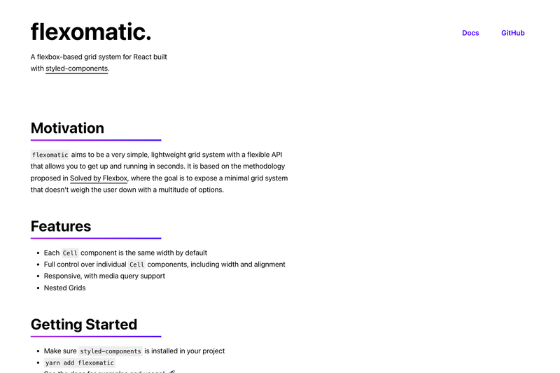
Flexomatic is a component-based flexbox grid system for React that renders responsive layouts through a minimal Grid and Cell API built on styled-components.
What is Flexomatic?
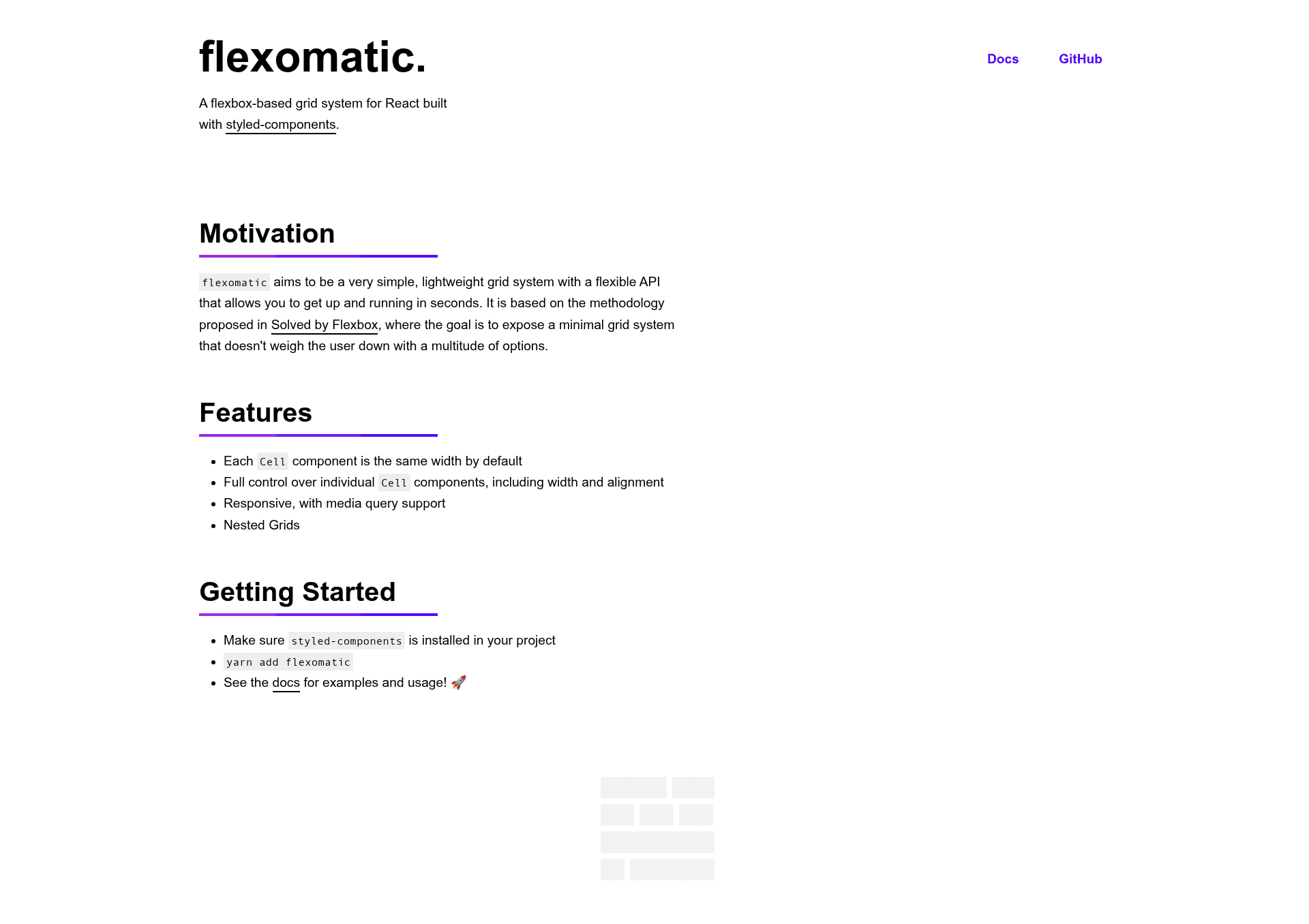
Flexomatic is a lightweight, component-based flexbox grid system for React, built with styled-components and following the grid methodology from Philip Walton's Solved by Flexbox. It provides two main components: Grid, the row container, and Cell, the column. Flexomatic accepts styled-components as a peer dependency, meaning your project must already have styled-components installed to use it. Its goal is to expose a minimal grid system without a large set of options, letting you compose responsive layouts with a few props.
Key Features
- Default equal widths — Every Cell in a Grid is the same width by default, so a row of three cells automatically becomes three equal columns.
- Per-cell width control — Set the width prop as a number greater than 0 and up to 1 (1 equals 100%, 0.25 equals 25%), or use the keywords full (100%), half (50%), third (33.33%), and fourth (25%).
- Responsive width arrays — Pass an array of up to three numbers or keywords to the width prop to assign base, tablet (768px), and desktop (1024px) breakpoint widths; more than three values causes an error.
- Individual flex control — Use the flexed prop on a single Cell to make it a flex container, or the flexCells prop on Grid to apply flex display to all child Cells.
- Alignment and direction — Grid supports direction options row (default), row-reverse, column, and column-reverse, plus align options start, center, end, and baseline for aligning cells.
- Configurable gutters — Set the spacing prop to control the gap between cells; the default spacing is "1em".
- Nested grids — Grid components can be nested inside Cells, allowing for complex multi-level layout structures.
Who is it for?
- React developers who need a small, focused grid primitive instead of pulling in a full CSS framework.
- Component library authors who want a dependency-light grid system to embed inside their own design systems.
- Rapid prototypers who want to build responsive layouts quickly with a declarative, component-based API and no configuration.
What can you do with Flexomatic?
- Create responsive page sections: Compose Grid and Cell with width arrays so columns reflow at the 768px and 1024px breakpoints.
- Build nested dashboard layouts: Nest Grid components inside Cells to create card grids and multi-column content areas.
- Align content precisely: Combine the align prop on Grid with flexed Cells to control vertical alignment of flex children.
How does Flexomatic work?
After installing Flexomatic with yarn add flexomatic and ensuring styled-components is present, you import Grid and Cell from the library and compose them in your React tree. The Grid component acts as a flex row, and each Cell becomes a flex item. Props such as width, direction, align, spacing, flexCells, and flexed map directly to CSS flexbox properties and media queries, so the layout logic stays in your component code.
FAQ
Does Flexomatic require styled-components?
Yes. Flexomatic lists styled-components as a peer dependency, so you must install styled-components in your project before you can use Flexomatic.
How do I install Flexomatic?
Run yarn add flexomatic in your project. Flexomatic's only requirement is that styled-components is already installed.
What width keywords does Flexomatic support?
Flexomatic supports the keywords full (100%), half (50%), third (33.33%), and fourth (25%) for the width prop. You can also use numbers between 0 and 1.
How many responsive breakpoints does Flexomatic support?
Flexomatic supports three screen sizes: base with no media query, tablet at 768px, and desktop at 1024px. The width array expects up to three values in that order.
What happens if I pass more than three widths?
Passing more than three values in the width array will result in an error, as Flexomatic only handles base, tablet, and desktop widths.