Newsletter
Join the Community
Subscribe to our newsletter for the latest news and updates

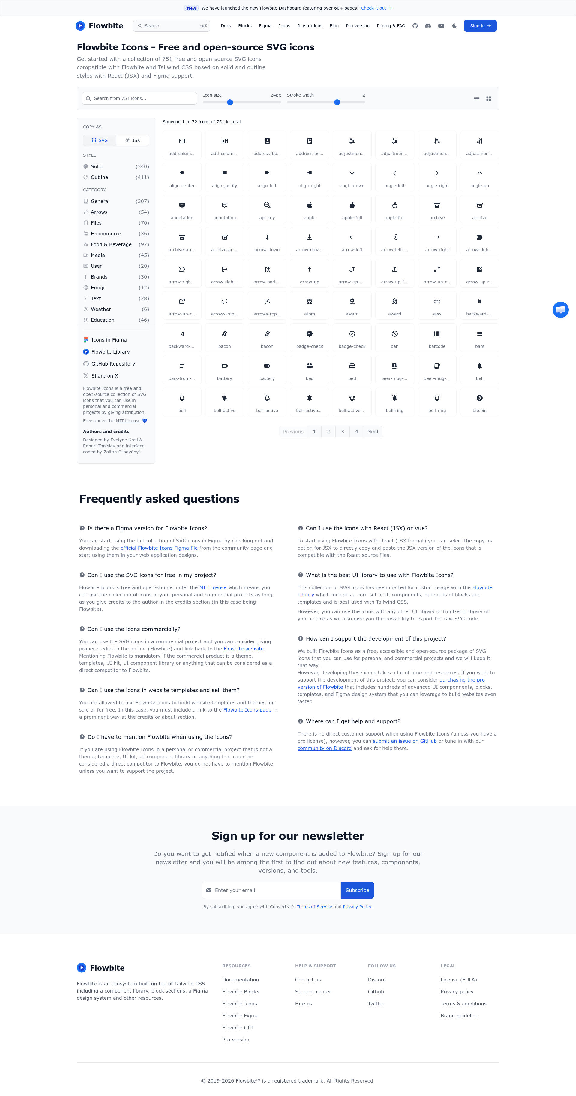
Flowbite React Icon library is the official collection of SVG icons, provided freely and as open-source.
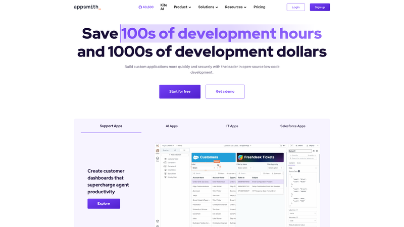
Platform to build admin panels, internal tools, and dashboards. Integrates with 25+ databases and any API.

Self-hosted open-source WebRTC SaaS and room scheduler for creating and managing scheduled MiroTalk video meeting rooms.
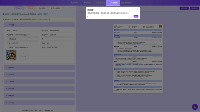
Open-source AI resume builder with multi-template editing, PDF export, and LLM-based polish, deep-dive, and mock interview features.
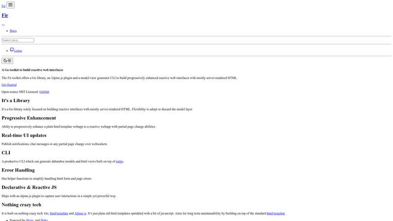
A Go toolkit for building reactive web interfaces with server-side html/template fragments and Alpine.js.
flowbite-react-icons is the official React component library for Flowbite Icons, delivering the full SVG icon set as importable outline and solid React components.
flowbite-react-icons is the official React package of Flowbite Icons, maintained by the Flowbite team. It takes the Flowbite SVG icon set and exposes each icon as a React component, with separate outline and solid endpoints that mirror the SVG file names. The package runs on any React application and can be installed using npm, yarn, pnpm, or bun.
outline and solid, so you can import AngleDown from either path depending on the style you need, with one-to-one parity to the SVG file naming convention.FlowbiteIconProps and applies global config such as size to every icon it wraps, letting you set a default dimension once instead of per icon.FlowbiteIcons can be nested; a child provider inherits values from its parent context and overrides them locally, enabling decoupled composition of icon groups with different sizes or colors.width/height props take precedence over the size prop, so you can fine-tune individual icons without breaking global defaults.FlowbiteIcons provider are server-rendering compatible, meaning values set in the provider render identically on server and client to avoid hydration warnings in frameworks like Next.js.BaseIcon component is exposed so you can create custom SVG icons while still accessing the FlowbiteIcons context, inheriting global config automatically.BaseIcon sets xmlns to http://www.w3.org/2000/svg and viewBox to 0 0 24 24 unless you override them.FlowbiteIcons context provider.FlowbiteIcons provider with size={48} and all of them will render at 48 by 48 pixels, with inline overrides available for exceptions.FlowbiteIcons provider with a different color or size inside an outer provider to style a subset of icons, while the rest keep the outer defaults.BaseIcon with your own SVG children (including attributes like strokeWidth, strokeLinecap, and strokeLinejoin) so they automatically adopt the context-based sizing and color.Install the package with your preferred package manager, then import an icon from either the outline or solid endpoint and render it as a JSX component. For global configuration, wrap icons in a FlowbiteIcons provider, which accepts a size prop and can be nested to create scoped overrides.
Install it via your preferred package manager: npm i flowbite-react-icons, yarn add flowbite-react-icons, pnpm add flowbite-react-icons, or bun add flowbite-react-icons. It's a single dependency that works in any React project.
Flowbite Icons are provided in two visual styles: outline (stroke-based) and solid (filled). In this package, they are available from separate import endpoints — flowbite-react-icons/outline and flowbite-react-icons/solid — so you choose the style at import time rather than via a prop.
FlowbiteIcons is a context provider that extends FlowbiteIconProps and sets global defaults for wrapped icons, such as size. It supports nesting, where inner providers inherit values from outer ones, and inline props always take precedence over context values.
Yes. The package is designed to be server-ready: all icons and the FlowbiteIcons provider render the same values on the server and the client, avoiding hydration warnings in server-rendered frameworks like Next.js.
BaseIcon applies two defaults: xmlns is set to http://www.w3.org/2000/svg and viewBox is set to 0 0 24 24. All other props follow the FlowbiteIconProps interface, which extends React's SVGProps<SVGSVGElement> and adds an optional size prop.
flowbite-react-icons is free and open-source, as stated in the official repository description.