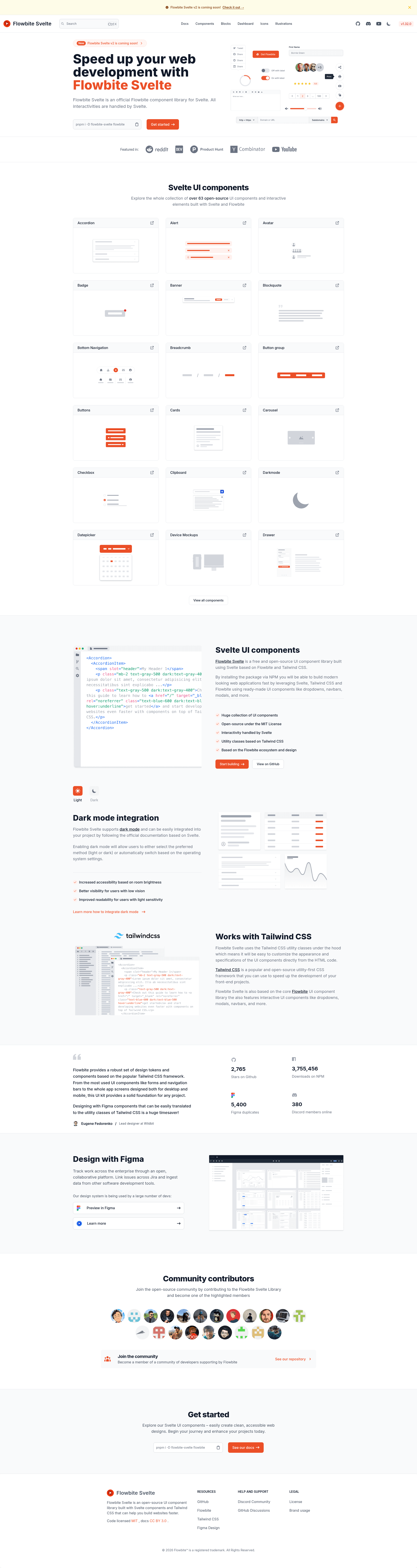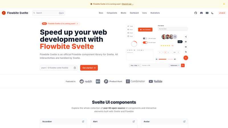
Flowbite Svelte is an open-source UI component library that brings the Flowbite design system to Svelte apps, with every interaction handled by Svelte rather than vanilla JavaScript.
What is Flowbite Svelte?
Flowbite Svelte is the official Flowbite component library for Svelte, built on top of Tailwind CSS. It takes a Svelte project and provides a set of pre-built, interactive components such as modals, dropdowns, navbars, and datepickers that developers can drop into their markup. The library is maintained by the creators of Flowbite and released under the MIT License, with full documentation at flowbite-svelte.com.
Key Features
- Svelte-native interactivity — All interactive behaviors, from dropdowns to modals, are implemented in Svelte, so no separate JavaScript file is required.
- Over 50 components — Includes alerts, badges, buttons, cards, forms, tables, toasts, tooltips, accordions, tabs, carousels, sidebars, and more, each with a dedicated documentation page showing usage and props.
- Tailwind CSS styling — Components are styled with Tailwind utility classes, so colors, spacing, and typography follow your existing Tailwind config.
- Dark mode support — The component classes include dark-mode variants, letting you switch your UI to dark mode by toggling a class.
- TypeScript types — The library ships with type definitions, and the docs include a dedicated page on TypeScript usage.
- MIT licensed — Free to use in personal and commercial projects, with contribution guidelines and a changelog available on GitHub.
Who is it for?
- Svelte developers — who want to build UI quickly without writing each component's interaction logic from scratch.
- Tailwind CSS users — who already use utility classes and want a consistent component set that respects their design tokens.
- Flowbite users — who know the Flowbite component patterns from other frameworks and want the same look in Svelte.
- Frontend teams — building marketing sites, dashboards, or internal tools that need common patterns like navbar, footer, tables, and modals.
What can you do with Flowbite Svelte?
- Build a marketing site: Compose navbar, footer, hero cards, and typography components to ship a landing page faster.
- Create an admin dashboard: Use the sidebar, dropdowns, tables, modals, and progress bars to assemble a data-dense interface.
- Add interactive UI elements: Drop in datepickers, tooltips, toasts, and drawers to enhance a web app without hand-writing JavaScript.
Community and support
Flowbite Svelte has an active community on GitHub Discussions for questions and feature ideas, plus a Discord server for casual chat. The repository includes a contributing guide and a changelog, and contributions are welcome.
FAQ
Is Flowbite Svelte free?
Yes, Flowbite Svelte is open-source under the MIT License, so it's free to use in personal and commercial projects.
What is the difference between Flowbite and Flowbite Svelte?
Flowbite is a set of components built for Tailwind CSS with vanilla JavaScript, while Flowbite Svelte is the official adaptation where all interactivity is handled by Svelte components.
Does Flowbite Svelte work with TypeScript?
Yes, the library provides type definitions and includes a dedicated TypeScript page in its documentation.
How do I install Flowbite Svelte?
The quickstart guide on flowbite-svelte.com walks you through adding the library and its Tailwind dependency to a Svelte project.