Gatsby Atomic Themes is a MIT-licensed monorepo that decomposes Gatsby site creation into seven composable npm themes, published under the @gatsby-themes scope, so infrastructure, component libraries, data queries, and page rendering can be versioned and reused independently.
What is Gatsby Atomic Themes?
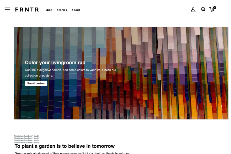
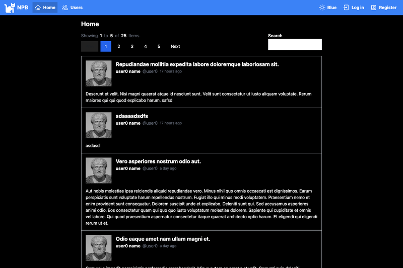
Gatsby Atomic Themes is an open-source Gatsby experiment by ERS-HCL that applies atomic-design thinking to Gatsby Themes: each package in the monorepo is a small, maintainable piece of site infrastructure rather than a full starter. The repository takes Yarn workspace packages (core, mui, emotion, tailwind, emotion-recipe, drupal, okta) as inputs and produces publishable npm themes plus two working demo applications. It runs on the Gatsby framework built with React and uses Yarn workspaces for local development, so changes can be tested across packages without publishing to npm first. The README links to a detailed point-of-view article on scaling Gatsby infrastructure with themes, and live demos are hosted at gatsby-atomic-themes.netlify.com, gatsby-drupal-theme-app.netlify.com, disney-clone-gatsby.netlify.com, and okta-theme.netlify.com.
Key Features
- Seven atomic themes —
@gatsby-themes/core(SEO, image processing, file-source setup, PWA, core branding),@gatsby-themes/mui,@gatsby-themes/emotion,@gatsby-themes/tailwind,@gatsby-themes/emotion-recipe-theme,@gatsby-themes/drupal, and@gatsby-themes/okta, each published to npm. - Component shadowing — applications can override or customize theme-derived components without forking the theme, and can separate GraphQL queries from component rendering using shadow components.
- Drupal theme with bundled queries —
@gatsby-themes/drupalincludes the Drupal Gatsby plugin configuration plus two template GraphQL queries (landing page listing all recipes, recipe detail by id) with matching PropTypes definitions (AllRecipesPropTypes,RecipePropTypes) importable into page templates. - Okta sign-in integration —
@gatsby-themes/oktaconfigures the Okta sign-in widget, with a live demo at okta-theme.netlify.com. - Storybook for every component theme — the mui, emotion, tailwind, and emotion-recipe-theme packages each ship a
storybookyarn workspace command. - Two demo applications —
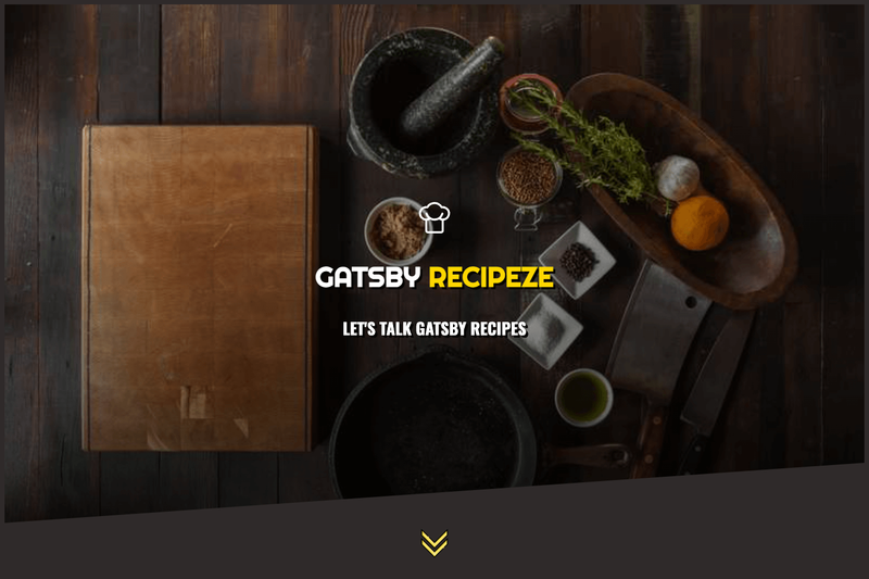
demo-appmimics the Gatsby Starter using core, mui, and emotion themes;drupal-appis the showcase Drupal recipe site with 100% Lighthouse results and PWA enabled. - Theme composition and extension — themes build on other themes (emotion-recipe extends emotion), demonstrating both composition and shadowing.
- External consumption test — the
sitefolder runs a Gatsby site that depends only on the published@gatsby-themespackages from npm, proving the themes work outside the workspace.
Who is it for?
- Gatsby site owners who want SEO, image processing, PWA, and analytics configuration maintained in one versioned place instead of copy-pasted across projects.
- Teams building multiple Gatsby sites that need consistent component libraries and theming — Material-UI, Emotion with theme-ui, or Tailwind with purgeCSS — without redoing setup.
- Drupal plus Gatsby developers building recipe-style content sites who want the plugin config and GraphQL queries provided out of the box and only page rendering left to the application.
- Theme authors looking for a working reference for Yarn workspaces, scoped npm publishing, Storybook integration, and component shadowing.
Use cases
- Site infrastructure teams: compose
@gatsby-themes/corewith@gatsby-themes/muito bootstrap a new Gatsby site that inherits base SEO, image processing, PWA, branding, and Material-UI SSR and browser theming from the themes. - Drupal content sites: use
@gatsby-themes/drupalto get the Drupal plugin configuration plus the recipe landing and recipe-detail queries, then implement only the index and recipe shadow templates in the app. - Auth-enabled apps: add
@gatsby-themes/oktato bring in the Okta sign-in widget without wiring the integration from scratch. - Component library publishers: ship a Gatsby theme with an accompanying Storybook so consumers can browse and test components while integrating the theme.
How does it work?
The repo uses Yarn workspaces, so each theme lives under packages/ and the demo apps are separate workspaces. Run yarn workspace demo-app develop for the Material-UI and Emotion demo site, or yarn workspace drupal-app develop for the Drupal showcase. Component themes provide storybook commands such as yarn workspace @gatsby-themes/mui storybook. The external site folder demonstrates consuming the published themes: add the @gatsby-themes package dependencies plus their peer dependencies, then run yarn and yarn develop.
FAQ
Is Gatsby Atomic Themes free?
Yes. The repository is released under the MIT license, and the themes are published publicly on npm under the @gatsby-themes scope.
What Gatsby themes are included?
Seven themes: core (SEO, images, PWA, branding), mui (Material-UI setup plus Header and Footer sample components), emotion (theme-ui based styling with an About example component), tailwind (Tailwind configuration with purgeCSS), emotion-recipe (recipe UI components and templates extending emotion), drupal (Drupal plugin config and queries), and okta (Okta sign-in widget).
How do I run the demo sites?
For the Material-UI and Emotion demo app run yarn workspace demo-app develop; for the showcase Drupal recipe app run yarn workspace drupal-app develop. The external site demo runs with cd site, yarn, then yarn develop.
Which themes include Storybook?
The mui, emotion, tailwind, and emotion-recipe-theme packages each include a storybook command, run with yarn workspace plus the package name and the storybook script, for example yarn workspace @gatsby-themes/mui storybook.
What is component shadowing used for here?
Component shadowing lets an application replace a theme's component files from its own source directory. Gatsby Atomic Themes uses it both to customize theme-derived components and to separate GraphQL queries, provided by the drupal theme, from page rendering, implemented in the application as shadow templates.