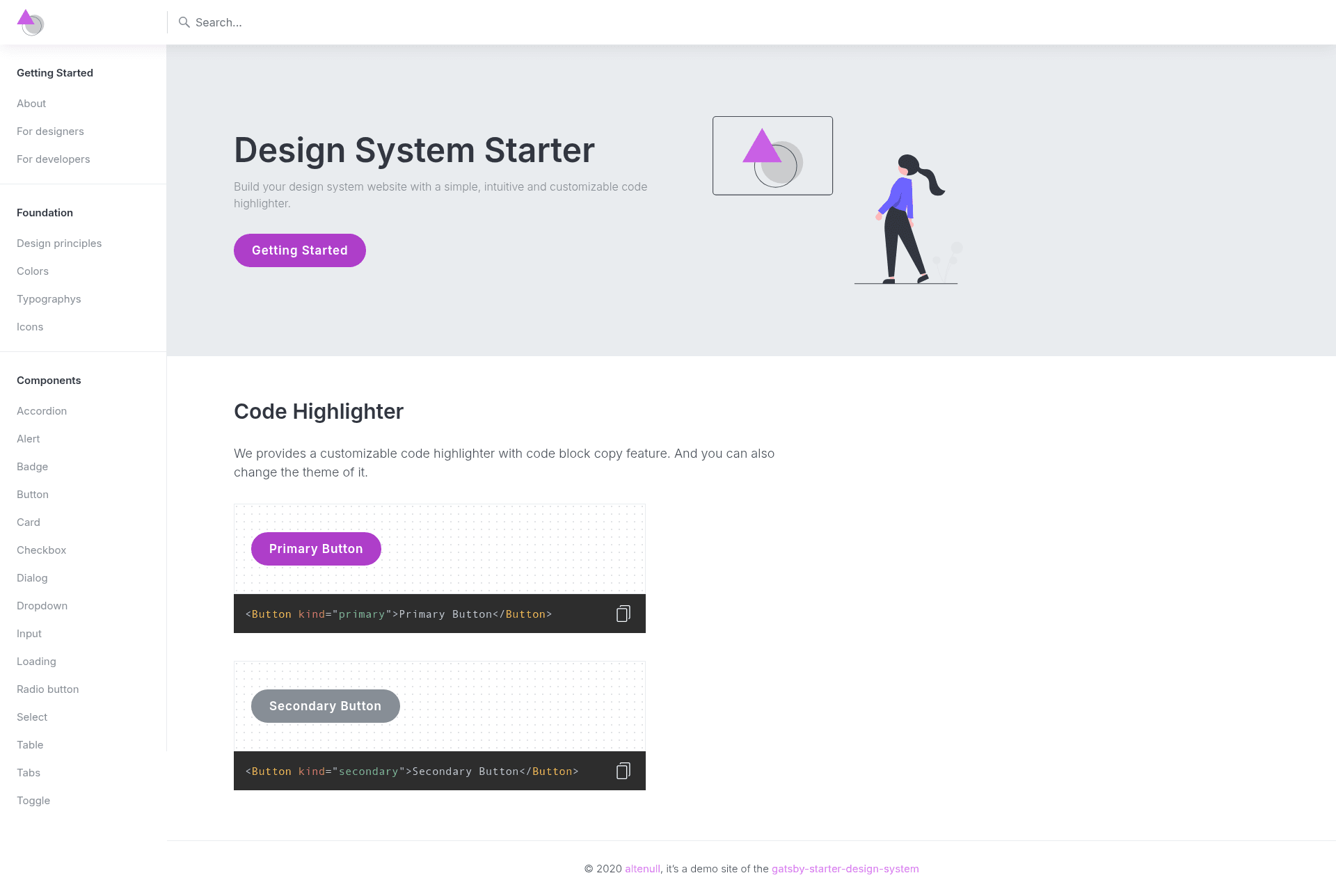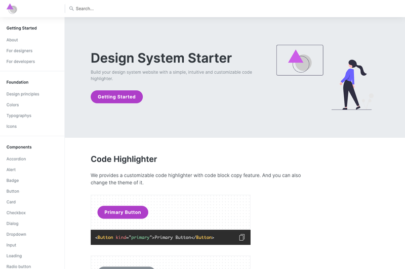
Gatsby Starter Design System is a Gatsby starter (Boilerplate) for building a design system website with a customizable code highlighter that includes a code-block copy feature.
What is Gatsby Starter Design System?
Gatsby Starter Design System is an open-source Gatsby starter created by altenull that scaffolds a design system website. It takes a new project as input via the Gatsby CLI and produces a static site with a component demo viewer and a code highlighter for documentation. It runs on Gatsby, the React-based static site generator, and is licensed under the permissive 0BSD license. The starter provides the core code needed to document UI components with live examples and syntax-highlighted code snippets.
Key Features
- Customizable code highlighter — The starter provides a code highlighter that supports code block copy and theme switching. The default theme is tomorrow night, and you can change it using any theme from the PrismJS theme list.
- gatsby-remark-prismjs integration — Code blocks in markdown files are highlighted using the gatsby-remark-prismjs plugin, which is built on PrismJS.
- Component demo viewer — The
ComponentDemoViewer.jscomponent lets you display live component demos alongside code snippets, ideal for design system documentation. - Customizable styling — The
CodeHighlighterContainer.jscontainer allows you to customize the animating of the copy icon and other highlight styles. - Quick start with Gatsby CLI — Create a new site with
gatsby new my-design-system https://github.com/altenull/gatsby-starter-design-system, then rungatsby developto start developing with hot reloading. - Live demo — A live demo of the starter is hosted on Netlify, viewable at
https://gatsby-starter-design-system.netlify.app/. - Open source license — Released under the 0BSD license, giving you unrestricted use and modification rights.
Who is it for?
- Design system maintainers — Use the starter to create a central documentation site for design tokens, components, and usage guidelines.
- Front-end developers — Quickly scaffold a style guide or component library site without building the tooling from scratch.
- Technical writers — Publish component documentation with live demos and copyable code examples.
What can you do with it?
- Build a component documentation site — Showcase each component with a live demo and the corresponding code snippet, thanks to the demo viewer and code highlighter.
- Create a design system for your team — Establish a single source of truth for UI patterns, using markdown files for content.
- Customize the code highlighter theme — Swap in any PrismJS theme and adjust the copy icon animation to match your brand.
How does it work?
- Install Gatsby CLI globally with
npm install -g gatsby-cli. - Create a new site using
gatsby new my-design-system https://github.com/altenull/gatsby-starter-design-system. - Start the development server with
gatsby developand view your site athttp://localhost:8000. - Edit
src/pages/index.jsand other source files to add your design system content; the browser updates in real time.
FAQ
Is Gatsby Starter Design System free?
Yes, it is open source and released under the 0BSD license, which allows free use, modification, and distribution with no copyright restrictions.
What code highlighter does it use?
It uses the gatsby-remark-prismjs plugin, which is based on PrismJS. The default theme is tomorrow night, and you can change it to any PrismJS theme.
How do I customize the code highlighter?
You can edit ComponentDemoViewer.js and CodeHighlighterContainer.js in the src/components/code/ and src/containers/code/ directories to customize the demo viewer styles and the animating of the copy icon.
Does it require any special setup?
You need to have Gatsby CLI installed globally. After that, the starter runs like any Gatsby site—run gatsby develop for local development and gatsby build for production.
Can I change the default theme?
Yes, since the code highlighter is based on PrismJS, you can select any theme from the PrismJS theme list and configure it in the starter.