Newsletter
Join the Community
Subscribe to our newsletter for the latest news and updates

Gatsby theme for generating slide decks from markdown
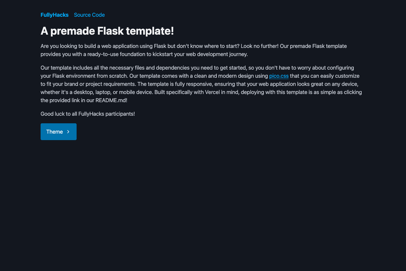
A premade Flask template for deploying Python web apps to Vercel with one-click and local run instructions.
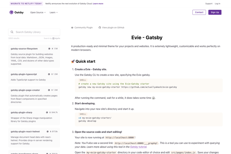
A production-ready, minimal Gatsby theme for lightweight React-based project and marketing websites.
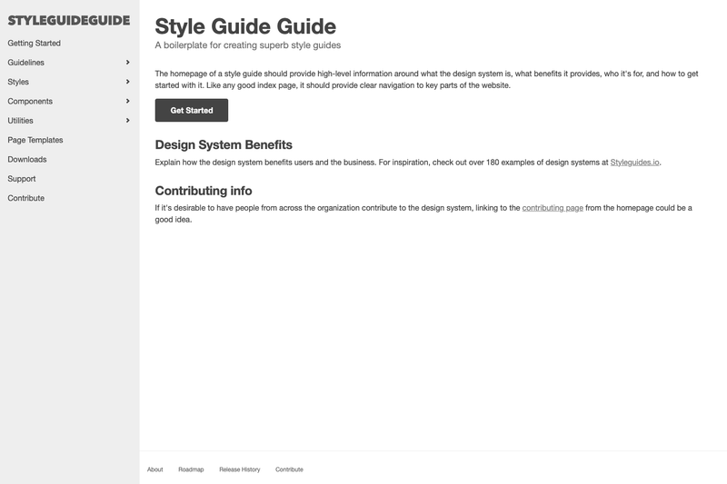
A boilerplate for creating your own custom style guide for your organization's design system.
A light site frame using Eleventy static site generator, served by Netlify.
gatsby-theme-slidedeck is a Gatsby theme that generates a navigable slide-deck website from Markdown/MDX files, with each .deck.mdx file in the deck directory becoming its own presentation.
Gatsby theme that takes .deck.mdx files as input and outputs a static site where every slide has its own route (e.g., /my-presentation/1). It is built on Gatsby's theme system, uses MDX for content, and is styled with Theme UI through gatsby-plugin-theme-ui. The theme was created by FLGMwt for the Gatsby Theme Jam and is distributed with a companion starter, gatsby-starter-slidedeck-theme.
.deck.mdx files using standard Markdown plus the gatsby-slide delimiter on its own line to split content into multiple slides.slideHeader.js) by dropping a file in src/gatsby-theme-slidedeck/, following Gatsby's component shadowing convention.gatsby-plugin-theme-ui and can be customized via the project's theme configuration.src/pages/index.js.utils/useShortcuts/config.js and can be shadowed to change or disable shortcuts.Conference talks: Author a deck in .deck.mdx, split slides with the gatsby-slide delimiter, and push to a Gatsby-powered site for sharing.
Workshop material: Maintain multiple training decks in one project; every deck gets its own route and appears on the index page.
Internal presentations: Build a lightweight company presentation site where each member can drop a .deck.mdx file and get a navigable deck with keyboard controls.
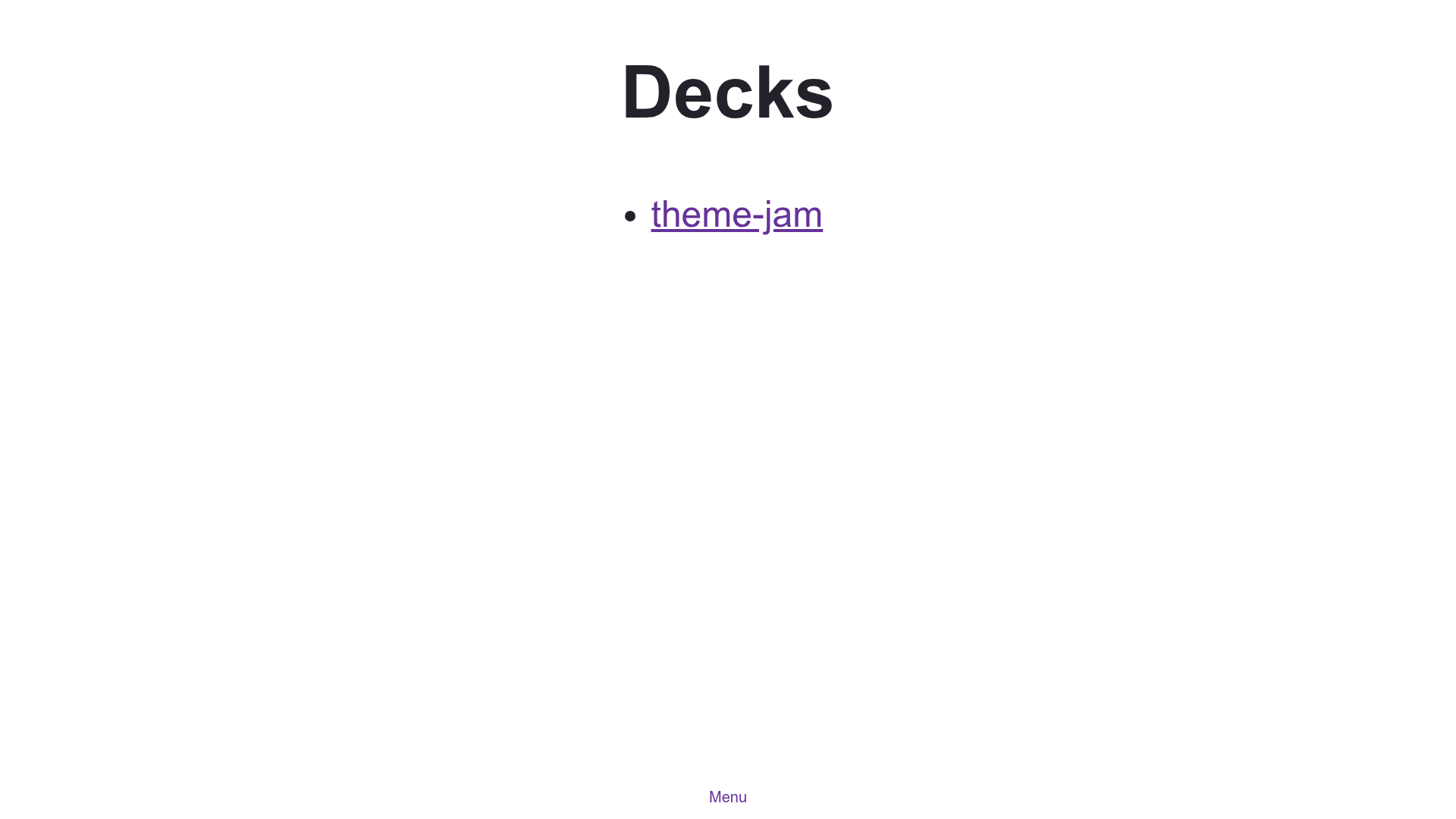
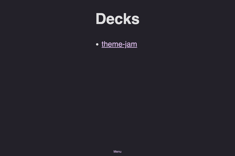
Install the starter with gatsby new my-slidedeck-site https://github.com/FLGMwt/gatsby-starter-slidedeck-theme. Add a .deck.mdx file under the deck directory and insert the text gatsby-slide on its own line to start a new slide. Running npm run develop generates the slides and index pages, and the theme's layout captures viewport size so touch events work across the whole screen.
Pros:
Cons (limitations noted by the author):
pre blocks.Inside a .deck.mdx file, place the text gatsby-slide on its own line between content blocks. Each separated block becomes a slide, and the URL increments per slide: /my-presentation/1, /my-presentation/2, and so on.
The default bindings are L or Right Arrow for next, H or Left Arrow for previous, R to reset to the first slide, and Q to return to the deck list. You can change them by shadowing utils/useShortcuts/config.js, which exports the key-code arrays.
The theme uses Theme UI, so you can edit color and typography settings through gatsby-plugin-theme-ui configuration. For larger changes, use Gatsby component shadowing by placing a file with the same name under src/gatsby-theme-slidedeck/.
Yes, swiping left or right on a touch screen moves between slides. The root layout is sized to the viewport to capture these swipes anywhere, which the author notes may introduce scrollbars when components are shadowed.
Yes, run gatsby new my-slidedeck-site https://github.com/FLGMwt/gatsby-starter-slidedeck-theme to scaffold a project. The starter comes preconfigured with the theme and a sample deck.