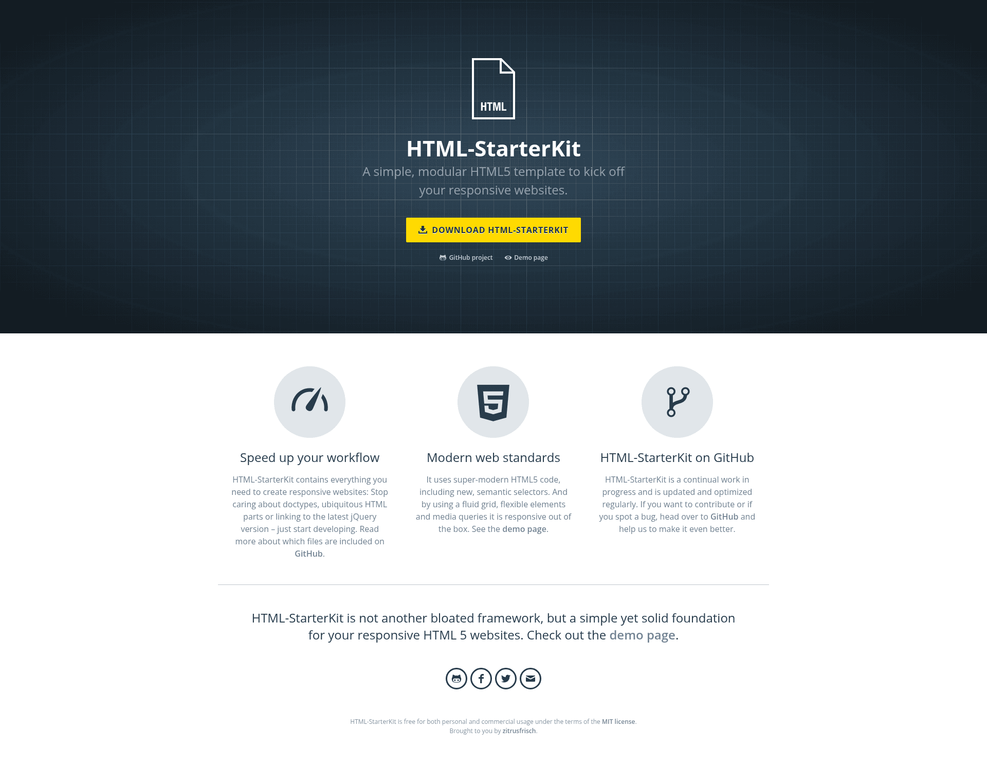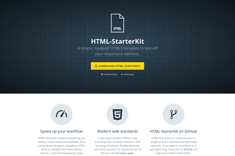
HTML-StarterKit is a free, MIT-licensed HTML5 boilerplate written in SCSS and based on the BEM naming convention, designed to speed up the start of responsive websites.
What is HTML-StarterKit?
HTML-StarterKit is a modular starter template that gives you a prebuilt index.html with common meta tags, compiled styles.css and styles.min.css, a functions.js for your own scripts, and an organized SCSS source folder. It runs in any modern browser and is maintained by zitrusfrisch, with the project homepage and a live demo at zitrusfrisch.de/html-starterkit. The template uses HTML5, SCSS, and a flexbox-based 12-column grid, and it is completely responsive out of the box.
Key Features
- SCSS source structure — The
scssfolder holds all styles, split into separate files per section and module, plus asettings.scssfor global settings and acorefolder for global styles; it includes Normalize CSS Reset and a set of mixins and functions. - BEM-based class names — Following the Block-Element-Modifier convention, classes like
grid__cellandgrid__cell--xxs-2keep the CSS readable and scalable. - 12-column flexbox grid — Wrap columns in a container with the class
grid, define each column withgrid__cell, and control widths at breakpoints fromxxstoxxxlusing classes such asgrid__cell--xxs-2; column spans range from 1 (default) to 12. - Grid offset classes — Add margins before or after a column with
grid__cell-offset-left--320-2andgrid__cell-offset-right--320-2for fine-tuned responsive layouts. - Custom form components — Version v4.2 introduced custom-styled select dropdowns, checkboxes, and radio buttons, as well as an optional sticky masthead.
- Utility classes — Spacing classes like
mt--s,mt--m,mb--lcontrol margin-top and margin-bottom; font-size and font-family utility classes were added in v4.1. - MIT license — Free for personal and commercial use; the source is publicly available on GitHub.
Who is it for?
- Front-end developers who want a ready-made HTML5/SCSS foundation with a grid system and BEM structure instead of hand-coding the same base files for every project.
- Web designers who need a customizable responsive grid with offset classes and predefined breakpoints to build page layouts efficiently.
- Agencies and teams that maintain multiple client sites and want a consistent, forkable starting point that can be adapted per project without licensing fees.
What can you do with HTML-StarterKit?
- Build responsive landing pages: Use the included
index.html, grid classes, and spacing utilities to assemble columns and sections without resetting browser defaults. - Style custom forms: Take advantage of the custom-styled select dropdowns, checkboxes, and radio buttons in v4.2 to match your design system.
- Prototype multi-breakpoint layouts: Experiment with
grid__cell--span classes and offset utilities to see how content behaves across small, medium, and large screens.
Pricing
HTML-StarterKit is free. It is released under the MIT license, so you can use it in personal and commercial projects without cost.
FAQ
Is HTML-StarterKit free?
Yes. HTML-StarterKit is released under the MIT license and is free for both personal and commercial usage. You can fork it and modify it as needed.
What is the latest version?
The latest release is version v4.4, published on 03.02.2023. It includes minor fixes and updates to the grid documentation.
Does HTML-StarterKit use a CSS framework?
No. It uses custom SCSS and a flexbox-based 12-column grid system, not a prebuilt CSS framework like Bootstrap. All styles are modular and based on BEM naming.
How do I use the grid?
Wrap columns in a container with the class grid, define each column with grid__cell, and specify the column span at different breakpoints using classes like grid__cell--xxs-2. Offsets are available via grid__cell-offset-left--320-2 and similar classes.