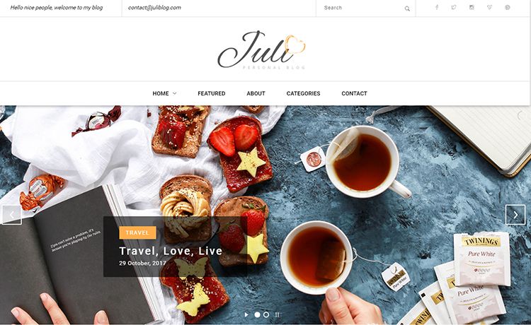
Juli is a free, open-source HTML5 blog theme created by Colorlib for building multi-page blogs with a full-screen image slider, multilevel dropdown navigation, and a right sidebar containing profile, category, subscription, and advertisement blocks.
What is Juli?
Juli is a free HTML5 blog theme distributed via ThemeWagon that outputs a complete multi-page blog website. The template accepts standard HTML, CSS, and JavaScript editing — it ships with 5 HTML files, multiple CSS files, 9 JS files, and demo images — and produces a static blog ready to host anywhere. It runs entirely in the browser on Bootstrap v4.0.0-alpha.6, Swiper, Layerslider, and jQuery v3.1.1, and is credited to Colorlib.
What makes Juli stand out?
- Full-screen image slider — A hero slider that spans the full viewport width, powered by Swiper and Layerslider, giving blog posts a visual showcase at the top of the page.
- Multilevel dropdown menu — The main navigation holds a multilevel dropdown structure, letting you organize posts into nested categories and subcategories.
- Right sidebar — Dedicated sidebar blocks for a profile bio, blog categories, email subscription form, latest posts, and advertisement slots.
- Instagram feed — An integrated Instagram feed block that displays a grid of recent images, useful for lifestyle and fashion blogs.
- Email subscription form — A built-in email subscription block lets visitors sign up for updates directly from the sidebar.
- Ghost buttons — Transparent, border-only buttons used throughout the theme for calls to action.
- On-hover effects — Interactive hover animations on images and cards to increase engagement.
- Circular progressbars — Animated circular progress indicators, often used to display skills or achievements in a blog author profile.
Who is it for?
- Lifestyle and beauty bloggers — Those who want a visually rich, slider-driven layout with social media integration to showcase photos and stories.
- Food and health bloggers — Use the category sidebar and email capture to organize recipes or wellness posts and grow a subscriber list.
- Indie writers and small publishers — Launch a multi-page blog without a CMS, using the five ready HTML files for static hosting.
- Designers and developers — As a starting point for custom blog templates, since it is open source and free for commercial projects.
What can you do with Juli?
- Fashion or travel bloggers: publish photo-heavy posts with a full-screen slider, Instagram feed, and circular progress bars to display stats like miles traveled.
- Yoga or wellness coaches: build a blog with an email subscription form in the sidebar to collect leads for classes or newsletters.
- Small media sites: create a multi-page publication with a right sidebar containing latest posts, categories, and advertisement blocks for ad revenue.
Pros and cons
Pros:
- Free and open source with lifetime updates.
- Can be used in commercial projects.
- Includes a full-screen slider, Instagram feed, and contact form UI.
- Compatible with all major browsers including mobile.
Cons:
- Built on Bootstrap v4.0.0-alpha.6, a pre-release version that lacks later Bootstrap 4 stabilizations.
- Last updated 3 years ago (as of the page), which suggests limited ongoing maintenance.
Pricing
Juli is free. The download is free, the source code is open, and the license permits commercial use with lifetime free updates. No premium tier is listed.
FAQ
Is Juli free to use?
Yes, Juli is a free HTML5 blog theme. The download costs nothing, and the license allows use in commercial projects without payment.
What frameworks and libraries does Juli use?
Juli is built on Bootstrap v4.0.0-alpha.6, Swiper, Layerslider, and jQuery v3.1.1. These handle the grid, sliders, and interactive components.
Can I use Juli commercially?
Yes, the theme is open source and can be used in commercial projects. The license permits free lifetime updates as well.
Does Juli include a contact form?
Yes, it includes a contact form UI design, though the form is presentational HTML/CSS and requires a backend service to actually send messages.
Does Juli support mobile devices?
Yes, the template is compatible with mobile browsers and is listed as responsive, consistent with Bootstrap's grid.