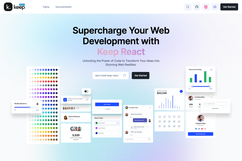
Keep React is an open-source component library for React.js that ships pre-designed Tailwind CSS components to speed up web application development.
What is Keep React?
Keep React is an open-source component library for React.js built on Tailwind CSS, maintained by StaticMania. It provides a collection of pre-designed UI components—such as the Button component shown in the usage example—that developers can import directly into their projects. The library runs in Vite or Next.js environments and outputs reusable React components styled with Tailwind CSS.
Key Features
- Tailwind CSS theme integration — The
keepThemefunction fromkeep-react/keepThemewraps your Tailwind config so components adopt your project's theme. - Multiple package managers — Installation supports npm, Yarn, and pnpm, making it easy to add to existing workflows.
- Vite and Next.js setup guides — The README includes step-by-step instructions for both Vite React applications and Next.js applications, including commands and config snippets.
- Phosphor React icons — Keep React depends on
phosphor-reactfor icons, included in the installation command. - Figma design files — Designers can access corresponding Figma files via Keep Design's website, enabling handoff between design and code.
- Open-source with contribution guidelines — The GitHub repository includes a contributing guide and lists a developer community; the repo has 1,430 stars.
Who is it for?
- React developers — speed up UI development by importing ready-made components rather than writing component code from scratch.
- Tailwind CSS users — get a cohesive set of components that already follow Tailwind's utility-first styling approach.
- Next.js developers — use the provided integration steps to add the library to a
create-next-appproject with Tailwind. - Design-conscious teams — align visual language across design and code by using the same component library and its Figma files.
What can you do with Keep React?
- Rapid prototyping: assemble a UI quickly by importing components such as the Button into a Vite or Next.js app.
- Consistent design systems: apply the same component set and theme across multiple projects to keep interfaces uniform.
- Community contribution: fork the repository and contribute new components or improvements via the contributing guide.
How does Keep React work?
Keep React is installed as an npm package and configured in three steps: add keep-react and phosphor-react to your project, wrap your Tailwind config with keepTheme, and import keep-react/css in your global stylesheet. After that, you can import any component from the library and use it like a regular React component, as shown in the example that imports Button.
Pricing
Keep React is open source and hosted on GitHub, meaning the source code is publicly available for anyone to use and modify. No paid tier or commercial licensing is mentioned in the repository.
Alternatives
- MUI (Material-UI) — a React component library that follows Google's Material Design guidelines.
- Ant Design — a React UI library offering enterprise-oriented components.
- Chakra UI — a React component library focused on accessibility and composability.
FAQ
Is Keep React free to use?
As an open-source project, Keep React's source code is freely available on GitHub. The repository does not list any paid plans, though the exact terms are defined in the linked license file.
How do I install Keep React?
Run npm i keep-react phosphor-react (or the Yarn/pnpm equivalents), then add the keepTheme wrapper to your Tailwind config and import keep-react/css into your global CSS file.
Does Keep React work with Vite?
Yes. The README provides a full Vite React application setup: create a Vite app, install Tailwind (with autoprefixer, postcss, and tailwindcss), then install and configure Keep React.
Does Keep React work with Next.js?
Yes. The README includes a dedicated Next.js installation section that walks through create-next-app with Tailwind, then installing Keep React and updating the config files.
What components are included in Keep React?
The documentation states the library offers a wide range of components, though the README's example specifically shows the Button component. Detailed usage and component examples are available at react.keepdesign.io.