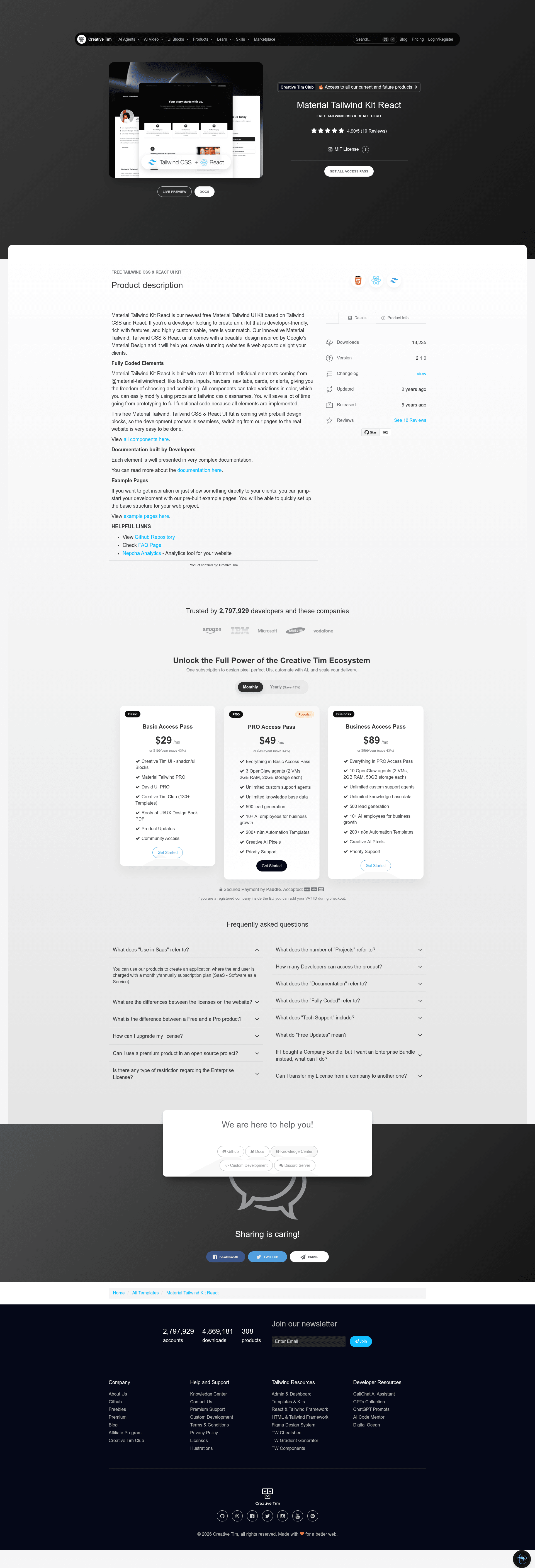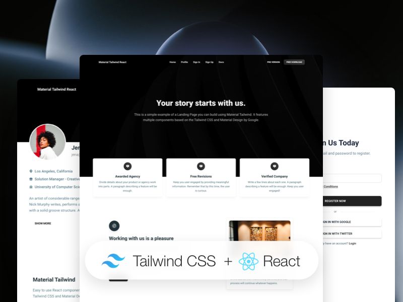
Material Tailwind Kit React is a free and open-source UI kit from Creative Tim that combines React, Tailwind CSS, and Google's Material Design into over 40 prebuilt components and four example pages.
What is Material Tailwind Kit React?
Material Tailwind Kit React is a free, open-source frontend UI kit produced by Creative Tim, built on the @material-tailwind/react component library, Tailwind CSS, and React. It takes a developer's React project and provides over 40 ready-coded interface elements — buttons, inputs, navbars, nav tabs, cards, alerts, and more — that can be customized through React props and Tailwind utility classes, and it outputs a set of example pages (home, profile, sign-in, sign-up) that can be used as the starting point for a website or web app. The kit runs on any Vite-based React setup; the included project uses Vite as its build tool.
Key Features
- 40+ Material Design components — Includes buttons, inputs, navbars, nav tabs, cards, and alerts, all implemented in @material-tailwind/react and ready to combine.
- Tailwind CSS customization — Each component accepts color variations and tailwind classnames via props, so styling changes don't require editing the library source.
- Prebuilt example pages — Ships with home, profile, sign-in, and sign-up pages under the demo at demos.creative-tim.com, giving a working skeleton for common landing/auth flows.
- Vite project structure — The download includes src with data, pages, widgets folders, plus App.jsx, main.jsx, routes.jsx, tailwind.config.cjs, and vite.config.js.
- Documentation on material-tailwind.com — Each element is documented on the Material Tailwind docs site (e.g., the button page) with installation and usage references.
- Nepcha Analytics integration — The template is integrated with Nepcha, an analytics tool, so you can track traffic sources on your deployed site.
- Open-source license — Released under Creative Tim's free license; the GitHub repository hosts issues, a changelog, and an issue template.
- Browser support — Officially supports the last two versions of Chrome, Firefox, Edge, Safari, and Opera.
Who is it for?
- React developers who need a head start on UI components and can import Material Tailwind components directly into an existing Tailwind project.
- Startup founders and freelancers building marketing or sign-up pages who want prebuilt home, profile, and authentication screens to launch quickly.
- Design-conscious developers who want Google Material Design aesthetics implemented in utility-first Tailwind CSS rather than a heavier component library.
What can you do with it?
- Build a landing page — Use the home example page and the kit's buttons, navbars, and cards to assemble a marketing site that matches Material Design patterns.
- Create authentication flows — Start from the included sign-in and sign-up pages, then wire them to your own backend or auth provider.
- Prototype an internal dashboard UI — Combine the data widgets, cards, and alerts from the src/data and src/widgets folders into a functional admin interface.
- Customize the theme — Modify tailwind.config.cjs and component props to adjust colors and spacing across the whole kit without touching the library internals.
How does it work?
Download the project from Creative Tim, install dependencies with npm install, yarn install, or pnpm install, then run the Vite dev server. The project is structured around a routes.jsx file that maps the example pages, so you can add or replace routes to create your own site. A one-click deploy to Genezio is also supported via the repository.
FAQ
Is Material Tailwind Kit React free?
Yes. The kit is described as a free Material Tailwind UI kit by Creative Tim and the repository is open source; it carries the "Free and Open Source" label in the project metadata and is distributed under Creative Tim's license.
What is the difference between Material Tailwind Kit React and Material UI?
The kit is built on @material-tailwind/react, a components library for Tailwind CSS and Material Design, not on Material-UI (MUI). It uses Tailwind utility classes for styling and is designed for Tailwind CSS users who want Material Design visual patterns.
Which frameworks does the kit support?
The React version runs on Vite and React. The README's version table lists only a React variant, so it is not intended for Vue, Angular, or Svelte out of the box.
Does the kit include any CSS or JS frameworks beyond Tailwind?
It includes Tailwind CSS and React, plus @material-tailwind/react and Hero Icons for SVG icons. The installation also references Nepcha Analytics for traffic insights.