Newsletter
Join the Community
Subscribe to our newsletter for the latest news and updates
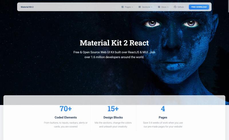
Free open-source ReactJS UI kit built on Material UI with 45 page sections, 80+ components, and 4 example pages.
Starter repository for integrating shadcn/ui with Next.js in an Nx monorepo
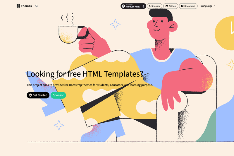
Open Source Bootstrap Themes for everyone.
A one-click starter project for Next and Netlify
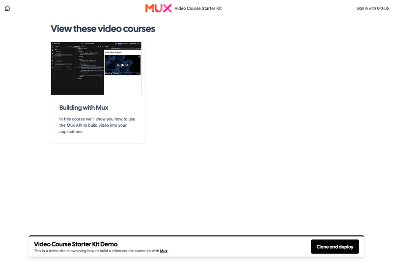
A starter template to help create a video course with Mux + Next.js
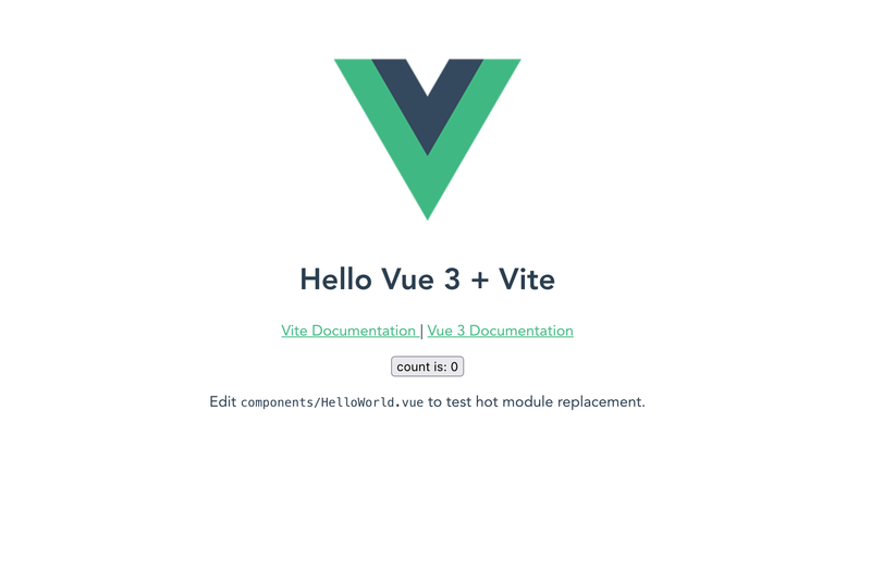
A minimal Vue 3 + Vite starter template from Vercel's boilerplate examples, deployable with one click or via the Vercel CLI.
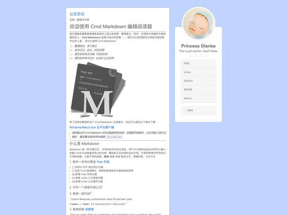
A simple and customizable Jekyll theme for personal blogs and static websites.
MaterialKit2 React is a free, open-source UI kit from Creative Tim for building responsive ReactJS interfaces with Google's Material UI design system.
MaterialKit2 React is a free and open-source web interface framework built on ReactJS and Material UI (MUI), distributed by Creative Tim through ThemeWagon. It takes design components and page sections as building blocks and outputs a responsive ReactJS front-end with consistent Material Design styling. The kit includes 45 page sections, 20+ attention catchers, 80+ elements, 50+ input areas, and 4 pre-built example pages for company presentations, landing pages, blogs, and support. Version 1.0.0 was released two years ago and updated three months ago.
MaterialKit2 React is free and open-source. It can be used in commercial projects and includes lifetime free updates.
Yes, it is free to download from ThemeWagon, open source, and can be used in commercial projects. You will need to provide an email address to receive the download link.
It is built on ReactJS and Material UI (MUI). The download includes JavaScript source files, all demo images, and required libraries and plugins.
Yes, the kit includes a full documentation page that explains how to use the components and sections.
It contains 45 page sections, 20+ attention catchers (alerts, tooltips, popovers, notifications, modals), 50+ input areas (newsletters, contact sections, forms, inputs), navigation styles (navbars, nav tabs, pagination), and 80+ elements like avatars, buttons, dropdowns, tables, toggles, social buttons, breadcrumbs, badges, progress bars, and typography.
Yes, it is fully responsive and mobile-friendly, working on any screen size, and is cross-browser compatible with Chrome, Edge, Firefox, Opera, Safari, and mobile devices.