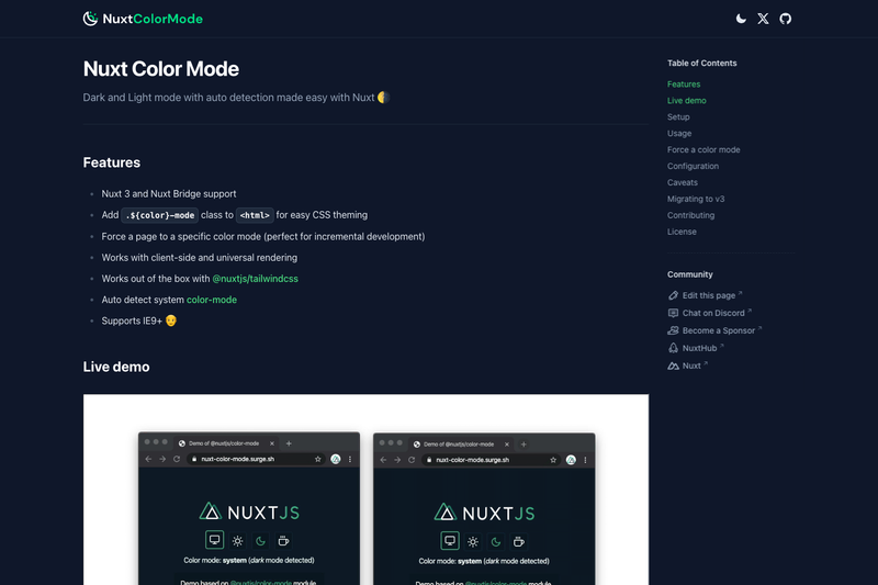
Nuxt Color Mode is a free, open-source Nuxt module that gives Nuxt applications automatic dark and light color mode support with system preference detection. Developed by the Nuxt team and published as @nuxtjs/color-mode, it adds a color class to the html element so you can theme your app with CSS, Tailwind, or any styling solution.
What is Nuxt Color Mode?
Nuxt Color Mode is a Nuxt module that handles light/dark theme switching for Nuxt 3+ projects. It takes your Nuxt app as input and outputs the active color mode as a class on the html element, for example .dark or .light. The module requires no mandatory configuration: after installation, it automatically detects the user's system color preference via the prefers-color-scheme media query and applies the appropriate class. It is built for client-side and universal (SSR) rendering, and it is published under the MIT License by the Nuxt team.
Key Features
-
Automatic html class injection — The module adds a class such as
.darkto the html element, so you can write CSS rules likehtml.dark { ... }and everything themes accordingly. -
System preference detection — Uses the CSS media query
prefers-color-schemeto detect whether the user prefers a light or dark scheme, and applies it automatically without any JavaScript on your part. -
Per-page forcing — You can force a specific page to render in a fixed color mode, which is useful when a landing page or a component has a fixed design.
-
Universal rendering support — Works with both client-side rendered and server-rendered Nuxt apps, so the correct class is present in the initial HTML to avoid a flash of the wrong theme.
-
Nuxt 3+ compatibility — Version 4 of
@nuxtjs/color-modetargets Nuxt 3 and later; the previous version for Nuxt 2 remains available at v2.color-mode.nuxtjs.org. -
Online playground and live demo — You can try the module in a StackBlitz playground or see it live at color-mode.nuxt.dev without setting up a local project.
Who is it for?
Nuxt Color Mode is for developers who build applications with Nuxt and want theme switching with minimal code. It is especially useful for:
-
Nuxt application developers — Add dark mode by installing the module, adding it to the modules array in nuxt.config, and writing a few CSS rules.
-
UI/component library authors — Use the injected html class to drive design tokens and component themes across a library without duplicating logic.
-
Sites with brand-specific themes — Force a fixed color mode on specific pages or sections during development or for pages that should never change.
What can you do with it?
-
System-aware theming — Automatically show a dark theme to users whose OS is in dark mode, and a light theme to everyone else, then optionally add a manual toggle that persists.
-
Incremental dark mode rollout — Force a page to a specific color mode during development to check how the design looks before enabling automatic switching for the whole site.
-
Server-side rendered theme class — Because the class is on the html element during SSR, the theme is correct in the first paint, which improves perceived loading and avoids theme flicker.
How does it work?
After you install @nuxtjs/color-mode and register it in the modules array of nuxt.config, the module reads the user's system preference and sets the appropriate class on the html element. It also exposes a small API for getting, setting, and toggling the color mode from your components, and it persists the user's selection so it survives page reloads.
FAQ
Does Nuxt Color Mode work with Nuxt 2?
No. Version 4 of @nuxtjs/color-mode requires Nuxt 3 or later. For Nuxt 2, use the older version documented at v2.color-mode.nuxtjs.org.
Is Nuxt Color Mode free?
Yes, the module is open source and released under the MIT License, so you can use it in personal and commercial projects at no cost.
How do I install Nuxt Color Mode?
Install the npm package @nuxtjs/color-mode and add it to the modules array in your nuxt.config file. No further configuration is required for basic dark/light mode to work.
Can I force a page to a specific color mode?
Yes. The module lets you force a page to a specific color mode, which is handy for incremental development or for pages with a fixed visual design.
What versions of Nuxt are supported?
Version 4 supports Nuxt 3 and later. Earlier versions of the module supported Nuxt 2 and are still documented in the v2 docs.