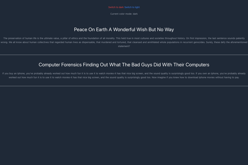
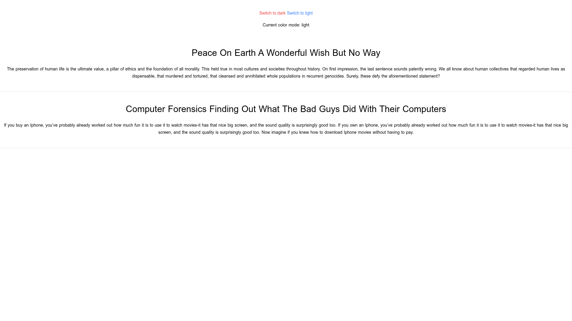
Nuxt Tailwind Typography Darkmode Boilerplate is a minimal Nuxt 2 starter project that demonstrates how to combine @nuxtjs/tailwindcss, @tailwindcss/typography, @nuxtjs/color-mode, and @nuxt/content in one working setup.
What is Nuxt Tailwind Typography Darkmode Boilerplate?
This boilerplate is a Nuxt v2 project configured with four specific packages: @nuxtjs/tailwindcss (v2.1+ with JIT enabled) for Tailwind CSS integration, @tailwindcss/typography for prose styling, @nuxtjs/color-mode for light/dark theme switching, and @nuxt/content for Markdown-based content. The repo was created to accompany a Stack Overflow question about configuring @nuxt/tailwind with typography and dark mode, so it serves as a runnable reference implementation. The output is a small Nuxt site where content is rendered with typographic styles and a dark mode toggle works out of the box.
What makes this boilerplate stand out?
This starter answers a specific, recurring configuration problem in one place, which makes it a useful reference rather than a full-featured template. The key details are visible in the repository metadata:
- Nuxt v2 base — Uses the stable Nuxt 2 framework, meaning the module paths and config are known to work with that major version.
- @nuxtjs/tailwindcss v2.1+ — The Tailwind CSS module is configured with Just-In-Time compilation enabled, so the generated CSS is limited to the classes actually used.
- @tailwindcss/typography — Adds the
proseclass family to Tailwind, allowing Markdown content to receive default typographic spacing and sizes without custom CSS. - @nuxtjs/color-mode — Handles dark mode by detecting the system preference and letting users switch manually; it stores the selection and applies the correct class to the html element.
- @nuxt/content — Provides a file-based content layer so you can write Markdown in the
content/directory and query it in Nuxt components. - Vercel topic — The repository metadata lists
vercelas a topic, suggesting the starter is ready or intended to be deployed to Vercel's platform.
Who is this boilerplate for?
Developers migrating an existing Nuxt site to dark mode can use this repo to see the exact module combination that makes Tailwind typography react to a theme switch. Nuxt beginners who are following the Stack Overflow question get a working example to clone instead of re-assembling configuration from prose answers. Content-focused projects using @nuxt/content benefit because the typography plugin ensures Markdown renders cleanly in both light and dark backgrounds.
What can you do with this boilerplate?
- Clone and run a Nuxt 2 project that already has dark mode and typography configured, saving setup time.
- Compare module versions — the package configuration shows that Tailwind CSS module v2.1+ with JIT is a compatible combination with color-mode and typography.
- Extract the configuration pattern — you can copy the nuxt.config.js module list and tailwind.config.js settings into your own Nuxt project without copying the rest of the starter.

![Image for TacoDAO [UI] on template0.com](https://cdn.sanity.io/images/asuw607r/production/e1ee34c0af73c2ebfc8aae0b0180cb45a7a8b8db-1500x1000.png?w=800&auto=format "Image for TacoDAO [UI] on template0.com")