Newsletter
Join the Community
Subscribe to our newsletter for the latest news and updates

A Tailwind CSS plugin providing over 30 ready-to-use UI components, from buttons to modals, styled with simple class names.
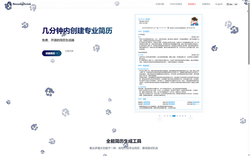
Free open-source online resume builder with Markdown support, PDF export, and browser-local data storage.
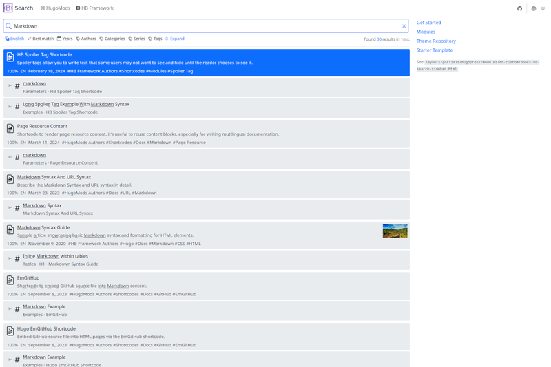
The HB search theme adds search functionality to Hugo sites built with the HB framework.
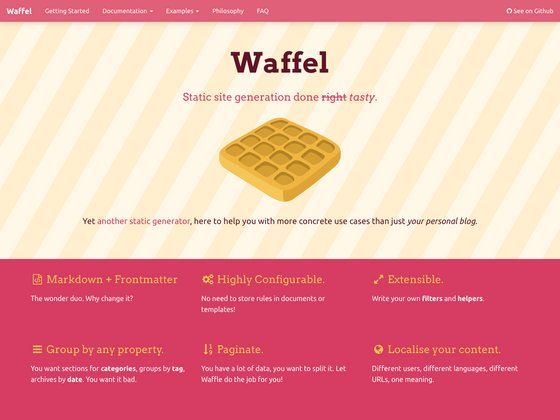
Node.js static site generator for Brunch with Nunjucks templates and YAML front matter.
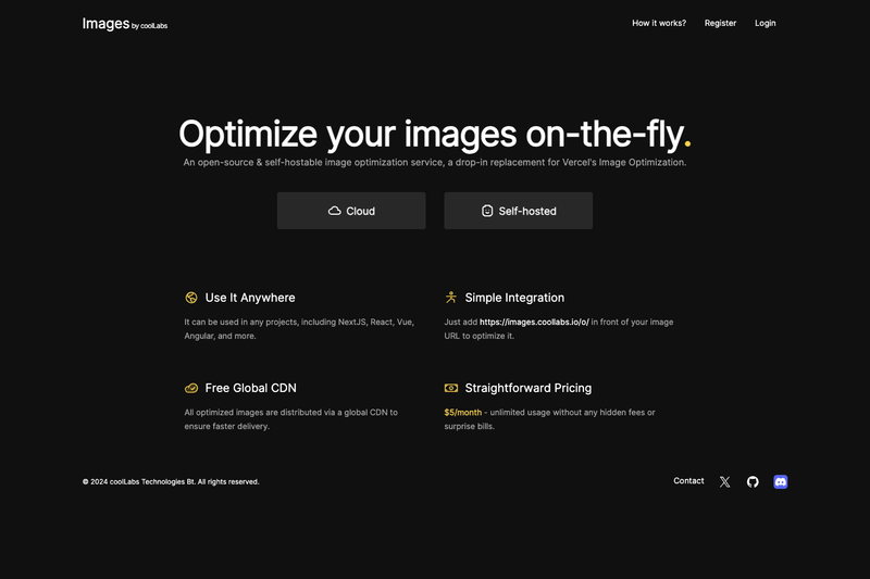
Self-hostable image optimization service for Next.js — a drop-in replacement for Vercel's Image Optimization with a free cloud CDN.
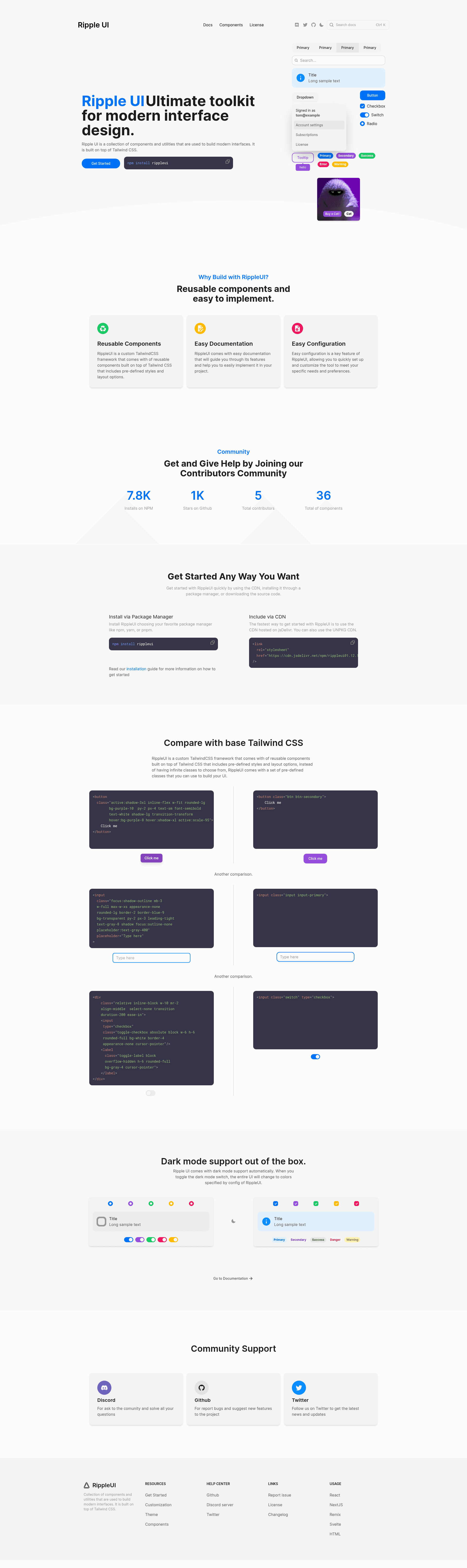
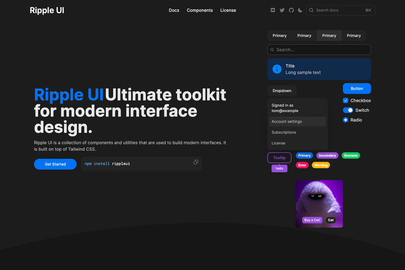
Ripple UI is a Tailwind CSS plugin that provides over 30 ready-to-use UI components, such as buttons, modals, and forms, styled with simple class names.
Ripple UI is an open-source npm package (rippleui) that extends Tailwind CSS with a library of pre-styled components. It accepts a Tailwind-config-based input (installed via npm install rippleui and registered as a plugin in tailwind.config.js) and outputs CSS classes that style raw HTML markup. The repository is maintained by Siumauricio, has 1043 stars, and is licensed under MIT. Official documentation lives at https://ripple-ui.com.
<button class='btn-primary btn'>, keeping markup familiar to Tailwind users.btn combined with btn-primary or other modifiers to create various button styles without writing CSS.After installing the package with npm install rippleui, you register it as a plugin in your Tailwind configuration:
module.exports = {
  plugins: [require('rippleui')],
};Then use the component classes directly in your HTML, like <button class='btn-primary btn'>. The plugin generates the necessary styles during the Tailwind build.
Yes, Ripple UI is released under the MIT License, so it can be freely used in personal and commercial projects without fee.
Run npm install rippleui in your project, then add require('rippleui') to the plugins array in your tailwind.config.js.
The official documentation is available at https://ripple-ui.com.
It includes over 30 pre-built components, such as Button, Input, Modal, Navbar, Table, Card, Accordion, Tabs, and more, with further components planned.
Yes, the project welcomes contributions. You can open a pull request with proposed changes for new components or improvements.