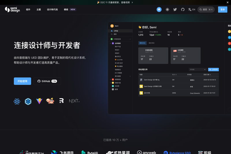
Semi Design, also released as the @douyinfe/semi-ui npm package, is an open-source React UI library and design system from ByteDance's DouyinFE team that provides 80+ components and a 3,000+ token theming engine. It takes design tokens and Figma designs as inputs and produces React components, cross-theme Figma UI kits, and generated code, running in any React 16+ project. The library is MIT-licensed, written in TypeScript, supports server-side rendering (SSR), and is maintained by the DouyinFE team with stable updates since 2019.
What is Semi Design?
Semi Design is a React UI library and design system that connects DesignOps and DevOps. It provides a collection of 80+ high-quality components, a Design System Manager (DSM) with 3,000+ design tokens, and official Figma plugins for Design to Code (D2C) and Code to Design (C2D). The npm package @douyinfe/semi-ui is the core distribution, and the project lives on GitHub under the DouyinFE/semi-design repository.
Key Features
- 80+ React components — A component library covering forms, navigation, data display, feedback, and layout, with stable updates since 2019.
- Design to Code (D2C) — A Figma plugin converts selected layers into real code, outputting JSX + SCSS, Emotion, Tailwind, or JSON Schema DSL.
- Code to Design (C2D) — Automatically generates a Figma UI Kit matching your code theme to keep design and code in sync.
- Semi DSM — A design system manager with 3,000+ design tokens that lets you define custom themes and sync them between Figma and code.
- Accessibility — All components follow W3C standards for keyboard interaction, focus management, and ARIA.
- Internationalization — Locale support for dozens of languages, timezone handling, and RTL (right-to-left) layouts.
- Quality assurance — Unit, E2E, and visual testing via Cypress and Chromatic are part of the project's CI pipeline.
- Tech stack — Written in TypeScript on a Foundation/Adapter architecture, compatible with SSR and web components.
Who is it for?
- React developers — Build enterprise web apps with pre-built, accessible components and a consistent design language.
- DesignOps teams — Use DSM and the Figma plugin to translate design tokens into themes and generate UI kits without hand-off gaps.
- Product teams at scale — Standardize on a single design system across dozens of projects, with internationalization and theming out of the box.
- Teams building SDKs or browser extensions — Leverage the web-component adaptation solution for DOM-isolated scenarios.
What can you do with Semi Design?
- Convert Figma drafts to code — Install the Semi Figma plugin, select a layer, and get JSX + SCSS, Emotion, Tailwind, or JSON Schema DSL in seconds.
- Create a custom design system — Use Semi DSM to configure 3,000+ design tokens and generate a theme that syncs between Figma and code.
- Build a React app UI — Import components like Button and Form from
@douyinfe/semi-uiand quickly compose forms, tables, and other interfaces. - Maintain design/code consistency — Run Code to Design to regenerate the Figma UI Kit whenever your theme changes.
How does Semi Design work?
Install the library via npm, yarn, or pnpm (npm install @douyinfe/semi-ui), then import components into a React app. For design-to-code, install the Semi Figma plugin, select a layer in Figma, and copy the generated code or open it in CodeSandbox for further editing. Design tokens defined in DSM are consumed by both the React components and the Figma plugin.
Alternatives
- Ant Design
- Material UI
FAQ
Is Semi Design free?
Yes, Semi Design is open-source and MIT-licensed. The npm package @douyinfe/semi-ui is free to use, and the source code is available on GitHub.
Does Semi Design support TypeScript?
Yes, all components are written in TypeScript, so static type support comes with the package. The component architecture follows a Foundation/Adapter pattern designed for readability and contribution.
What is Semi DSM?
Semi DSM (Design System Manager) is a tool within Semi Design that provides more than 3,000 design tokens for configuring every detail of a theme. It lets you define your own design system and keeps Figma and code in sync.
How does the Figma Design to Code plugin work?
The official Semi Figma plugin supports Figma Dev Mode: select a layer and get the corresponding code immediately on the right panel. It outputs formats including JSX + SCSS, Emotion, Tailwind, or JSON Schema DSL, and you can jump to CodeSandbox to continue editing.
What browsers does Semi Design support?
Semi Design supports the latest two versions of Chrome, Firefox, and Safari, plus Edge and Electron latest two versions.