
Template details
BUI
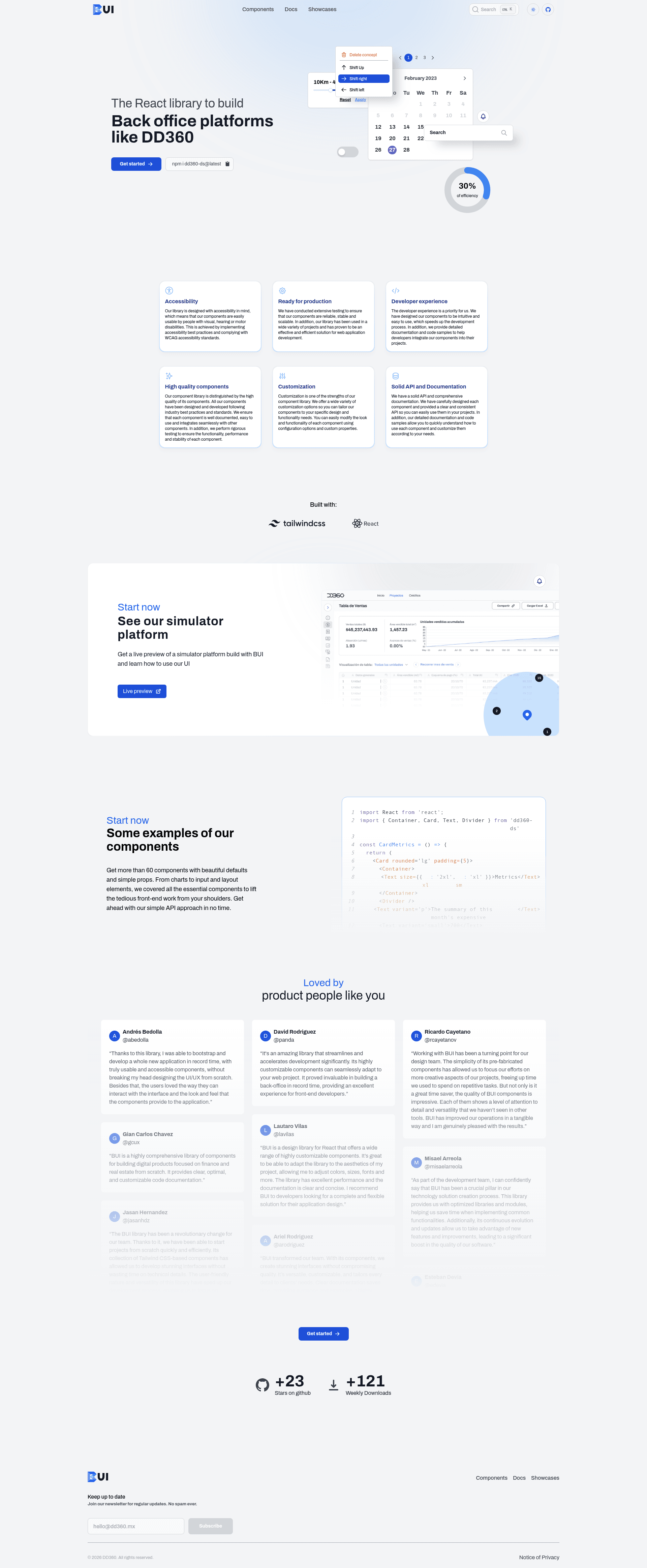
BUI: Tailwind based React component library to build back-office platforms
About this template
BUI is a React component library for building back-office platforms, published on npm as dd360-ds and maintained by DD360.
What is BUI?
BUI is a React ecosystem library specifically created for building back-office platforms, with the package name dd360-ds. It provides prebuilt, reusable UI components such as Button, styled with Tailwind CSS, so developers can assemble admin dashboards and internal tools faster. The library runs inside any React application and outputs styled, responsive interfaces; it was created by developers at DD360 and is open sourced on GitHub under dd3tech/bui.
Key Features
- Tailwind CSS foundation — BUI's components are built on Tailwind, and the library ships a precompiled stylesheet
dd360-ds/dd360.cssthat you import once in your app entry point. - ThemeProvider with createTheme — Import
createThemeandThemeProviderfromdd360-ds/themeto define a custom palette, including primary and secondary colors, and wrap your app to apply the theme globally. - Simple installation — Install with
npm install dd360-dsoryarn add dd360-ds, then import individual components like Button directly fromdd360-ds. - TypeScript support — According to the repository metadata, BUI is written in TypeScript, giving you typed props and better editor autocompletion.
- Open source under MIT — The library is free to use, and the source code is available on GitHub under the MIT license.
- Storybook documentation — A Storybook environment is hosted on Chromatic, letting you browse and test components interactively.
- StrictMode compatible — The setup example wraps the app in React's StrictMode alongside ThemeProvider, indicating compatibility with modern React development practices.
Who is it for?
- React developers building back-office platforms — Use BUI to get a ready-made set of components like Button instead of writing custom CSS and markup for every admin screen.
- Product and engineering teams at companies such as DD360 — Standardize UI consistency across internal tools by centralizing theme settings in createTheme.
- Developers who prefer Tailwind-based design systems — Since components are styled with Tailwind, visual consistency is easy to maintain, and the built-in theme provider adapts colors across all components.
What can you do with BUI?
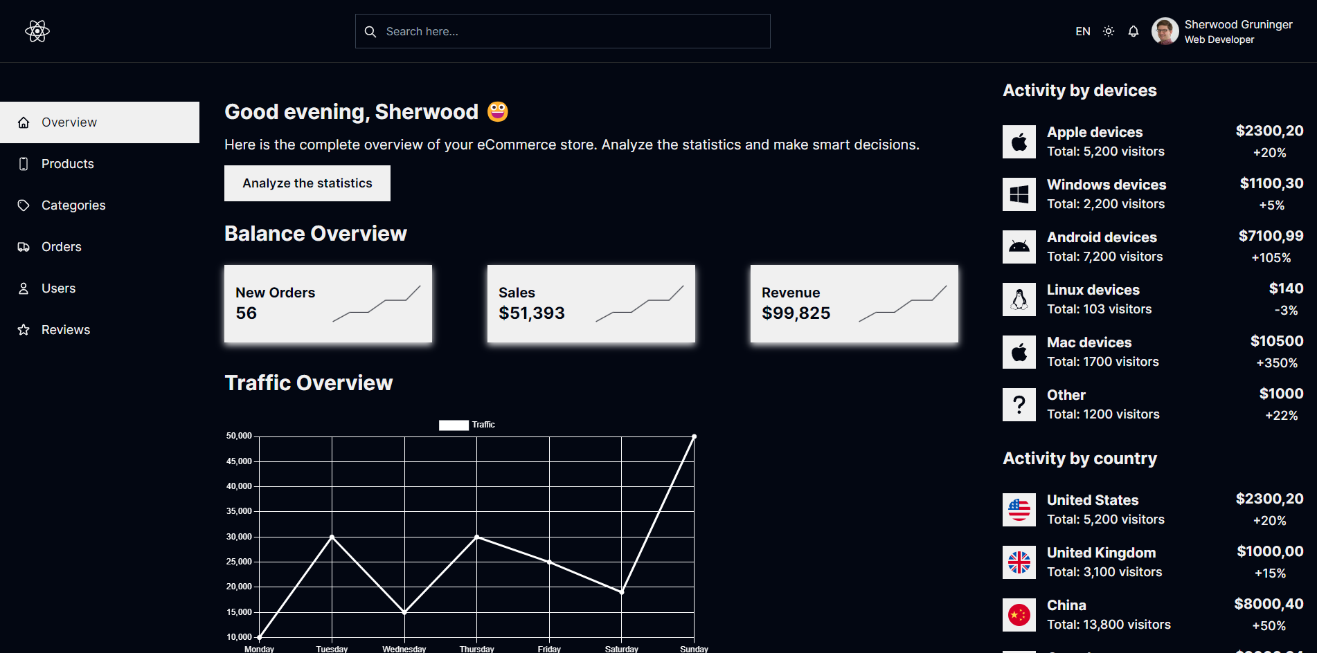
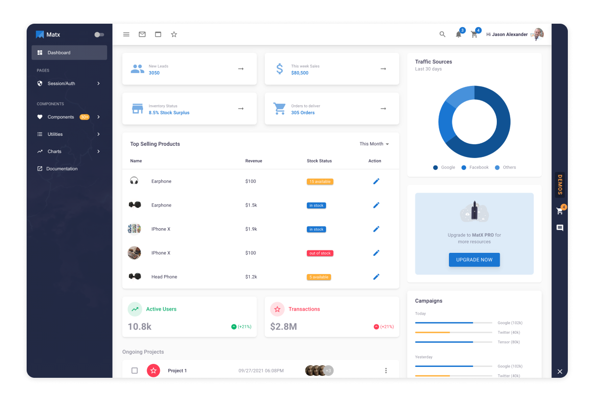
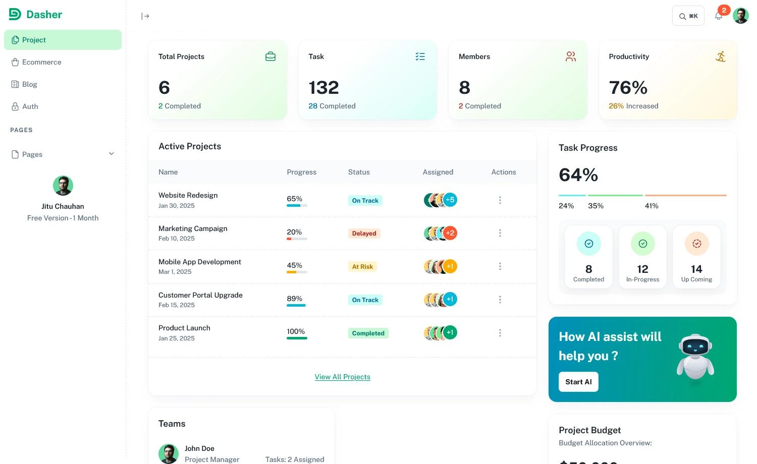
- Build admin dashboards: Import BUI components and wire them together into screens; wrap your app in ThemeProvider to apply a consistent color scheme across all pages.
- Customize branding: Use createTheme with a configuration object that sets primary and secondary colors (for example, purple and amber) so every button, input, and card reflects your brand.
- Combine with other CSS: The README instructs importing
dd360-ds/dd360.cssas the last stylesheet, so BUI styles cleanly override earlier styles when mixing with other frameworks.
How does BUI work?
After installing the package with npm or yarn, import dd360-ds/dd360.css at the top of your app. Then import components from dd360-ds and use them in JSX. If you want theming, call createTheme with your palette, pass the result to ThemeProvider, and wrap your application root.
Pricing
BUI is free and open source under the MIT license, with no paid tiers or usage fees.
Alternatives
- Ant Design — a React UI library also focused on enterprise and admin interfaces.
- Material UI — a popular React component library implementing Google's Material Design.
FAQ
Is BUI free?
Yes, BUI is released under the MIT license, so you can use it in personal and commercial projects without paying licensing fees.
How do I install dd360-ds?
Run npm install dd360-ds or yarn add dd360-ds. Then import the bundled stylesheet with import 'dd360-ds/dd360.css' and bring in components like Button from the package.
Can I customize the color theme?
Yes, import createTheme and ThemeProvider from dd360-ds/theme. Pass a palette object with primary and secondary colors to createTheme, provide that theme to ThemeProvider, and wrap your app so all BUI components adopt the custom colors.
Do I need my own Tailwind setup?
No, BUI includes its own compiled CSS. You only need to import the dd360.css file; no separate Tailwind configuration is required.
Where are the BUI docs?
The documentation is available at the BUI website and on GitHub via the bui-docs repository. A Storybook instance is also accessible through the Chromatic link in the repository.