Newsletter
Join the Community
Subscribe to our newsletter for the latest news and updates

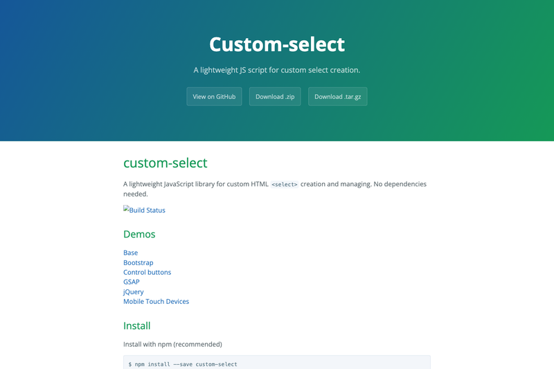
A lightweight JavaScript library for custom HTML <select> creation and managing. No dependencies needed.
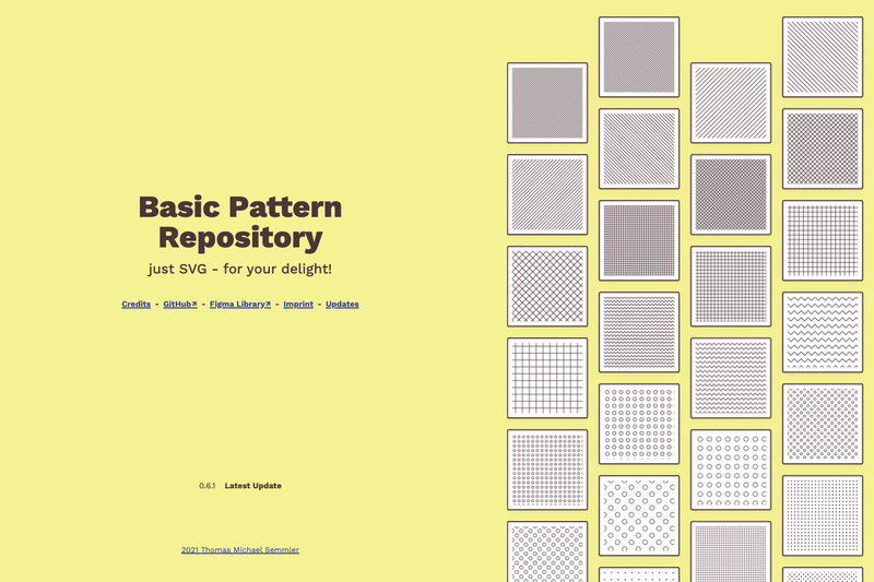
A collection of hand-made, tileable SVG patterns for inline use, with copy-paste snippets, downloadable files, and a JSON API.
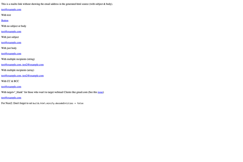
Nuxt component to protect email from spam-bots without sacrificing usability.
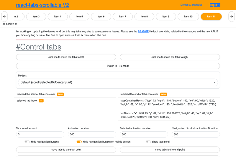
A React scrollable tabs component with RTL support, scroll modes, and TypeScript typings.
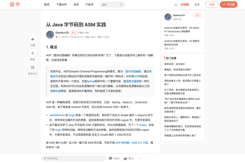
A Java/Android AOP library that logs method arguments, return values, and execution time using ASM bytecode manipulation.
Custom Select is a lightweight, dependency-free JavaScript library that transforms native HTML <select> elements into fully styleable custom dropdowns while keeping the underlying native select in the DOM for value and form sync.
Custom Select is an open-source browser library (published on npm as custom-select) that takes native <select> elements as input and produces a configurable custom dropdown UI — a container div, a span opener, a panel div, and option divs — while preserving the native select's value, disabled state, and change events. It accepts a CSS selector, an HTMLElement, or a list of elements (NodeList, HTMLCollection, or Array) and returns an array of instances with methods and properties for full programmatic control. The project is maintained on GitHub with 100 stars and includes demos hosted on CodeSandbox.
require('custom-select').default), or a plain <script> tag.containerClass, openerClass, panelClass, optionClass, optgroupClass, isSelectedClass, hasFocusClass, isDisabledClass, isOpenClass) can be renamed through pluginOptions, leaving no styling locked in.open, disabled, and value read and set state on both the custom UI and the native select; methods append, insertBefore, remove, empty, and destroy manage options and optgroups at runtime.custom-select:open, custom-select:close, custom-select:disabled, custom-select:enabled, and custom-select:focus-outside-panel, while the native select still fires its standard change event.$('#mySelect').customSelect() and access the same features through string commands.append, insertBefore, remove, and empty to add or delete options and optgroups after initialization, and the custom panel updates automatically to mirror the native select.custom-select:open and custom-select:close events on the container, or intercept custom-select:focus-outside-panel to animate scrolling instead of the default jump.Calling customSelect('select') wraps each matching native <select> in the generated container/opener/panel markup, then rebuilds the panel options from the native <option> and <optgroup> elements. The returned array holds instance objects; setting value, open, or disabled on an instance synchronously updates both the custom UI and the hidden native select, which keeps form behavior intact.
.default suffix when requiring the package.Run npm install --save custom-select, or download the minified build from the GitHub releases page. For ES6 use import customSelect from 'custom-select'; for CommonJS use var customSelect = require('custom-select').default.
No. The core custom-select package has zero dependencies. A separate jQuery-adapted build is available in the release downloads for projects that prefer the $('#mySelect').customSelect() syntax.
Every class name in the generated markup is configurable through the pluginOptions object, so you can supply your own class names and write completely custom CSS. A basic custom-select.css file is included in releases as a starting point.
Chrome, Safari 7.0, Firefox 10, Android 4.0, Mobile Safari 6.0, and Internet Explorer 10 are the supported browsers listed in the project docs.
The init call returns an array of instances, so use customSelect('select')[0]. You can also read the customSelect property on the native select element or on the generated container div (for example, document.querySelector('select').customSelect).