Newsletter
Join the Community
Subscribe to our newsletter for the latest news and updates

A React scrollable tabs component with RTL support, scroll modes, and TypeScript typings.
Deprecated Nuxt.js module providing reactive ResizeObserver-based breakpoints via $breakpoints.
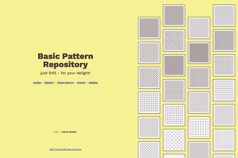
A collection of hand-made, tileable SVG patterns for inline use, with copy-paste snippets, downloadable files, and a JSON API.
Nuxt component to protect email from spam-bots without sacrificing usability.
A lightweight JavaScript library for custom HTML <select> creation and managing. No dependencies needed.
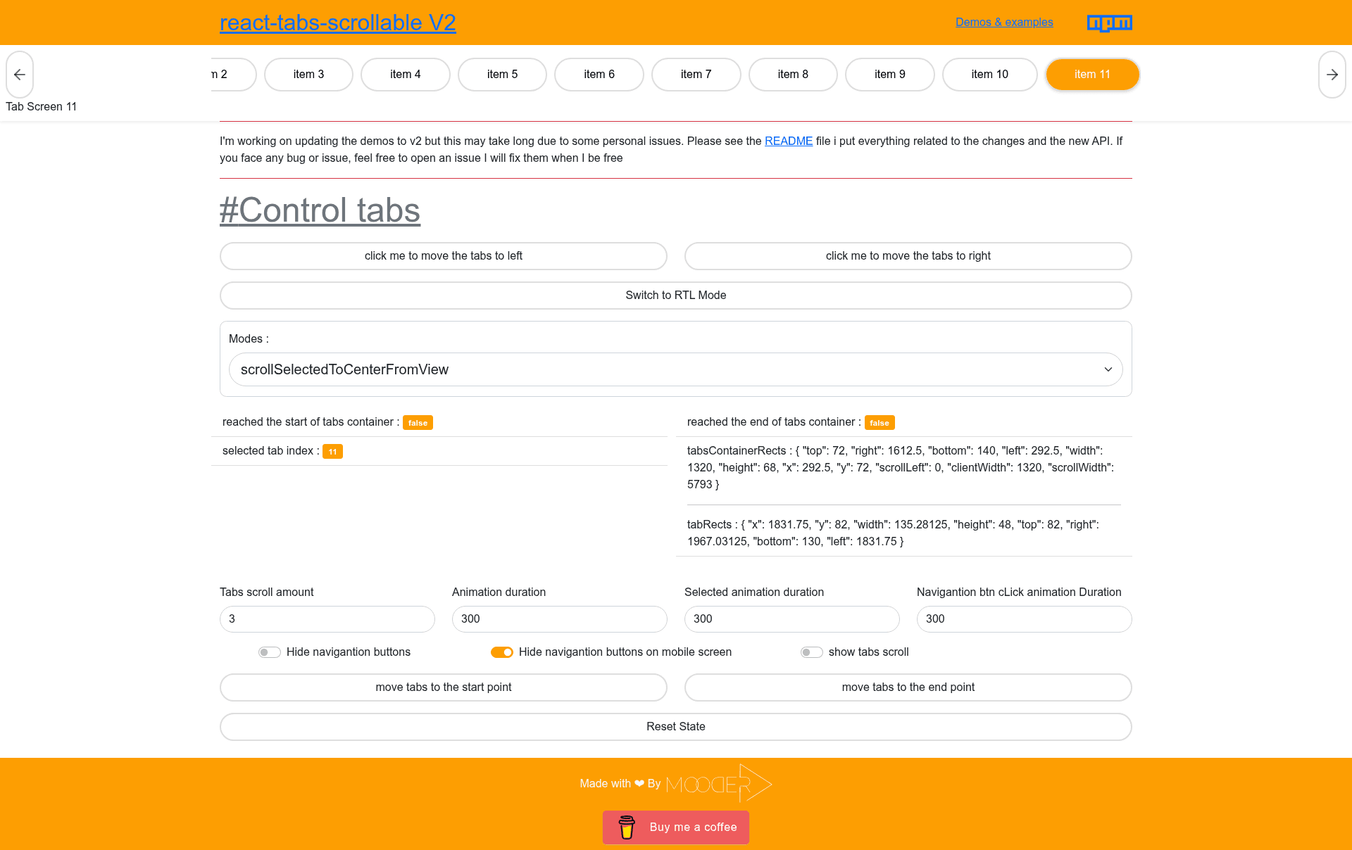
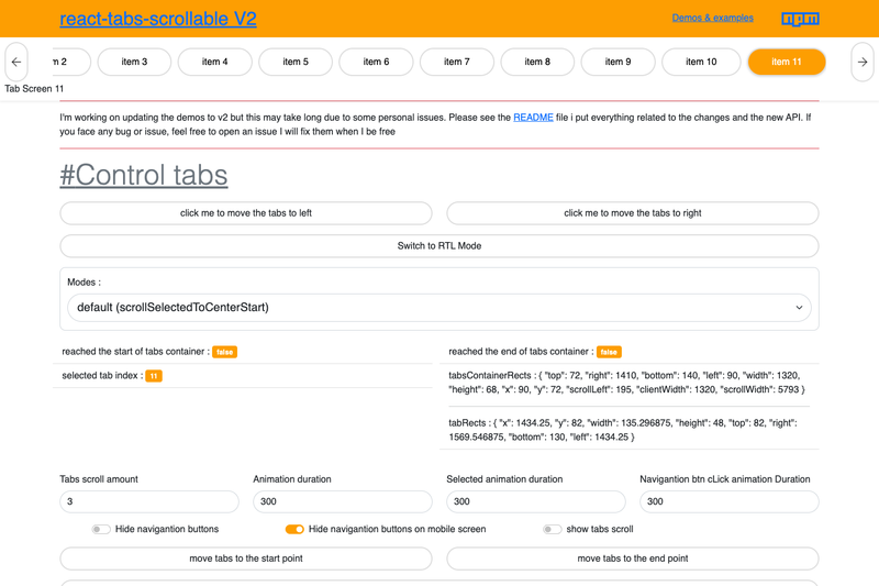
React Tabs Scrollable is an open-source React component library that renders scrollable tab bars with built-in RTL support, four configurable scroll modes, and a gzipped size of 3.9 kB.
React Tabs Scrollable provides three components — Tabs, Tab, and TabScreen — that together build scrollable tab navigation for React applications. It takes an activeTab index and an onTabClick callback as required props, and renders an accessible, horizontally scrollable tab strip with optional left/right navigation buttons. The library is built with TypeScript, ships with a CSS file (rts.css) you can edit, and is published on npm by developer Mood-al.
isRTL to true to flip the tab direction for right-to-left languages; this was the original motivation for the library.scrollSelectedToStart (default), scrollSelectedToCenter, scrollSelectedToEnd, or scrollSelectedToCenterFromView to control how the selected tab is positioned in the viewport.tabAs and navBtnAs.className and style props, and refs are available for the tabs container, each tab, and both nav buttons.action ref exposes goToStart(), goToEnd(), onLeftNavBtnClick(), and onRightNavBtnClick() methods.TabScreen component to pair tab buttons with content panels that appear when the matching activeTab is selected.Tabs and Tab to create scrollable menus, category lists, or dashboard tabs without writing custom scroll logic.isRTL prop handles right-to-left layout out of the box, which is rare in similar components.hideNavBtnsOnMobile and rely on touch scrolling.Install the package with npm install --save react-tabs-scrollable or yarn add react-tabs-scrollable, then import Tabs and Tab and include the rts.css file. Pass an activeTab state value and an onTabClick handler that updates that state; the component scrolls the selected tab into view based on the chosen mode. The action ref can invoke navigation methods programmatically, and TabScreen components display content linked to the active tab index.
Yes, it is open source and published on npm under a standard open-source license. You can use it in personal and commercial projects, and the GitHub repository accepts feature requests and contributions.
Set the isRTL prop to true on the Tabs component. The library was originally built because of RTL support, so the scrolling direction and navigation buttons flip automatically to match right-to-left languages.
mode prop do?The mode prop controls how the selected tab is scrolled into view. The four options are scrollSelectedToStart, scrollSelectedToCenter, scrollSelectedToEnd, and scrollSelectedToCenterFromView. The default is scrollSelectedToStart; the last mode only scrolls when the clicked tab is outside the center area.
Yes. Pass a ref to the action prop and then call ref.current.goToStart(), ref.current.goToEnd(), ref.current.onLeftNavBtnClick(), or ref.current.onRightNavBtnClick() from your own buttons or logic.
Yes, the TabScreen component pairs with Tabs. Give it the same activeTab value and an index that matches a tab's index; it shows its children only when that tab is active. You can also pass a custom className for entrance animations.