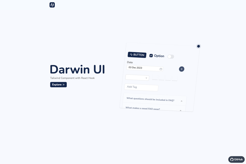
Darwin UI is a React component library built with Tailwind CSS that provides 17 reusable, hook-powered UI components to speed up front-end development.
What is Darwin UI?
Darwin UI is a collection of common React components created with Tailwind CSS to speed up development. It takes React components as its building blocks and outputs styled, hook-based UI elements that you can drop into a React or Next.js application. The project is hosted on GitHub under the topics nextjs, tailwindcss, and ui-components, with 8 stars at the time of writing.
Key Features
- 17 implemented components — Includes Button, Datepicker, Checkbox, FAB, Switch, Dropdown, OTP input, Add Tag, Accordion, Card, Ticket Card, Modal, Tags, Drawer, Input Mask, On Scroll, and Radio button, each with Tailwind styling.
- React Hooks architecture — Component behavior such as open/close states and input masking is powered by React Hooks, as stated in the repository description.
- Tailwind CSS utility styling — All components use Tailwind CSS classes, so you can customize them by editing utility class names or extending your Tailwind config.
- Input Mask component — A dedicated component for formatting text inputs like phone numbers or credit card numbers.
- On Scroll component — A component for triggering interactions when the user scrolls, useful for animations or lazy loading.
- OTP input — A one-time password field designed for authentication and verification flows.
- Next.js compatibility — The GitHub topics include nextjs, signaling that the components work in Next.js projects.
- Extended roadmap — Planned components include Tooltips, Pagination, Tab bar, Credit Card input, Slider, Progress bar, Badge, Carousal, Marquee, Table, Table Sortable, and Time Digital.
Who is it for?
- React developers — Use Darwin UI to quickly assemble common interface elements without writing repetitive JSX and Tailwind markup from scratch.
- Tailwind CSS users — Developers who already use Tailwind can keep their styling approach consistent by using these pre-built components with utility classes.
- Rapid prototyping — Build functional screens for dashboards, forms, or admin panels using Cards, Modals, Dropdowns, and other components without design work.
- Next.js projects — Since the library lists nextjs as a topic, developers building Next.js applications can integrate these components directly.
What can you do with Darwin UI?
- Build complete forms: Combine Checkbox, Radio button, Input Mask, and OTP input to create registration, login, or checkout forms with consistent styling.
- Assemble dashboard layouts: Use Card, Ticket Card, Drawer, and Dropdown to organize data and navigation in admin interfaces.
- Add interactivity quickly: Accordion, Modal, Switch, FAB, and On Scroll provide common interaction patterns without writing custom state logic.
- Implement authentication screens: The OTP input and Input Mask components handle verification codes and formatted input fields in auth flows.
FAQ
Does Darwin UI work with Next.js?
Yes, the GitHub repository lists nextjs as a topic, indicating the components are compatible with Next.js projects. The components are built with React, so they should work in any React-based framework including Next.js.
How many components does Darwin UI currently include?
The checklist shows 17 implemented components: Button, Datepicker, Checkbox, FAB, Switch, Dropdown, OTP input, Add Tag, Accordion, Card, Ticket Card, Modal, Tags, Drawer, Input Mask, On Scroll, and Radio button. Additional components are listed as planned.
What are the planned components for Darwin UI?
The roadmap includes Tooltips, Pagination, Tab bar, Credit Card input, Slider, Progress bar, Badge, Carousal, Marquee, Table, Table Sortable, and Time Digital. These are marked as unfinished in the checklist.
Is Darwin UI built with React Hooks?
Yes, the repository description reads "Darwin UI - Tailwind Component powered by React Hook," which indicates that the components are implemented using React Hooks to manage their behavior.