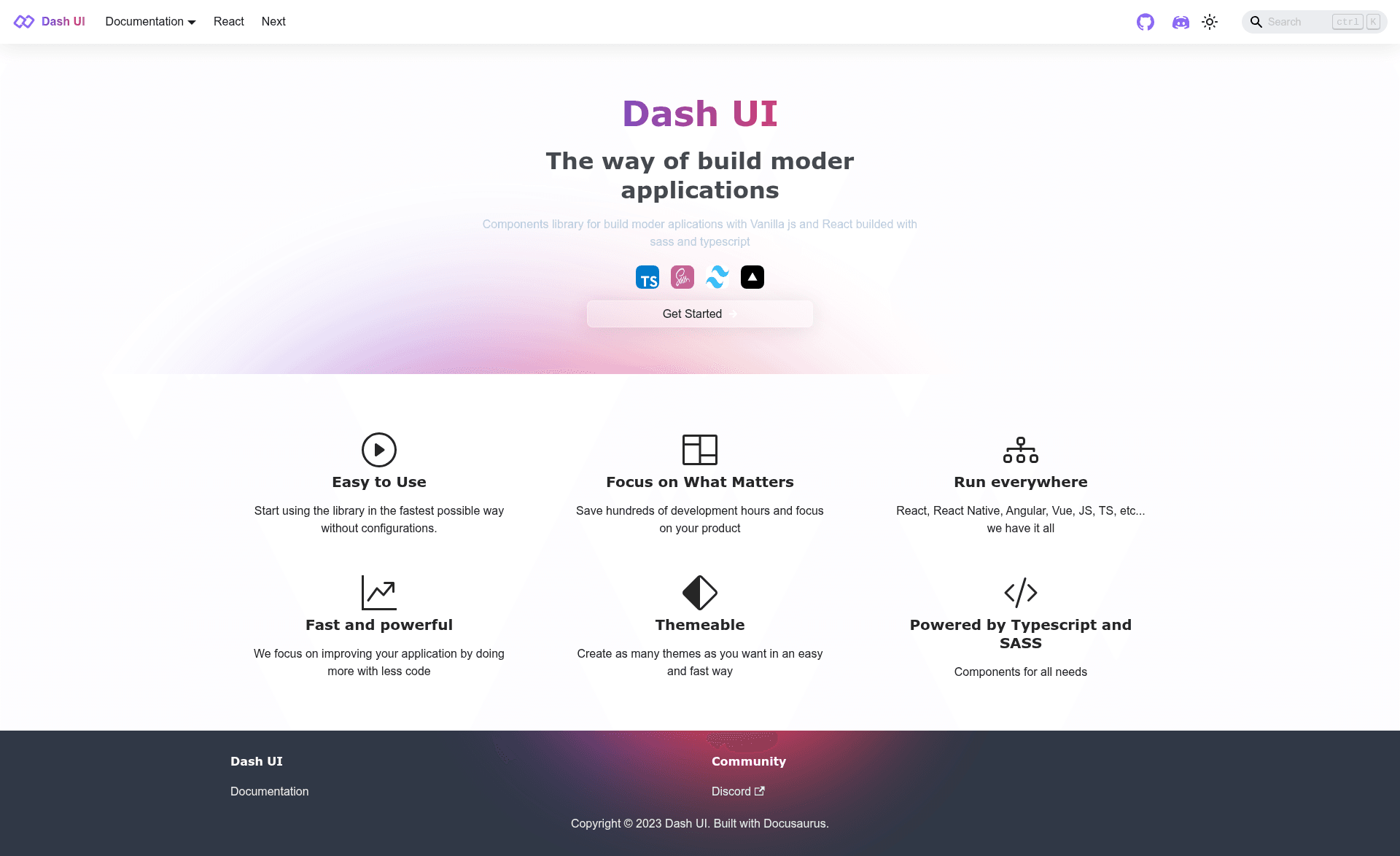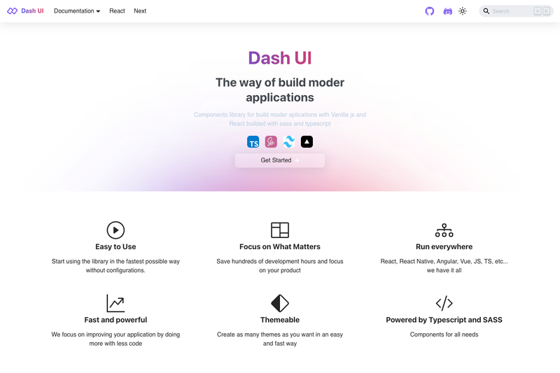
Dash UI is an open-source component library for building modern web applications with Vanilla JavaScript and React, inspired by Tailwind CSS and built with Sass and TypeScript.
What is Dash UI?
Dash UI is a components library that provides reusable UI components for both Vanilla JS and React. It takes styling inspiration from Tailwind CSS and implements components with Sass for styling and TypeScript for types. The project is maintained by the DashReact GitHub organization and published as an npm package under @dash-ui-lib/core. Its demos cover themes and buttons, layouts and text utilities, flex utilities, a grid system, glass effects, and loaders.
Key Features
- Dual framework support — components work in Vanilla JavaScript and React, so the same library serves both plain JS and React projects.
- Sass and TypeScript — styling is written in Sass and the package ships TypeScript types, as shown by the npm TypeScript badge.
- Tailwind-inspired design — the component set follows a utility-oriented approach similar to Tailwind CSS, with text, flex, and grid utility components.
- Component variety — includes theme and button systems, layout and text utilities, flex utilities, a grid system, glass effects, and loaders.
- Nx workspace integration — uses Nx generators such as
nx g @nrwl/react:appfor apps andnx g @nrwl/react:componentfor components, plusnx g @nrwl/react:hookfor hooks. - Storybook and testing — Storybook can be launched per library with
nx runcommands, and unit tests run vianx testwith linting vianx lint. - Publishable libraries — each library is built with
nx buildand published to the public npm registry from the dist folder usingnpm publish --access public.
Who is it for?
- React developers — build applications with prebuilt components and TypeScript types without writing utility CSS from scratch.
- Vanilla JavaScript developers — use the same UI components in plain JS projects, since the library explicitly supports Vanilla JS.
- Component-library teams — leverage the Nx workspace, Storybook, and publishing workflow to create and distribute an internal component library on npm.
- Tailwind CSS users — get a component-oriented alternative that captures Tailwind's utility spirit through Sass-based components.
What can you do with Dash UI?
- Assemble pages quickly — combine buttons, layouts, text utilities, and grid components to build screens without hand-writing all the CSS.
- Create a consistent visual theme — apply the included theme and button settings to keep styling uniform across your app.
- Develop and publish your own component library — use the Nx generators, Storybook, and npm publishing path to turn components into a shareable package.