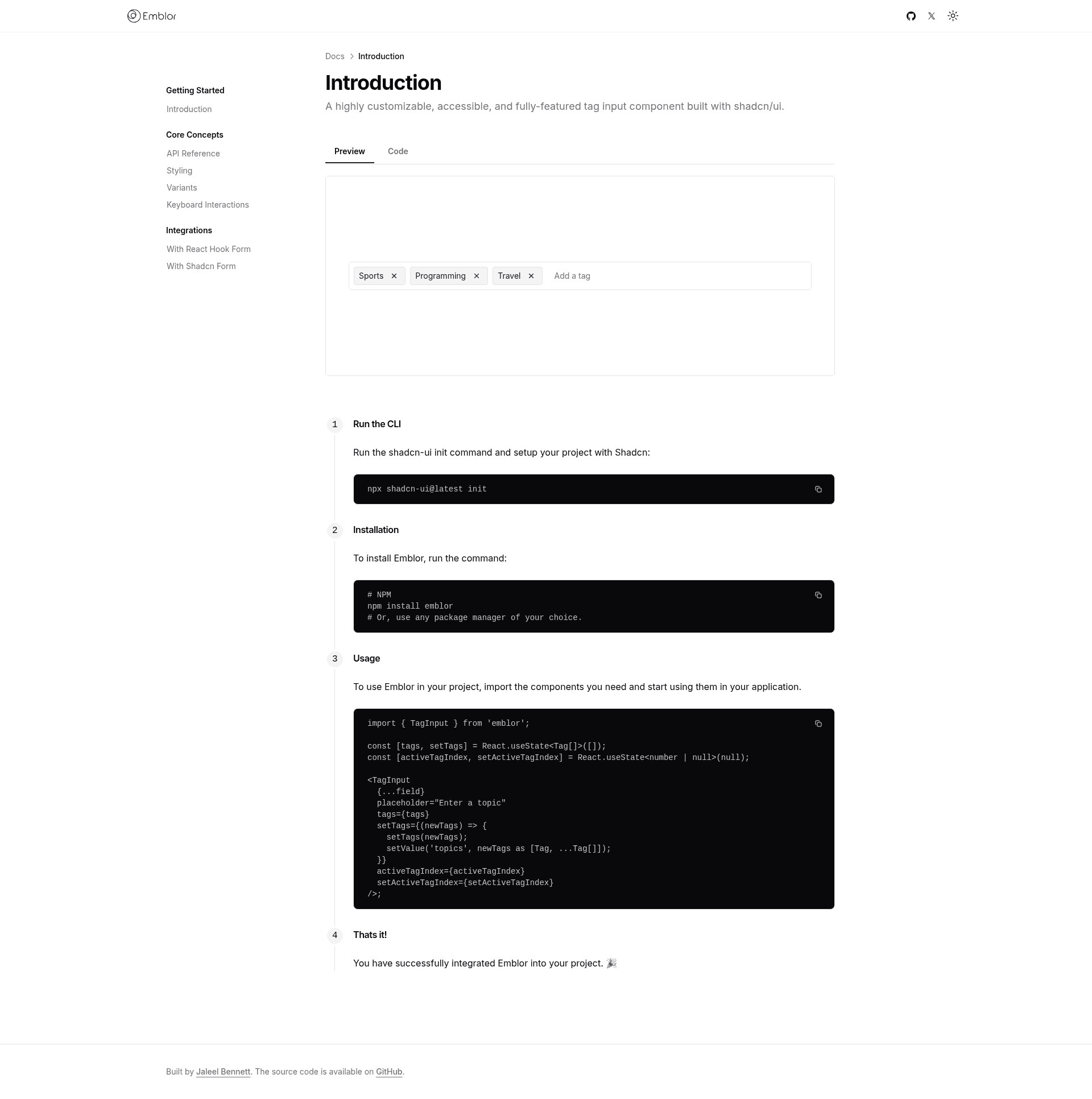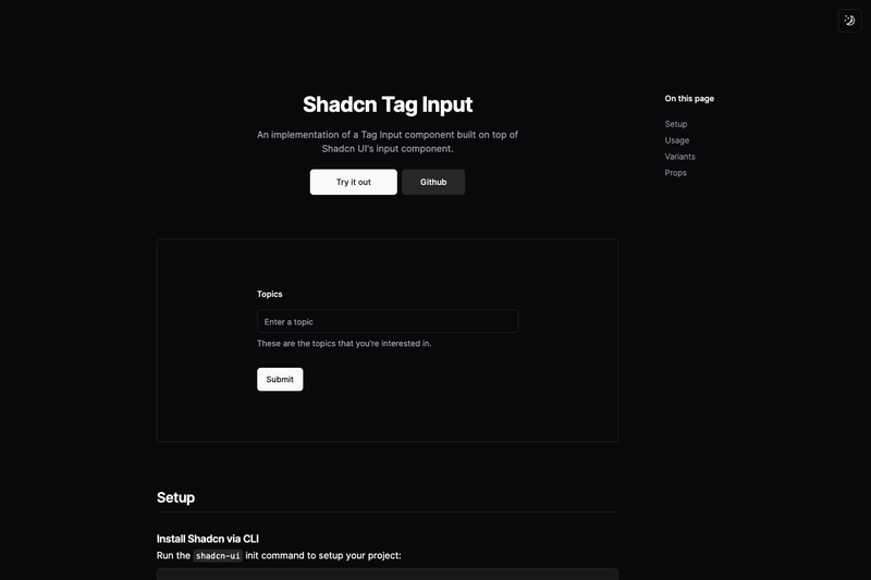
Emblor is an open-source tag input component for React built on Shadcn UI, combining autocomplete, validation, drag-and-drop, and accessibility features into a single drop-in component.
What is Emblor?
Emblor is a highly customizable tag input component for React, created by JaleelB and distributed as an npm package. It consumes an array of tags (each an object with an id and text) and renders an input field with tag chips, supporting autocomplete suggestions, validation rules, and drag-and-drop reordering. It outputs the updated tag list through a setTags callback and emits events like onTagAdd, onTagRemove, and onTagClick. The component is built on top of Shadcn UI's Input, Popover, Command, and Dialog components, making it consistent with Shadcn-based design systems.
Key Features
- Autocomplete — Enable a suggestion dropdown powered by Shadcn's Command/Popover, with an
autocompleteOptionslist and a customautocompleteFilterfunction. - Validation & limits — Enforce
maxTags,minTags,minLength,maxLength, and a customvalidateTagpredicate;allowDuplicatescontrols repeated tags. - Drag-and-drop reordering — Set
draggableto true to let users reorder tags using their pointer; works with the sortable tag list. - Custom rendering — Pass a
customTagRendererto fully control each tag's markup, or usestyleClassesto theme every sub-component (input, tag body, close button, autocomplete, popover). - Delimiters & paste handling — Add tags with Enter or comma delimiters, define a custom
delimiterList, and tags are automatically added when pasting text. - Keyboard navigation & accessibility — Navigate tags and suggestions with the keyboard; built on Radix-based Shadcn components for accessible interactions.
- Form framework integration — The included example shows integration with React Hook Form and Zod; the
setTagscallback pairs directly withsetValuein a controlled form. - Flexible layout — Position the input field at the bottom, top, or inline (
inputFieldPosition), display tags in a popover (usePopoverForTags), or show a tag count withshowCount.
Who should use Emblor?
- React developers building forms — Add a validated tag or topic picker to any form with React Hook Form and Zod, as demonstrated in the official usage example.
- Teams already on Shadcn UI — Get a tag input that matches the visual language and component primitives of an existing Shadcn UI app.
- Product engineers building admin or settings UIs — Configure max tag counts, duplicate prevention, and autocomplete to manage metadata, email lists, or skill tags.
What can you do with Emblor?
- Form builders: integrate a tag input into a React Hook Form schema with Zod validation, using
setTagsto sync state andonSubmitto send structured tag data. - Admin panels: allow users to add comma-separated labels or categories with
maxTagslimits,delimiterList, and drag-and-drop reordering. - Settings pages: build a read-only tag view with
readOnly, or a clearable input withclearAllandonClearAll.
How does Emblor work?
Install the package with pnpm add emblor, then import Tag and TagInput into a React component. Pass the current tags array and a setTags state setter, configure optional props for autocomplete, validation, and layout, and handle the returned tag list through callbacks. The component renders the input and tag list, adding tags on delimiter/Enter, removing on close-button click, and reordering when draggable is enabled.
FAQ
Is Emblor free?
Yes, Emblor is an open-source component published on npm and hosted on GitHub, so it can be freely installed and used in any project.
What dependencies does Emblor need?
Emblor requires React, Shadcn UI's Input, Popover, Command, and Dialog components, Tailwind CSS, tailwind-merge, and clsx. The usage example also uses React Hook Form and Zod, but those are only needed for the form integration sample.
Can I customize how tags look?
Yes, you can pass a customTagRenderer to render each tag as any React element, or use the styleClasses prop to apply custom Tailwind classes to the input, tag body, close button, autocomplete, and popover sub-components.
Does Emblor support duplicate tags?
By default duplicates are disallowed. Set the allowDuplicates prop to true to let users add the same tag more than once.