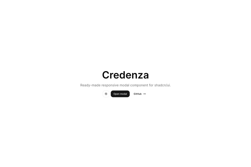
Credenza is a responsive modal component for shadcn/ui that automatically renders a dialog on desktop and a drawer on mobile, built on top of shadcn/ui's dialog and drawer primitives.
What is Credenza?
Credenza is a ready-made responsive modal component for shadcn/ui. It takes the standard shadcn/ui dialog and drawer components and combines them into one API, choosing which to render based on a 768px mobile breakpoint. The component is created by redpangilinan and is available as a GitHub repository with 898 stars; you can install it directly from the shadcn registry or copy its source files.
It is built for React projects that already use shadcn/ui and Tailwind CSS, typically Next.js 14 projects (the repository includes next-14 among its topics). It exports a full set of sub-components: Credenza, CredenzaTrigger, CredenzaClose, CredenzaContent, CredenzaDescription, CredenzaHeader, CredenzaTitle, CredenzaBody, and CredenzaFooter.
Key Features
- Automatic responsive switching — Uses a
useIsMobilehook with a 768px breakpoint to render a Dialog on desktop and a Drawer on mobile, so one component replaces two. - Full shadcn/ui API parity — Exports trigger, content, header, title, description, body, footer, and close components that mirror the shadcn/ui dialog and drawer APIs.
- Controlled or uncontrolled usage — Works with a
CredenzaTriggerfor click-to-open, or withopenandonOpenChangeprops for state-controlled modals. - Background scaling support — Wrapping your app in a
vaul-drawer-wrapperdiv enables Vaul's background scale effect on mobile. - Built on Vaul and Radix — The drawer behavior comes from Vaul (by emilkowalski) and the dialog from shadcn/ui's Radix-based dialog, giving you accessible and animated behavior.
- Mobile auto-focus — On mobile the component sets
autoFocuson the drawer content, matching native drawer expectations. - Registry installation — Install with one command:
pnpm dlx shadcn@latest add https://credenza.rdev.pro/r/credenza.json(or npx for npm users). - TypeScript source — The component code is written in TypeScript and includes a context for tracking mobile state.
Who is it for?
Credenza is for Next.js and React developers who build with shadcn/ui and want a single modal component that behaves like a dialog on desktop and a bottom sheet on mobile without writing their own responsive logic. It's also for shadcn/ui CLI users who want to add a community component through the registry instead of copying files manually. Finally, it's for teams standardizing on shadcn/ui who need consistent modal behavior across breakpoints.
What can you do with Credenza?
- Build responsive forms and confirmations: Use CredenzaContent with a header, body, and footer to create a modal that works on any screen size.
- Implement mobile-friendly settings sheets: With the drawer variant, your modal becomes a bottom sheet on phones, which matches mobile UX patterns.
- Create state-driven dialogs: Control the open state with React's useState via the
openandonOpenChangeprops for programmatic toggling.
How does Credenza work?
The component uses a useIsMobile hook that listens to matchMedia with a max-width of 767px. When the viewport is mobile, the Credenza component renders Vaul's Drawer; otherwise it renders shadcn/ui's Dialog. All sub-components (trigger, content, header, etc.) read the same mobile state from a React context so they stay consistent. To install, you can either run the registry command or manually copy the dialog, drawer, use-mobile, and credenza source files into your project.
FAQ
Is Credenza free?
Yes. Credenza is open-source software hosted on GitHub by redpangilinan. You can install it for free via the shadcn registry command or by copying the source files from the repository into your project.
Does Credenza replace shadcn/ui's dialog and drawer?
Credenza builds on shadcn/ui's dialog and drawer rather than replacing them. It selects between the two based on the 768px breakpoint, so you still need shadcn/ui and Vaul installed for it to work.
What is the mobile breakpoint?
The component's useIsMobile hook uses a maximum width of 767 pixels to decide between mobile and desktop. At 768 pixels and wider, it renders the dialog; below that, it renders the drawer.
Can I use Credenza with state instead of a trigger?
Yes. The root Credenza component accepts open and onOpenChange props, so you can control it with React state. The example in the README uses a function component that sets open to true when a button is clicked.
Does Credenza work with Next.js App Router?
The repository is marked with next-14, and the examples use Next.js. Since Credenza is a client-side component with "use client" at the top, you can use it in App Router pages as long as the importing file is a client component.