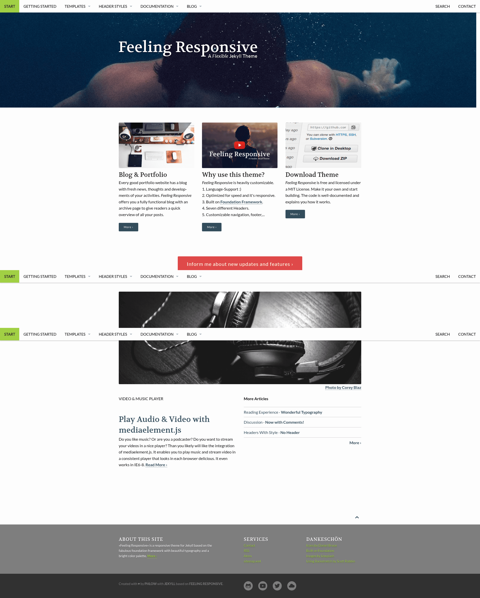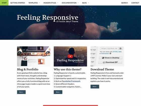
Feeling Responsive is a free, responsive Jekyll theme built on the Foundation framework, designed for company sites, portfolios, and blogs. This is a flexible theme that takes Jekyll content and produces a fast, mobile-friendly static website with six header options and built-in language support.
What is Feeling Responsive?
Feeling Responsive is a free and open-source Jekyll theme created by PhlowMedia. It runs on Jekyll, the static site generator, and uses the Foundation CSS framework for its layout and UI components. The theme takes Markdown or HTML content written for Jekyll and outputs a fully static, responsive website. It comes with extensive documentation, a live demo site, and a changelog, making it easy to get started and customize.
Key Features
- Responsive layout — The theme uses Foundation's grid system to adapt content to any screen size, from mobile to desktop.
- Language support — Built-in internationalization makes it possible to create multilingual websites without extra plugins.
- Six header styles — Choose from six distinct header layouts to suit different page types and branding.
- Customizable navigation and footer — Site menus and footer content are configurable via Jekyll data files, so no hard-coding is required.
- Speed optimization — The theme is designed with performance in mind, keeping page loads fast.
- Free to use — The theme is free, with support available via PayPal for those who wish to contribute.
- Multiple use cases — The theme's flexibility supports company sites, portfolios, and blogs out of the box.
Who should use Feeling Responsive?
- Small business owners — Build a professional company website quickly without hiring a developer, using Jekyll's simple folder structures and the theme's ready-made templates.
- Freelancers and designers — Showcase a portfolio with six header options and customizable layouts to present creative work.
- Bloggers and writers — Publish an international blog with language support and responsive typography, all managed through Jekyll's Markdown workflow.
What can you do with Feeling Responsive?
- Developers: Use the theme as a foundation for custom Jekyll projects, taking advantage of Foundation's documented components and the theme's clearly organized source files.
- Agencies: Build client sites faster with a theme that includes documentation, a changelog, and a demo for reference.
- Educators: Create course or project websites that are responsive and available in multiple languages.
FAQ
Is Feeling Responsive free?
Yes, Feeling Responsive is free to use. The license is available in the GitHub repository, and the author accepts donations via PayPal for continued development.
What framework does Feeling Responsive use?
Feeling Responsive is built on the Foundation framework, a responsive front-end CSS framework, which provides the grid system and many UI components used in the theme.
Can I use Feeling Responsive for a blog?
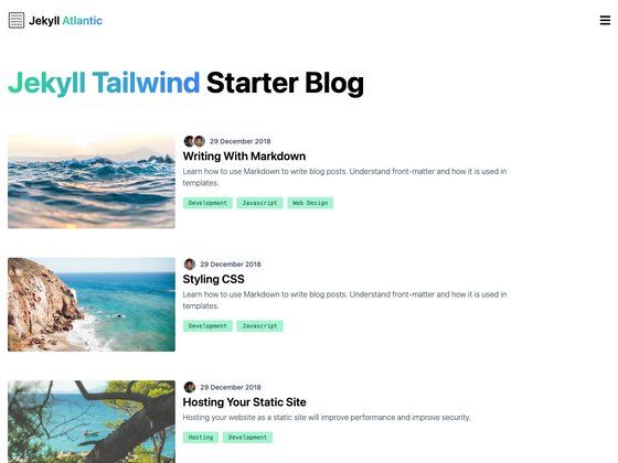
Yes, the theme is designed for blogs, as well as company sites and portfolios. It supports Jekyll's blogging features out of the box.
Where can I get documentation?
Documentation is available at the theme's demo site: http://phlow.github.io/feeling-responsive/documentation/.