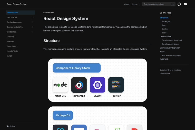
React Design System is a Turborepo-based monorepo template for building a design system component library with React 18, TypeScript, Storybook, SASS, Rollup, and Next.js, created by @chepetime in Mexico City.
What is React Design System?
React Design System is a starter repository that organizes a complete design language system into separate packages, apps, configs, and tools. As input, it takes new component code written against the React UI library; as output, it produces a distributable component library, design tokens, an icon set, a Storybook documentation site, and a Next.js web app. It runs on Node.js LTS (18.7) with pnpm as the package manager and Turborepo for task orchestration.
The monorepo structure splits reusable libraries into packages/ui (React components with TypeScript, Rollup, and SASS), packages/tokens (design tokens), and packages/icons (React icons generated with SVGR and Rollup). Applications include apps/docs, a Storybook instance, and apps/web, a Next.js app. Shared ESLint and TypeScript configurations live in config/eslint-config-custom and config/tsconfig.
Key Features
- Turborepo monorepo — manages dependencies and scripts across packages, apps, configs, and tools from a single
pnpm installand a set of root-level commands. - Component library package —
packages/uiis built with React 18, TypeScript, Rollup, and SASS, producing a distributable bundle usable by product teams. - Design tokens package —
packages/tokensships reusable design token values as a standalone distributable package. - Icon library package —
packages/iconsgenerates React icon components from SVG sources using SVGR and bundles them with Rollup. - Storybook documentation app —
apps/docscompiles React stories directly from source via@chepe/ui/src, giving faster reloads and hot module replacement during development. - Next.js web app —
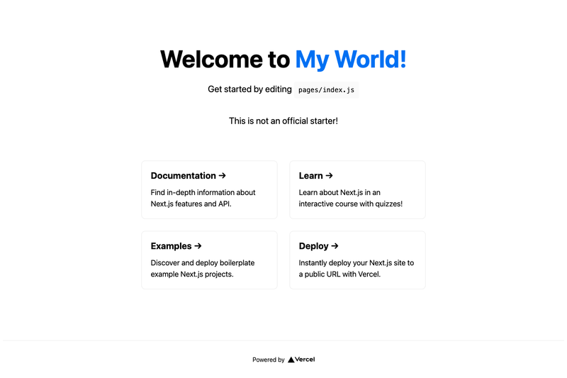
apps/webconsumes the bundled output of the React library, simulating the final package experience for product teams. - Component generator CLI —
tools/generatorscaffolds new component boilerplate with commands likenpm run generate:component --name=Heading. - GitHub Actions CI — workflows include
ci.ymlfor building@chepe/ui,storybook-tests.ymlthat turns Storybook stories into executable tests including accessibility checks, anddeploy-docs.ymlfor documentation deployment.
Who is it for?
- Design system engineers — need a pre-configured monorepo with separate packages for UI components, tokens, and icons so they can start building a branded library without setting up tooling from scratch.
- Frontend teams using React — can consume the component library from
packages/uidirectly in their applications and useapps/webas a reference implementation. - Storybook maintainers — benefit from the pre-wired Storybook instance in
apps/docswhere stories are compiled from source and automatically tested for accessibility in CI. - Open-source contributors — can use the
tools/generatorto add new components with consistent boilerplate, then rely on the GitHub Actions workflows to build and test contributions.
What can you do with React Design System?
- Create a new component: run
npm run generate:component --name=Headingto generate boilerplate, then develop and document it in Storybook. - Preview components in isolation: start the Storybook instance with
pnpm run storybookto see stories compiled from source with HMR. - Test components with accessibility checks: the
storybook-tests.ymlworkflow converts every Storybook story into an executable a11y test in CI. - Build a consumer web app: run
pnpm run webto launch the Next.js app that imports the bundled React library, mirroring how external teams will use the package.
How does React Design System work?
After cloning the repository and running pnpm install, you run either pnpm run storybook (Stories use @chepe/ui/src for speed) or pnpm run web (uses the bundled code from @chepe/ui). New components are scaffolded through tools/generator, and all builds and tests are orchestrated by Turborepo and GitHub Actions.