FT Form Components is a React and TypeScript component library for building web forms, published on npm as ft-form-components and offering ready-made components such as Button, Input, Steps, CheckBox, and RadioButton.
What is FT Form Components?
FT Form Components is an open-source library that provides essential form building blocks for React developers. It takes props and JSX children as input and outputs styled, interactive components that can be customized with className. The library is written in TypeScript and runs in any React environment, including Next.js, and is installed via the npm command npm install ft-form-components.
Key features
- Loading-aware Button — Accepts a
loadingboolean prop and an optionalloadingComponent; whenloadingis true, clicks are blocked until the async function completes, preventing duplicate fetch operations. - Composable Input — Input is a composite component with four children: InputArea for single-line text, TextArea for multiline text, Header for labels, and Warn for validation messages, all accepting className for styling.
- Multi-step progress indicator — Steps takes required
maxStepsandcurrentStepprops and shows each step with configurable colors:completedStepColor(default #16a34a),currentStepColor(default #ca8a04), anduncompletedStepColor(default #dc2626). - Customizable CheckBox — CheckBox accepts
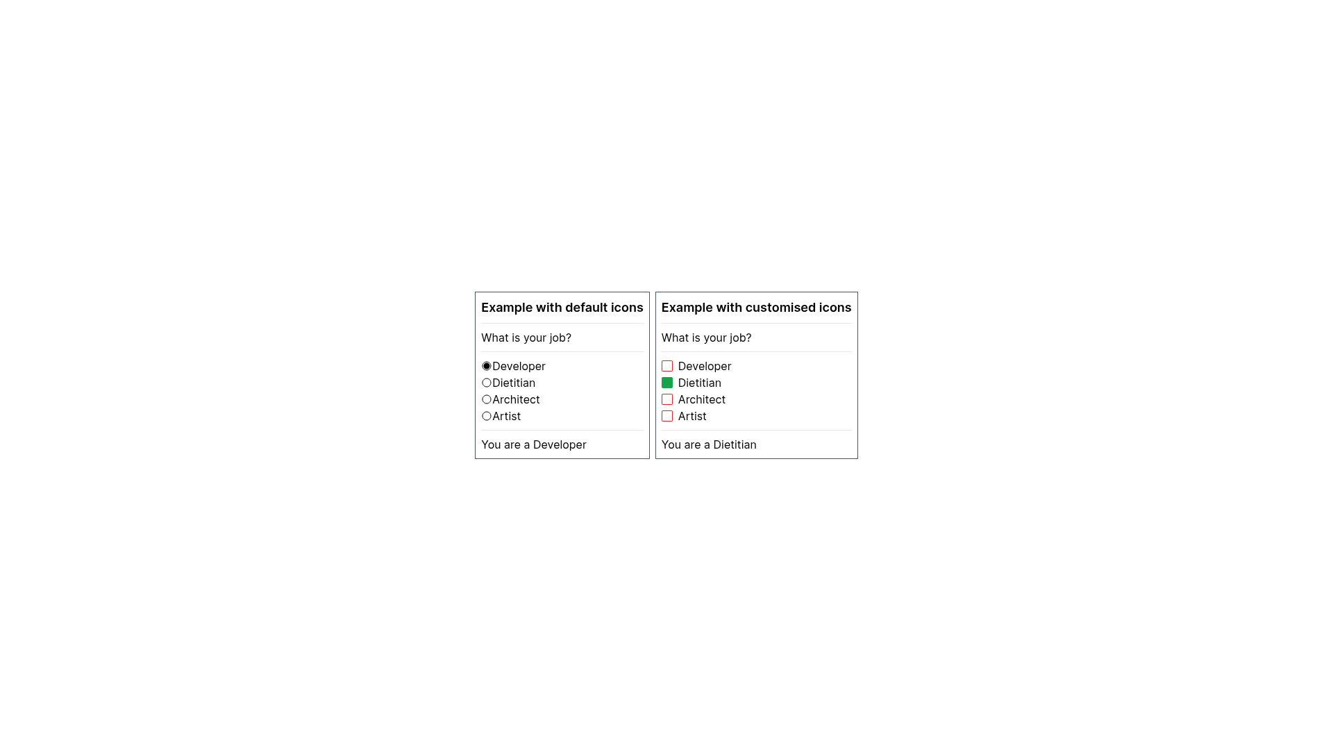
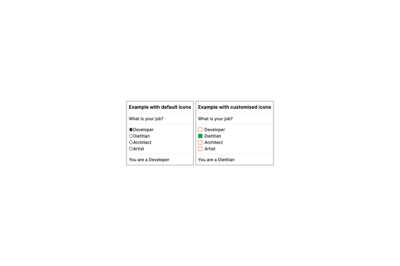
checked,checkChanged, and optionalcheckedComponentanduncheckedComponentto replace the default checkmark, and it supports an additional onClick event. - Self-grouping RadioButton — RadioButton.Group treats its children as a radio group without a name attribute; it takes
values,selectedValue, andsetSelectedValue, with options forselectedComponentandunselectedComponentcustom icons. - TypeScript and Tailwind ready — Examples throughout the readme use TypeScript state and Tailwind CSS classes, showing components drop into class-based styling workflows.
Who is it for?
- React developers who need standard form components that are easy to customize and integrate into existing projects.
- Next.js developers — the repository topics include nextjs, and the readme examples use Next.js-style pages with useState; components work without extra configuration.
- Product teams building multi-step forms — the Steps component gives users a visual indicator of their progress, which helps in long signup or checkout flows.
- Design-conscious builders — every component accepts className, and CheckBox and RadioButton allow custom components for checked/unchecked states, so visual designs are not locked in.
What can you do with FT Form Components?
- Prevent duplicate async submissions: use Button with the
loadingprop set to true during a fetch so users cannot trigger multiple requests by clicking repeatedly. - Add inline validation: combine Input.Warn with a
validboolean to display a warning message when a value is invalid, such as a username containing spaces. - Build multi-step wizards: use Steps with
maxStepsandcurrentStepto show users which stage of a form they are on, with color coding for completed, current, and uncompleted steps. - Create custom radio groups: map over an array of options with RadioButton.Group and RadioButton.Button to render a group that updates
selectedValueand can display bespoke icons.
How does it work?
Install the package with npm install ft-form-components. Import each component directly from its own file (for example, import Button from 'ft-form-components/Button'), then compose it in JSX with the props and children documented in the readme. The components accept className, so you can apply Tailwind or any other CSS framework.
Pros and cons
Pros:
- The Button loading prop addresses a common bug where users double-click submit buttons during async operations.
- Input's composite children keep related concerns (label, field, warning) together in one component.
- CheckBox and RadioButton support full icon customization for a unique look.
- TypeScript types are included, and examples show typed state and dispatch.
Cons:
- The library is still in development; the checklist marks Image/video picker, Autocomplete dropdown list, Basic dropdown list, Masked inputs, and Credit card view as not yet implemented.
- There is no mention of accessibility features or automated tests in the readme.
FAQ
Is ft-form-components free?
Yes. The package is published on npm with no pricing or license fee described in the readme. The repository metadata shows zero stars, and the documentation describes it as downloadable for testing, consistent with a free open-source library.
How do I install ft-form-components?
Run npm install ft-form-components in your project. Then import individual components from their own paths, such as import Steps from 'ft-form-components/Steps' or import Input from 'ft-form-components/Input', and use them in your JSX.
Does ft-form-components work with Next.js?
Yes. The repository topics include nextjs, and the readme examples are written in a Next.js-style React component format. The components themselves are framework-agnostic within React, so they work in any React or Next.js project without extra configuration.
Can I style the components with Tailwind CSS?
Yes. All components accept a className prop, and the readme shows examples applying Tailwind classes like bg-blue-600 px-4 py-2 to Button and border-gray-600 border rounded to Input.InputArea. The library does not require a specific CSS framework.
Which components are still missing?
The readme's checklist shows five items not yet implemented: Image and video picker, Autocomplete dropdown list, Basic dropdown list, Masked inputs for phone numbers and credit cards, and Credit card view. These will be added as development continues.