Newsletter
Join the Community
Subscribe to our newsletter for the latest news and updates

Landing page kit built with React, Shadcn/ui and Tailwind that you can copy/paste into your project.
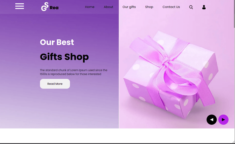
Rea is a free Bootstrap 4 HTML5 multipage landing page template for gift shops, with hero carousels, geolocation, and newsletter UI.
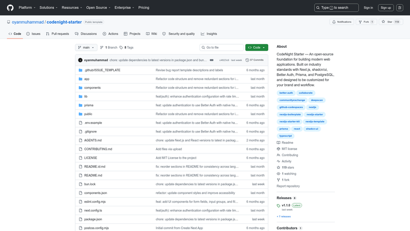
Lightweight Next.js 16 starter kit with Better Auth, Prisma, UploadThing, Tailwind CSS, and shadcn/ui — production-ready foundation.
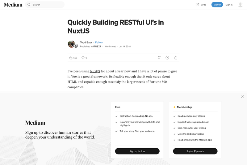
An example of creating restful interfaces quickly with Nuxt.js
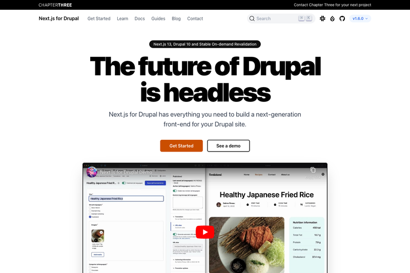
A simple starter for building your site with Next.js and Drupal.
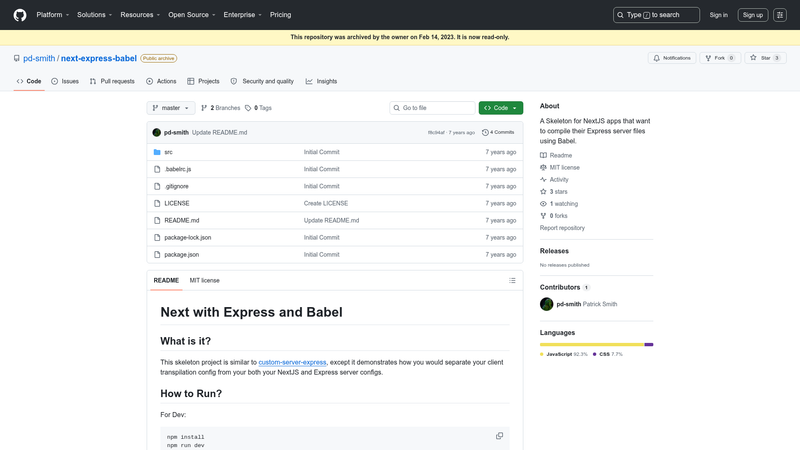
Boilerplate using Prismic, Gatsby, React and Netlify.
Launch UI is an open-source landing page kit for Next.js that supplies copy-paste-ready components built with shadcn/ui, Tailwind CSS, and TypeScript.
Launch UI is a collection of production-ready website components for building landing pages, built on Next.js 16, Tailwind CSS 4.2, shadcn/ui, and TypeScript 5.9. It takes a standard Next.js project and supplies ready-to-use React components — navbar, hero sections, feature grids, FAQ accordions, stats displays, CTAs, footers — that you install via copy-paste rather than as a dependency. The kit is developed by the team behind launchuicomponents.com and is released under the MIT License.
npm install.npm run dev.The core Launch UI repository is free and open-source under the MIT License. A paid Pro version adds six additional component groups (Bento Grid, Feature, Social Proof, Tabs, Carousel, Testimonials) and is referenced via the launchuicomponents.com/pricing page.
Yes, the core Launch UI repository is free and licensed under the MIT License. You can use it in personal and commercial projects. A separate Pro version with additional components is available for purchase on the Launch UI website.
Yes. Launch UI v2.0 adds full support for Tailwind v4, React 19, and Next.js 16. If you're using Tailwind 3, a version that still supports it is maintained on a separate branch of the GitHub repository.
The free version includes Navbar, Hero, Items, Logos, FAQ, Stats, CTA, and Footer components. Each component has multiple variants, such as static and floating navbars, illustration-based heroes, and multi-column footers.
The Pro version adds Bento Grid, Feature, Social Proof, Tabs, Carousel, and Testimonials components. These are advanced components like masonry-style bento grids, marquee social proof, and accessible tab/carousel layouts.
The repository and documentation are built around Next.js projects — the quick start assumes a Next.js app, and the components are distributed as part of a Next.js template rather than a standalone React library.