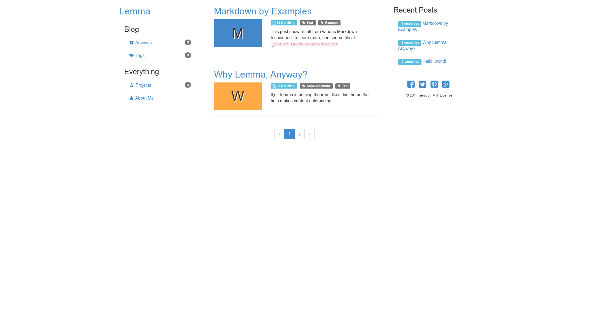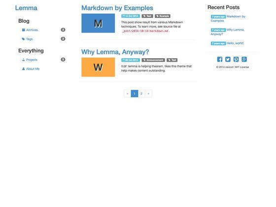
Lemma is a simple responsive Bootstrap theme for Jekyll that lets you publish a static website directly to GitHub Pages. It is a minimal Jekyll theme built on the Bootstrap CSS framework, distributed under the MIT license.
What is Lemma?
Lemma is a small open-source theme for Jekyll, the static site generator written in Ruby. It takes a Jekyll project — markdown posts, layouts, and configuration — and generates a complete responsive website using Bootstrap's grid and components. The theme was designed as a lightweight starting point for developers who want a standard Bootstrap look without starting from scratch. Its repository metadata describes it as a "Bootstrap theme for GitHub Pages (Jekyll)", confirming its intended use on the GitHub Pages platform. The project is hosted on GitHub and has an open-source MIT license.
What makes Lemma stand out?
Because Lemma is built directly on Bootstrap, it inherits the entire Bootstrap ecosystem rather than reinventing styles. The theme integrates Bootstrap's CSS and JavaScript, so common UI components like navigation bars, buttons, forms, and responsive grids work out of the box. The theme is considered "yet another simple responsive theme" by its author, implying a deliberate focus on minimalism and ease of use. It is also tagged with hacktoberfest, meaning the project welcomes community contributions during that annual event. The repository has 11 stars, indicating a small but existing user base that has found the theme useful.
Who should use Lemma?
Developers who are comfortable with Jekyll and want a Bootstrap-based theme without extra complexity will find Lemma a suitable starting point. It is particularly useful for those hosting personal blogs, project documentation, or portfolio sites on GitHub Pages. Since the build process uses standard Jekyll commands, anyone already familiar with bundle install and bundle exec jekyll build can pick it up quickly. Beginners who want to learn how Bootstrap and Jekyll work together can also study the theme's source code as a reference.
What can you do with Lemma?
- Personal bloggers: Publish a clean, responsive blog by writing markdown posts and letting Jekyll turn them into static HTML using Lemma's layouts.
- GitHub Pages users: Deploy a site directly from a GitHub repository by pushing Jekyll source files, thanks to GitHub Pages' native Jekyll support.
- Open-source learners: Inspect the theme's codebase to see how Bootstrap classes and Jekyll templating combine in a minimal project.
How does Lemma work?
The theme follows a standard Jekyll workflow. Clone the repository, install dependencies with bundle install, then build the site with bundle exec jekyll build. The resulting static files can be served locally or pushed to GitHub Pages. The development instructions on the project page list these steps in order, so setup requires no custom commands.
Pricing
Lemma is free to use. It is released under the MIT license, which permits copying, modification, and distribution with attribution and inclusion of the license notice.
FAQ
Is Lemma free?
Yes, Lemma is free and open-source. It is licensed under the MIT license, meaning you can use, modify, and redistribute the theme for personal or commercial projects.
What is Lemma built with?
Lemma is built as a Jekyll theme and integrates the Bootstrap CSS framework. It includes Bootstrap's custom CSS and JavaScript files, so no separate installation of Bootstrap is required.
How do I build Lemma locally?
Clone the repository, run bundle install to install the required Ruby gems, then run bundle exec jekyll build. The generated static site will be placed in the _site directory by default.
Can I use Lemma on GitHub Pages?
Yes. GitHub Pages supports Jekyll natively, and Lemma is described as a Bootstrap theme for GitHub Pages. Add the theme to your repository and push your Jekyll source to have GitHub Pages build and serve the site.
Is Lemma responsive?
Yes, the theme explicitly describes itself as "a simple responsive theme". Because it uses Bootstrap, its grid layouts and components automatically adapt to different screen sizes, from mobile phones to desktop monitors.