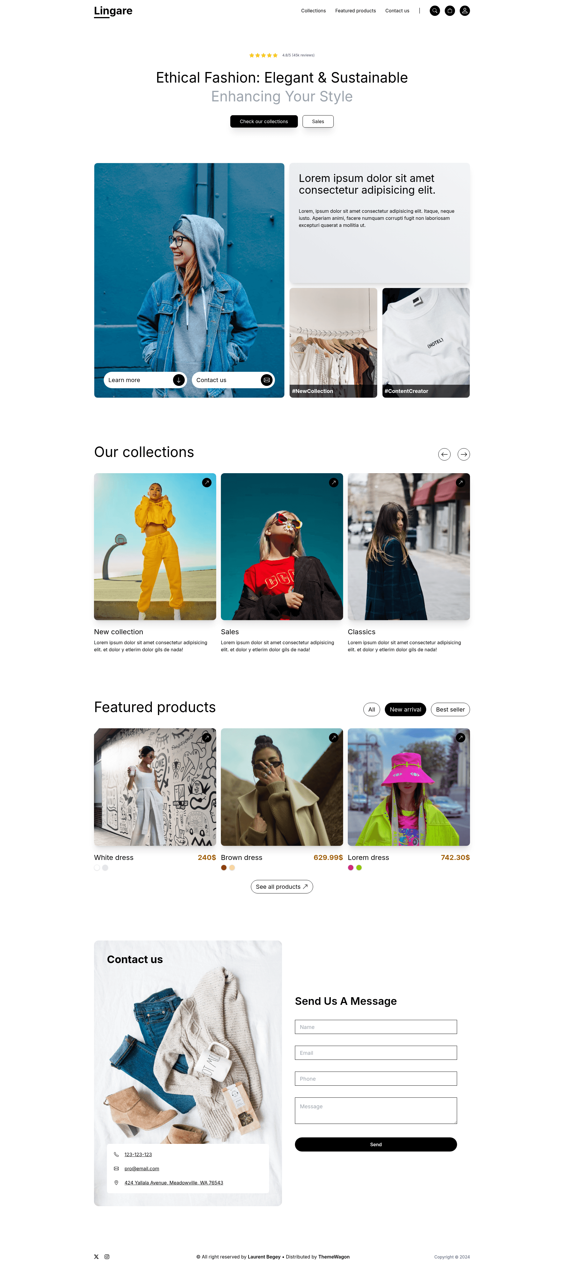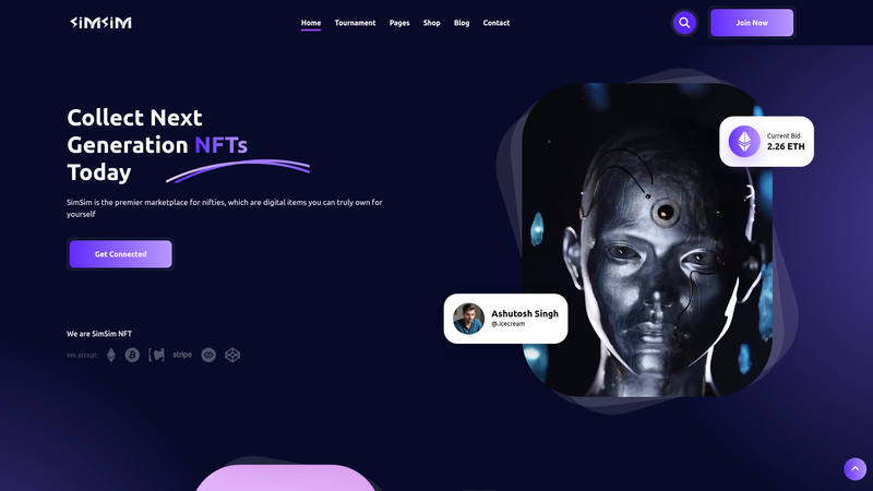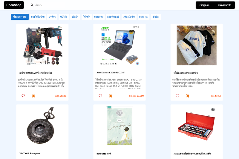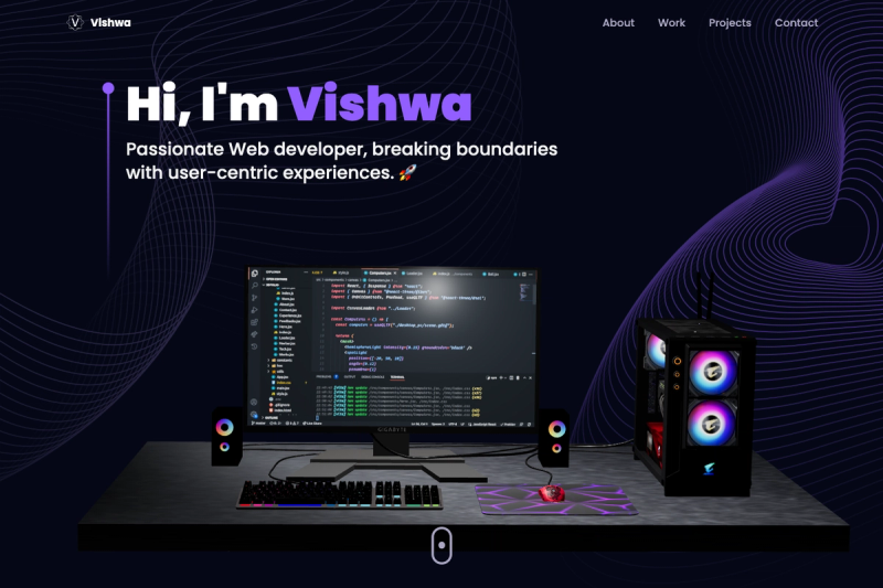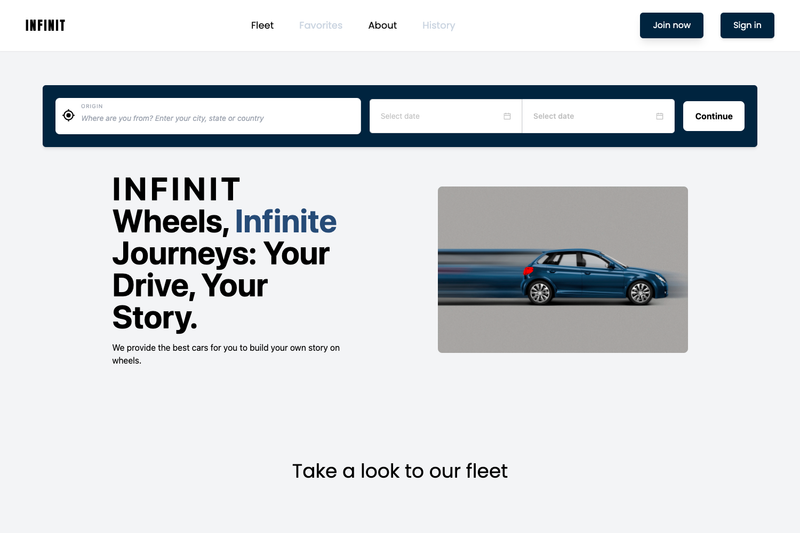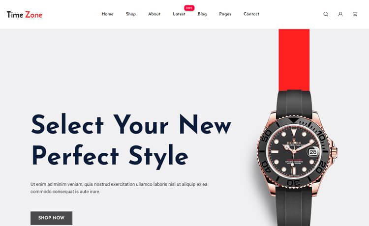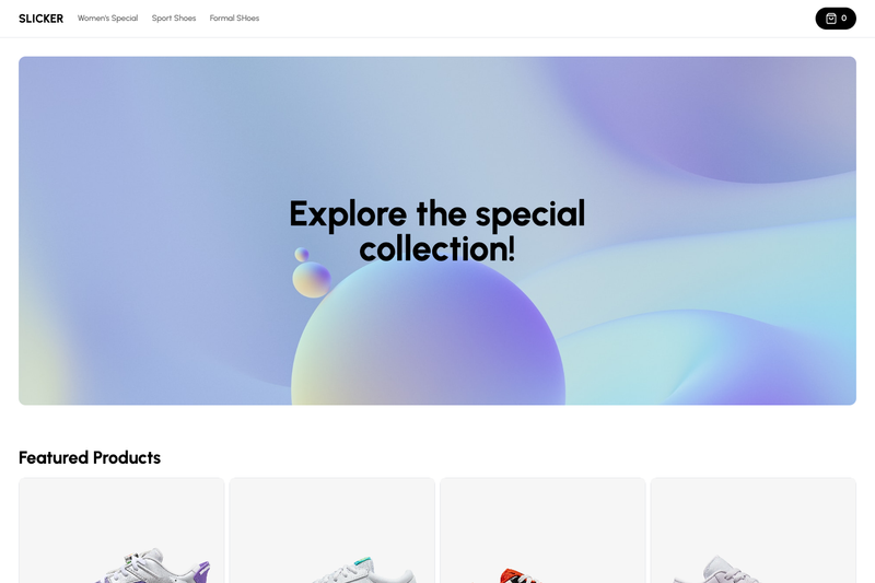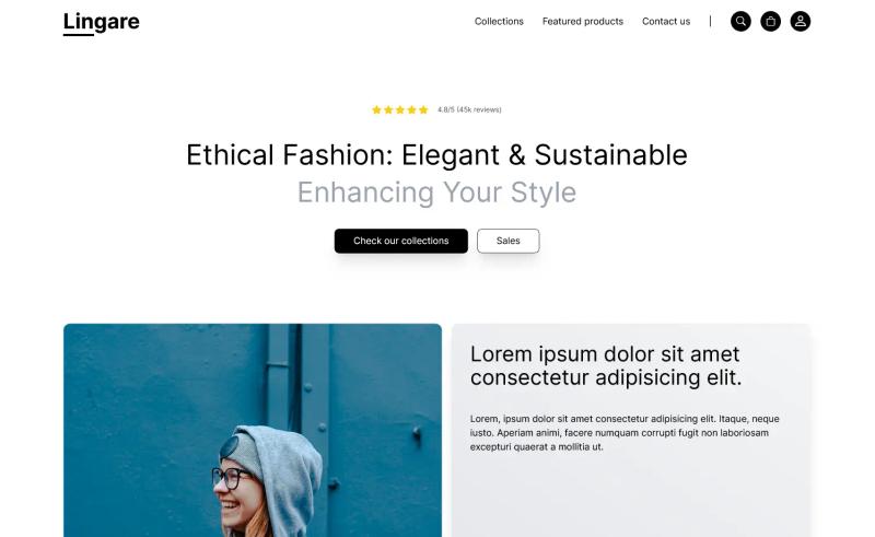
Lingare is a free, one-page landing page template from ThemeWagon built with Tailwind CSS and HTML5, designed for product showcase pages on eCommerce and online shopping sites. It takes a static HTML/CSS structure and produces a fully responsive single-page website that can be deployed to any static host. The template was created by Laurent Begey and is available under an open-source license with lifetime free updates.
What is Lingare?
Lingare is a free, one-page Tailwind CSS landing page template that gives you a ready-made product showcase page with a hero header, navigation bar, product cards, and contact form. It is built with Tailwind CSS and HTML5, so you get a clean, utility-based CSS codebase without extra frameworks. The template runs on any static host and is distributed by ThemeWagon.
Key Features
- Tailwind CSS framework — Styling is built entirely with Tailwind CSS utilities, with no additional CSS framework required.
- Hero header and top navigation bar — Includes a sticky top nav and an attention-grabbing hero section for branding and key messages.
- Product cards — Ready-made card components for displaying products with images and details, including on-hover effects.
- Contact form — A built-in contact form section for capturing visitor inquiries.
- Tabbed contents — Tabbed UI components to organize product info or features without extra JavaScript libraries.
- Mobile-first responsive design — Layout adapts across all screen sizes, from small phones to desktop monitors.
- One-page layout — All sections are combined into a single scrolling page, which simplifies navigation and keeps the codebase clean.
- Page-speed and SEO optimized — Clean, lightweight code is designed to load fast and rank well in search results; the template is also cross-browser compatible.
- In the box — Includes 1 pre-built page, all demo images, and the Tailwind CSS library/plugins.
Who is it for?
- eCommerce startup founders — Use Lingare to launch a polished product landing page quickly without hiring a designer or writing custom CSS from scratch.
- Freelance web developers — Get a clean, modifiable codebase to customize and deliver to clients who need a product showcase site.
- Small online store owners — Create a lightweight, responsive storefront landing page that works across all browsers and devices.
What can you do with Lingare?
- Product launches: Build a single-page marketing site to announce a new product, featuring hero imagery, product cards, and clear call-to-action buttons.
- Online storefronts: Display a curated set of products using the included product card and tabbed content sections.
- Portfolio of services: Repurpose the layout as a personal or agency showcase by swapping product cards for service offerings, keeping the contact form for leads.
Pricing
Lingare is free to download and open source. You can use it in commercial projects and receive lifetime free updates. No premium tier is mentioned on the page.
FAQ
Is Lingare free?
Yes, Lingare is a free template offered by ThemeWagon. You can download it at no cost, and it is open source, so you are free to use it in personal and commercial projects.
What CSS framework does Lingare use?
Lingare is built with Tailwind CSS, a utility-first CSS framework. It also uses HTML5 and modern technologies. No other CSS libraries are included; the template relies on Tailwind's utility classes.
Can I use Lingare in commercial projects?
Yes, the template license permits commercial use. The page states it is open source and can be used in commercial projects with lifetime free updates.
Does Lingare include demo images?
Yes, all demo images are included in the download package, along with 1 pre-built page and the Tailwind CSS library and plugins.
Which browsers and devices are supported?
Lingare is compatible with Chrome, Edge, Firefox, Opera, Safari, Android, iPhone, iPad, and other mobile devices. The mobile-first responsive design ensures a consistent experience across screen sizes.